I don’t tend to share work-in-progress shots for a few reasons:
1. I knit a lot on the go, where it’s not too convenient to take pictures.
2. I am really really bad at processing all my photos, and more of them just adds to the laod.
3. I just don’t think of it.
But I did think of it today, and it’s gotten me thinking a bit about useful general photography tips I need to remember when knitting:
Knit photography #1: Be careful of focus and depth of field
I love small depths of field in general photography and beautiful bokeh (aka the blurry bits) and all, but when taking pictures of my knitting, I need to make sure that the focus is where I want to be, and covers enough of the area around where I’m trying to draw the eye:
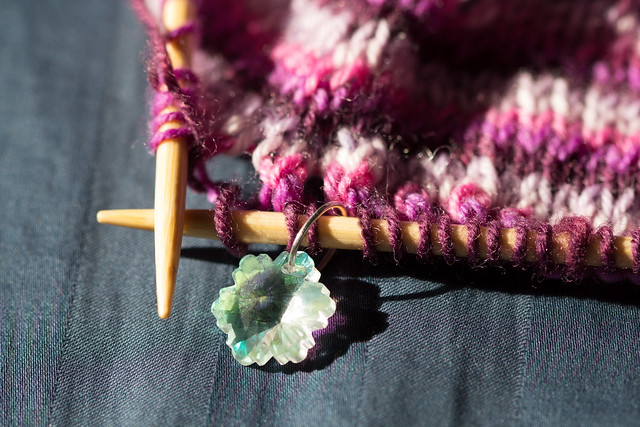
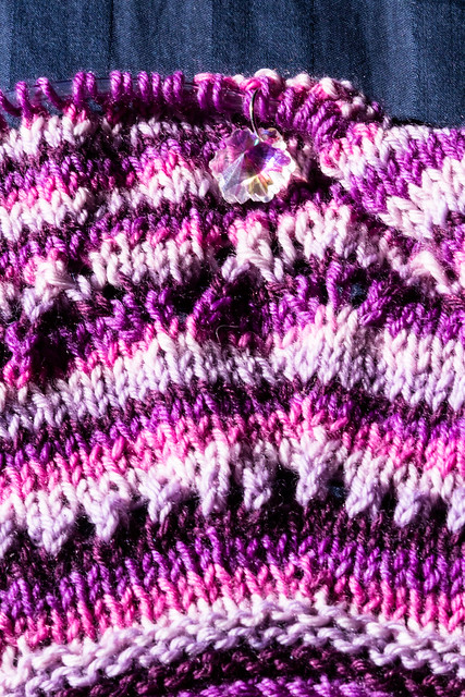
So here, I’m taking a picture of my pretty little stitch marker, and I’ve only left a small row of knitting in focus.
Since this is a maker blog, I’ll say that I made the stitch marker myself, for values of “made” that include “I bought a bunch of beads that had rings through them and separated them then re-closed the circles.” My project *sparkles* in the sun right now thanks to the beads, which is fun when I’m actually knitting in the sunbeam.
The narrow depth of field actually works well for something that small, but when I’m showing a series of stitches, I have to remember to adjust my photography style so that people can see the stitches well.
That can mean making sure the section is really flat:
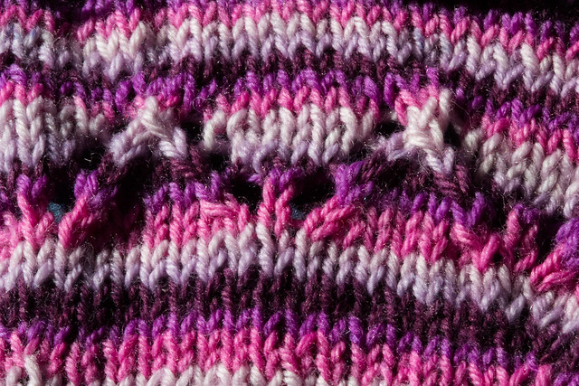
Or it can mean just making sure the depth of field is big enough for the area in question:
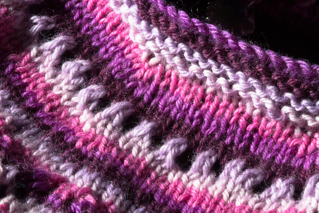
Knit photography #2: Yarn has weird light properties
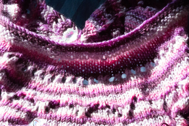
When you look up close at yarn, you can usually see that it’s at least a little bit fuzzy. This helps make it warm and soft, but also means it has some weird light properties where it will seriously glow given enough light. This can be awesome, or it can be really irritating, but the important thing to remember is that photographing knit/crocheted fabrics in bright light can be challenging in different ways, and each yarn is going to be a little different.
The extreme contrast isn’t always a bad thing: it can help you showcase lace. In theory. In reality, I always seem to end up with hyper-real photos, or ones with huge dark patches that just don’t look right:
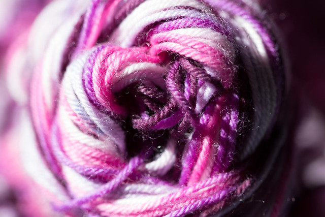
And the sun is pretty bright already, so even if the yarn didn’t pick up the light so well, it could be a mess:
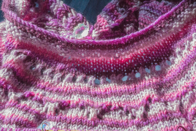
You can fix these things, of course, with some messing around in lightroom/photoshop, but then you lose out using the extreme contrast to show stitch definition, and you can make the project look a little dull:
I suspect it’s going to take a lot more experimentation before I can quickly snap off a few photos in sunlight! But for now, I’ll be thinking critically about what I do and practicing doing it until I feel like I’ve got the kind of photos I want for matching with my patterns.
And with that, I give you one more photo where I’m proud of the light. This one showcases the rainbow nature of my stitch markers:

So pretty!