Hot and thunderstorm-y so far this July. Went downtown for Canada Day and had regrets — so hot, so loud — but the war museum was air conditioned. Kid noped out just in time for us to get on the train and back to the car before the skies opened and the thunder and lightning started. Then we had a long power outage at home as the thunderstorms rolled in, the patio door started leaking a very small amount, and the neighbour’s fence fell on our car (no visible damage, though!). It was simultaneously too exciting and also incredibly boring, but I got lots of reading done while the dog lay nervously over my legs, stirring to look at the strange noises or to complain if I stopped petting him to turn the page.
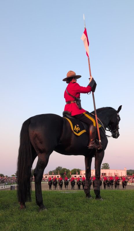
RCMP Musical Ride. There is one black horse with mountie rider holding a lance in the foreground, and the others are visible in the outdoor arena below, all standing at attention for the lowering of the flag at sunset.
We had a much nicer time at the RCMP musical ride on the weekend before. The show hasn’t changed much since I was a kid except for updates to the pop music they used, but it was a nice night and my kid got to go pet a horsie’s nose after the show so he was satisfied with the experience. The governor general’s foot guard band played some numbers too, which was a delight for me as someone who played a lot of concert band gigs in parks over the years. (This is the longest I’ve gone without a band since I was in elementary school and it feels weird to be so out of practice, but I’m not quite up to joining a band again right now. Playing music was so much of my life but choir filled the gap until we moved.)
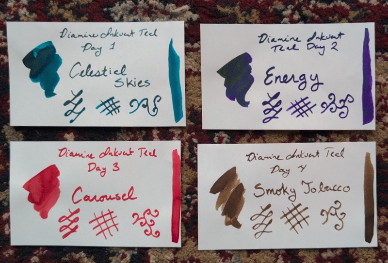
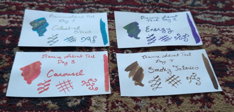
July 2026 Journal Supplies
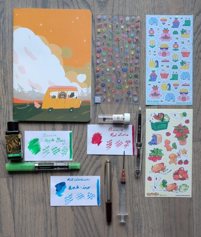
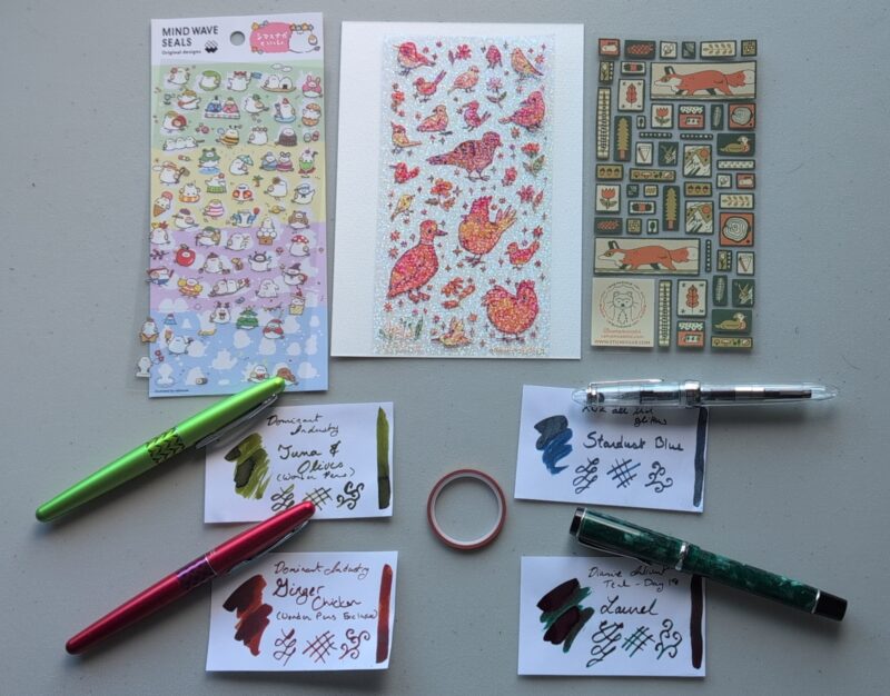
A new A5 notbook with a camper van vibe, three sticker sheets, three pens and inks.
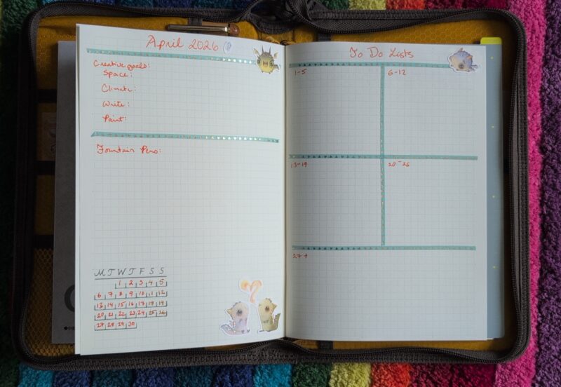
New Notebook!
I picked up a cute Mugobuni camper van themed A5 notebook from an art store in Toronto (they had the Traveler’s Notebook half-year weekly calendar I wanted). I think I’d seen some Mugobuni art on stationery blogs a pen store blog post or maybe they did stickii or something because the name and style feel vaguely familiar? I guess they’re based in Toronto just like the art store. The notebook was something like CAD $10 so I wasn’t expecting anything too fancy, but it’s pretty nice: 20 sheets / 40 pages (around my favourite size!), sewn spine, rounded corners, cute cover, dot grid that seems to be 6mm spaced. Now, 6mm spaced is fantastic for me with larger pens, but alas, the paper did not like my twsbi eco 1.1 stub and I got a bunch of bleedthrough. Then the flex nib had the same problem if I flexed it. And even my Pilot Medium had a few dots seeping through.
In the end, I swapped the Eco to have a medium nib and ditched the Monza for a Preppy in a fine, plus I tried all the other pens I still had inked on the page. No serious problems, so it seems like the eco 1.1 and the flex were just bad ideas but it’s otherwise pretty fountain pen friendly paper!
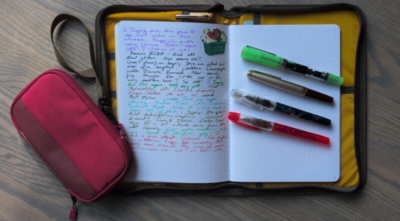
Inside of the Mugoubuni notebook with a page trying different pens/inks. My new lineup of pens for this month is sitting on the blank right hand page beside the writing.
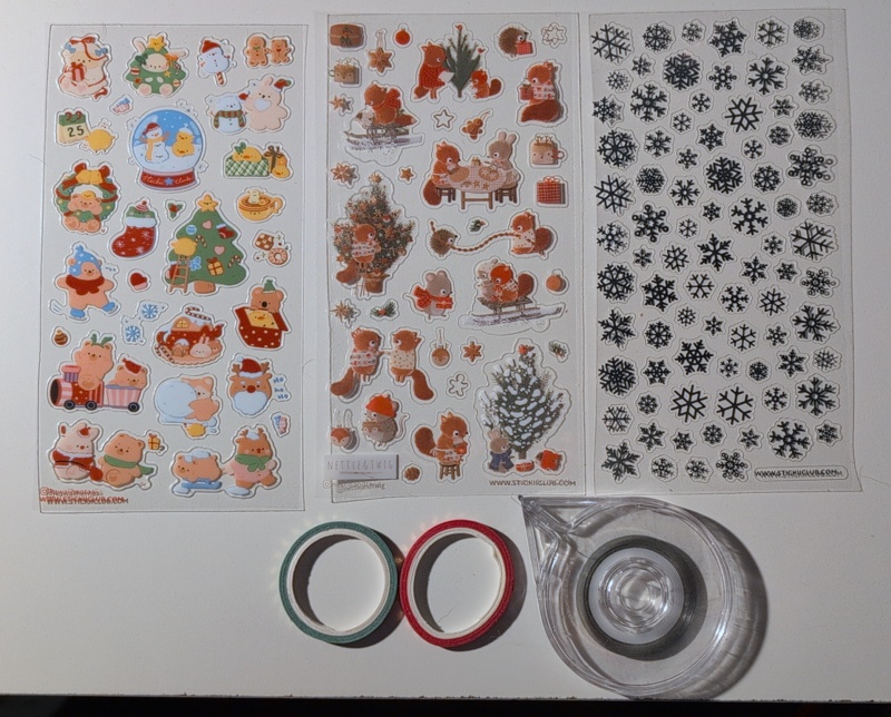
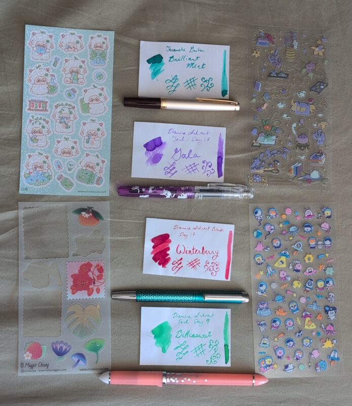
Stickers
All of these from the June 2026 pack from stickii.
- Flower Icons from CoCo MoMo
- Produce doggies from Yumbrite
- Gardening friends from Hello Yonnie
Pens and Inks
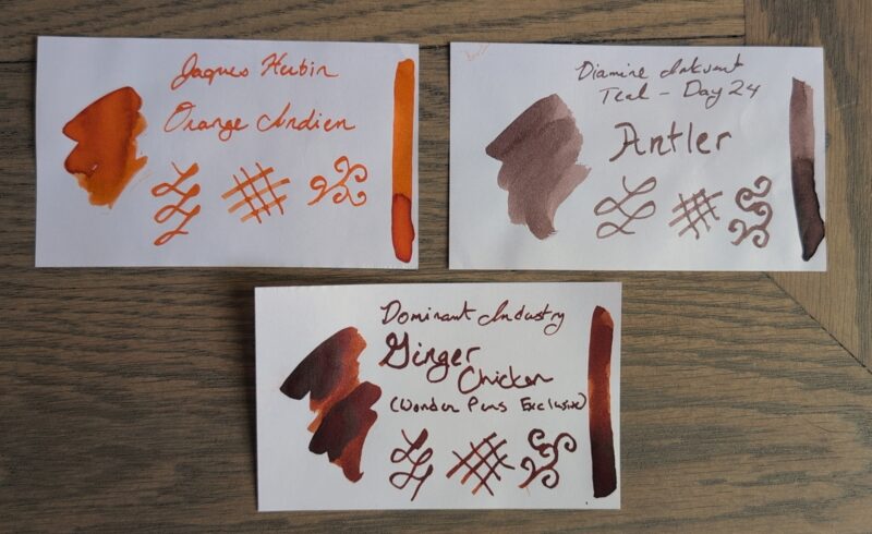
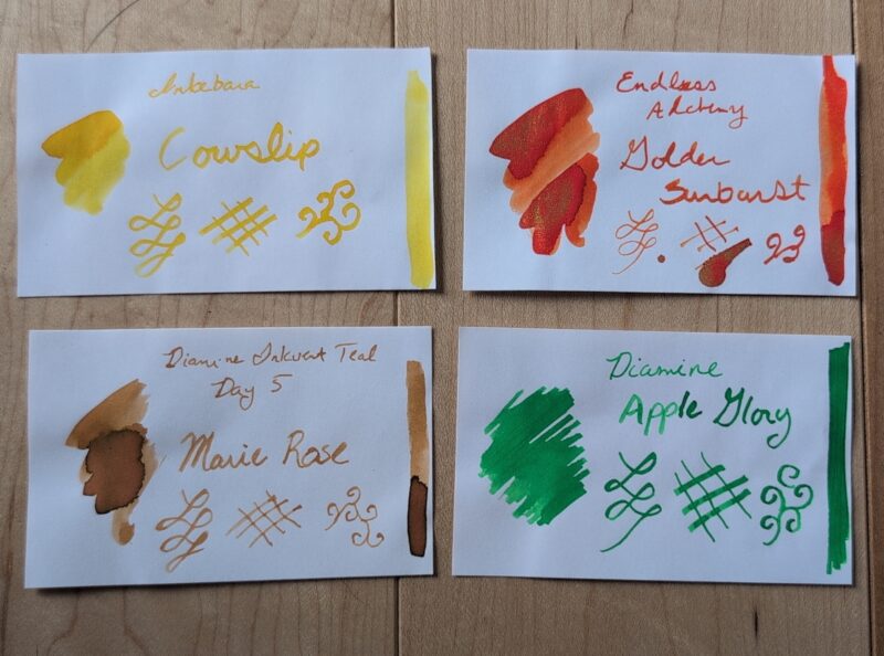
- Glow green TWSBI Eco <M> – Diamine Apple Glory. I had started with a 1.1 stub but it was bleeding through the paper. Swapped to the medium and it seems fine now.
- Pilot E95S <M> – Pilot Iroshizuku ama-iro. Also reading a bit wet on this paper but not bad enough to swap.
- REMOVED: Monteverde Monza <flex> – Diamine Red Lustre. This combo of ink/nib/paper didn’t work and it was too skippy and scratchy, so I’ve swapped it out already on day 3.
- Platinum Preppy Wa <fine> (red gourd) – Red cartridge from Platinum. I tried this with the Diamine Red Lustre but the results were, uh, lackluster, so I switched to the cartridge. That ink may need some dilution at this point but I might just swap it into the paint box.
- Platinum Preppy Wa <fine> (blue koi) – original black cartridge. Normally this is my todo list pen but it’s nice on this paper so it got promoted back to journalling.
Notes from Last Month
The Conklin Durograph did grow on me with practice and I found it considerably more usable than I remembered. But while I liked using it for copying quotes and it wasn’t causing me pain to use it, but it still wasn’t the pen I wanted to reach for much this month. The plan is to clean it out and tuck it away in the drawer for now and mentally slot it on the giveaway list if an opportunity to make someone else happy arises. No hurry since pens don’t take up much space.
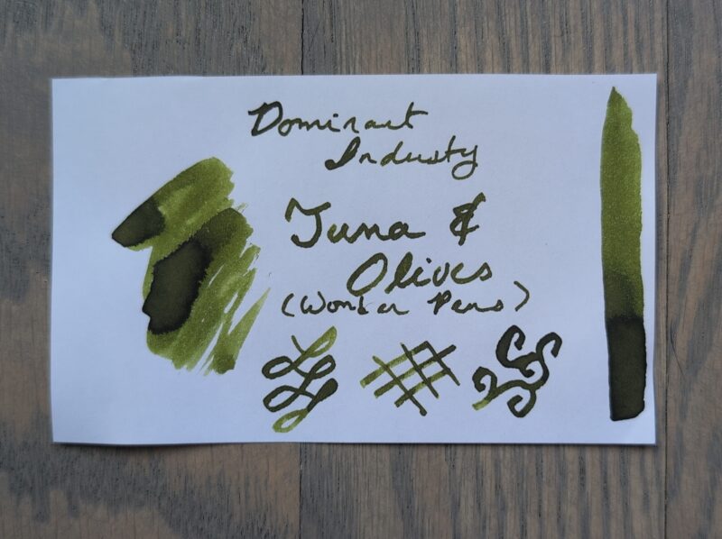
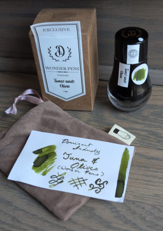
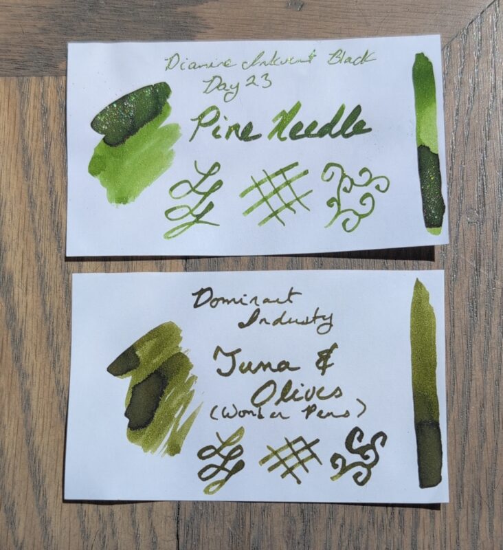
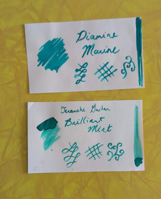
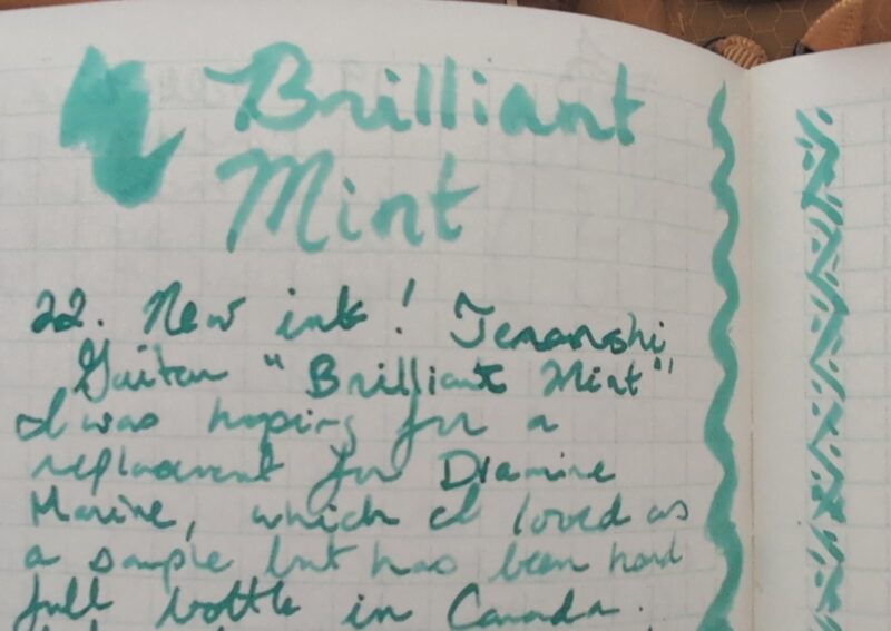
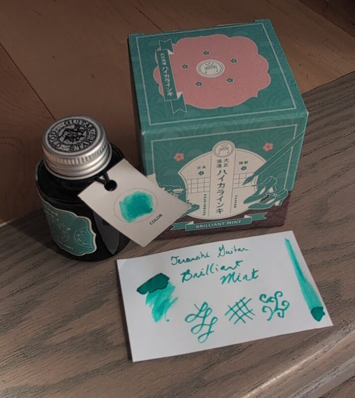
Both the Pilot Metropolitans and the Dominant Industry inks were great and they’re moving over to my work notebook next. The green pen did dry out a bit by the end of the month so I’ll keep an eye on it.
The Monza got swapped out last month for my Kaweco Liliput with the same ink. Turns out a large blob of shimmer had gotten stuck on the lid and once I got it mixed in the ink behaved as expected, so it probably wasn’t the Monza’s fault that it failed at shimmer in June. But of course now I’m trying paper that can’t handle the flex nib… this poor Monza can’t catch a break. It’s slated to get cleaned out and ignored for now since there’s no point in trying it again on this paper. Unlike the Durograph which is heavy and has a wide nib, this one’s light and has multiple nibs so I’ll try it for things like my work notebook and give it a fairer shot with more cooperative ink before it gets shelved.
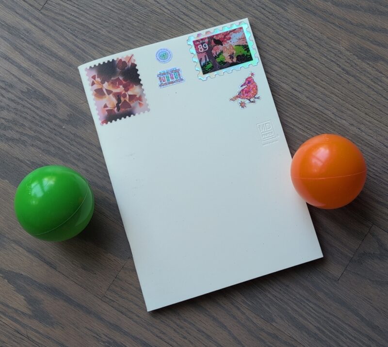
MD notebook with stickers on the top of the cover.
I was glad to see the MD Paper notebook finished. It’s reasonably priced, has the smaller number of pages that I prefer, I like that the simple cover lends itself to sticker decorations, and I actually enjoyed using it for drawing. Unfortunately, the drawing seemed to result in too much hand oil on the page rendering parts of it useless for fountain pen ink or causing random skipping in pens that I know normally perform well. If I used a shield to write/draw it was fine, but I found myself hesitant to use it and drawing in other notebooks instead which … I mean, that’s fine but I kind of want to also draw in my journals? Even if I don’t do it that often?
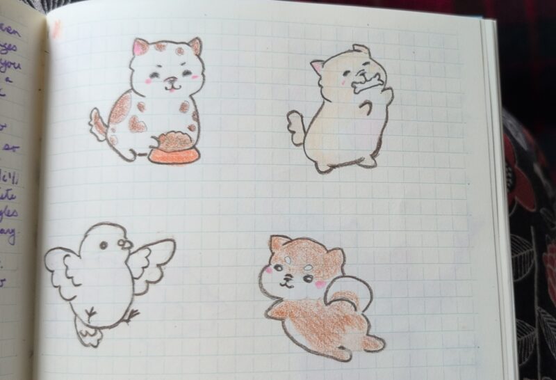
Drawing exercises from Kawaii Doggies and Kawaii Birdies, shown in my MD Paper notebook.
I’m also kind of tired of the ghosting through the paper. It’s not unusable or anything, but I feel like I’d probably be happier with thicker paper, especially since I prefer notebooks in the smaller page count range so I can afford to use thicker paper without it being too much. So in the end, like the Conklin Durograph, this MD notebook is perfectly fine and I can use it but it’s not sparking joy for me. I’d been hoping I could just pick up these 3-packs of notebooks and have a default journaling notebook that was relatively easy to get in Canada, but alas I don’t think they’re the right choice. Alas! I’ll use the other two eventually, but in the meantime I do still have several years worth of paper to try so it’s not urgent that I find the perfect one yet.
![Three sheets of stickers: cute dragons, large botanicals and weather icons, an ivory covered MD notebook, three ink swatches (Diamine Tundra [grey], Diamine Mint Twist [green with blue shimmer], and Pennoia Selyempezgo [peach]) and fountain pens (Kaweco Liliput, Pelikan Pura, Pilot E95S).](https://curiousity.ca/wp-content/uploads/2026/04/1000005301-1-800x471.jpg)


 The Liliput Clip fits nicely and most importantly, has solved my problem. Now the pen clips securely into the pencil case I use for my journal setup and it doesn’t slip out into my bag, the couch, or wherever I’m writing. I love this pen a lot but it was absolutely an escape artist. I decided to go with a more complementary colours vibe instead of getting the silver and I still haven’t made up my mind if that was the right choice (so it probably wasn’t) but I don’t care enough to get a second clip when this won’t transfer to my other kaweco pens. I also picked up a spare folding converter. I already had one of the regular ones and one of the folding ones and I’d been a bit mystified by the folding one because it didn’t make any difference in the kaweco sport — they both fit and have the same ink capacity. But it turns out that if you try to use the old converter in the liliput, the plunger has to be half depressed or it won’t fit in the body of the pen, so suddenly the folding piston thing makes a lot more sense. I didn’t desperately need a 3rd converter but now I’ve got the option if I want to ink all three kaweco pens at once. I do like them for travel because they’re easy to fill and clean in a hotel room and don’t hold much ink, so it might happen!