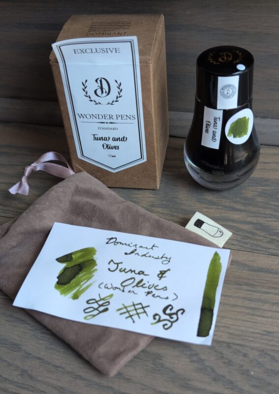
As promised, here’s the second Wonder Pens exclusive ink I picked up. This ink is inspired by the other cat.
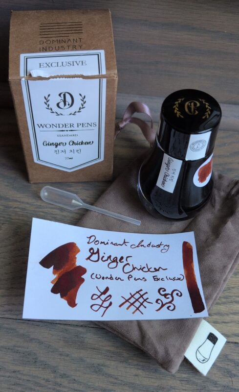
Dominant Industry Ginger Chicken, a Wonder Pens exclusive ink inspired by their orange cat. It’s a deep orange/brown colour with nice shading. I’ve pictured the swatch with the packaging: the bottle with a nice wider round base, suede-like bag, pipette and cardboard box.
It’s a nice dark orange-leaning brown, fairly dark in my dip pen but you can definitely see the shading. It was nice for painting and might get used for some tree branches in art one of these days. I did try my hand at replicating the characters on the label but I don’t know how well I did.
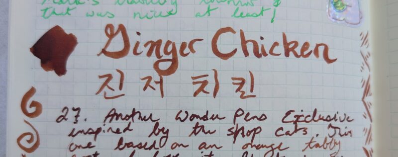
Writing and painting using Ginger Chicken ink in my notebook. It comes out as a deep orange-brown, lighter and more orange in the letting done with a paint brush.
I don’t really have any similar inks, but here’s the closest two I could find in my collection. Orange Indien is considerably more orange and bright, Antler is a more dusty pink
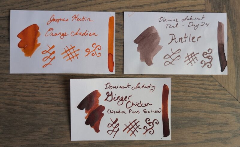
A set of three ink swatches: Jaques Herbin Orange Indien (bright orange), Diamine Antler (dusty pink-leaning brown) and Dominant Industry Ginger Chicken (deep orange-brown with shading)
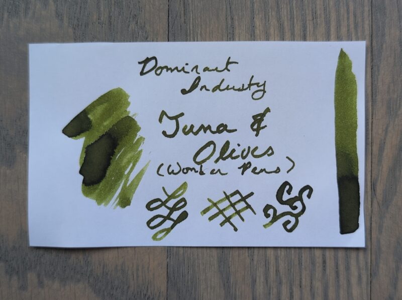
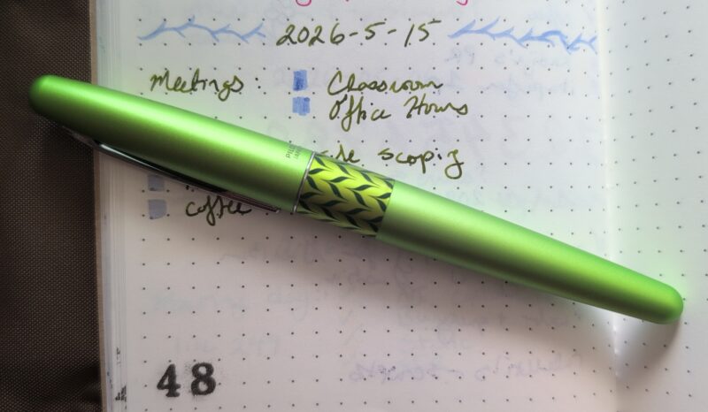
I really like this one! It’s a colour I use moderately frequently in art because there’s lots of trees and woody shrubs with a orange/red/brown thing going on, but it’s not at all like any of my existing inks. It’s darker than I tend to pick but I don’t think that’ll keep it out of rotation because it’s going to match so well with a lot of other colours I enjoy using. I think I’ll plan to put it in a pen at the end of the week and use it alongside Tuna and Olives in next month’s journal palette, maybe with a blue to round out the set or maybe just using my vintage desk pen since it currently has a blue-black cartridge in it. I don’t usually swatch cartridges (since mostly I get black ones free with purchase) but I should probably swatch that one so I can compare it when building palettes.
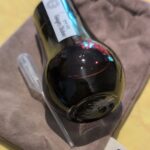
Ginger Chicken ink bottle on its side so you can see the light shining through the edge of it and showcasing the dark orange ink.