Swatch Wednesday: Diamine Red Dragon

  • This is the second ink out of a set of three I bought to celebrate finishing a longer piece of fiction writing,  This is the colour of the three that I really wanted.  I love red inks, probably a bit of a holdover when I did more editing and marking by hand.  When I was relatively new to the PhD one of my collaborators used to hand papers back with practically every other word crossed out and you’d think that would make me more sensitive to seeing red ink but he was so darned good at it that as a former editor myself I just had to stand there in awe of how absurdly good he was at condensing text so we could fit in more science to a 7 page limit. So it’s definitely more fond memory than grad school trauma!


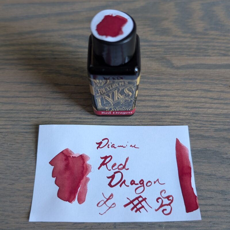
Diamine Red Dragon fountain pen ink bottle and swatch.

Diamine Red Dragon fountain pen ink bottle and swatch.

Similar to Blush (not pictured but basically a shade lighter), I felt like Red Dragon reminded me of blood while I was dong the larger swatches because it has a tendency to look a bit brown at the edge until it dries.  I don’t really notice the effect as much when writing with the dip pen, though.

A lot of the red inks that people recommend on top 10 ink lists are darker.  Colours that are lovely, but they wouldn’t stand out against black text the way I want a red to work because of the editing connection.  So I’ve been slowly collecting brighter red inks.  Perhaps unsurprisingly, the ones closest to this one are other Diamine ones.

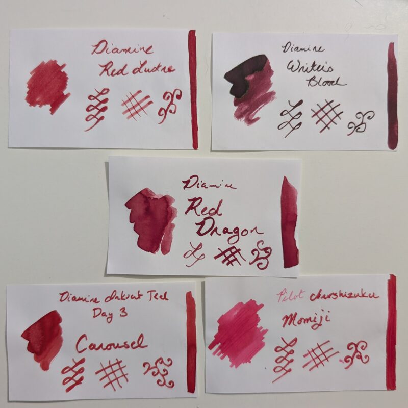
A set of fountain pen ink swatches photographed together for comparison. On the top row is Diamine Red Lustre and Diamine Writer's blood. In the centre is Diamine Red Dragon. At the bottom is Diamine Carousel and Pilot Iroshizuku Momiji.

A set of fountain pen ink swatches photographed together for comparison. On the top row is Diamine Red Lustre and Diamine Writer’s blood. In the centre is Diamine Red Dragon. At the bottom is Diamine Carousel and Pilot Iroshizuku Momiji.


  • Red Lustre has shimmer and has given me no end of headaches in pens so I’ll be glad when the sample is done because I think I’m down to only being able to use it in my Pelikan since it clogged in every other pen I tried to use.  Red dragon looks pretty similar to Red Lustre but without the shimmer, and it may actually the same base?
  • Writer’s blood is beautiful but it’s just not an editing red. That is, it’s too dark to stand out enough against black printed text. Which makes it lovely for the way I actually use it but it doesn’t scratch the red ink itch right for me.
  • Carousel from inkvent has a shiny almost lacquered vibe that I love, but it’s a pigment ink so I’m a little more reluctant to use it in all of my regular writers. It may wind up in my red Preppy when I run out of what’s in the cartridge, probably 3 years from now at my current rate. I didn’t bother to swatch the Preppy cartridge but it’s brighter.
  • Momiji is just outright more pink and I love it but I don’t even really think of it as a red because it’s so pink.


Red Dragon is a nice no-nonsense red that works consistently and while it’s still maybe is still a touch darker than the perfect editing red in my mind, it should be lovely for journal writing which is how I’m actually going to use it.  And generally speaking Diamine inks are on the inexpensive side of things: I paid less than CAD $10 for 30ml before taxes.  Will this be the last red ink I ever buy?  Probably not.  I still think it would be fun to have one that was a touch brighter or one that had a bit more shading.  But I like it a lot and since the idea was to treat myself for a writing accomplishment, I’m happy to have something that gives me more of an “editing red” vibe than a “goth vampire writing” vibe (sorry Writer’s Blood).  Will I ever go back to editing on paper?  Likely not.  But apparently I’m never going to stop loving red ink.

Swatch Wednesday: Diamine Cool Green

Picked this up as part of a set of 3 inks.  I actually wanted the red one, but the vendor had a bundle that made it worth getting 3, and since I was treating myself as a congratulations for finishing up a piece of writing I’d been working on for months, I was willing to splurge a bit extra and get them all.


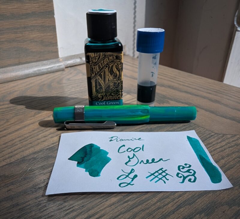
Diamine Cool Green fountain pen ink with swatch, 2ml in a vial that I spilled on the table, and Kaweco Sport pen in "Marble Ocean"

Diamine Cool Green fountain pen ink with swatch, 2ml in a vial that I spilled on the table, and Kaweco Sport pen in “Marble Ocean”


I used this ink immediately after swatching it because I, uh, knocked over the full bottle on my table.  You can see the 2ml I rescued in the sample vial, and there’s a bit more in the pen since I was hesitant to put potentially messy or contaminated ink back in the original bottle.  (It spilled directly over a swatch of Diamine Red Dragon.  Though what’s in the pen doens’t seem to be slightly red or anything so clearly it wasn’t as big a deal as I thought it could be in the moment.)


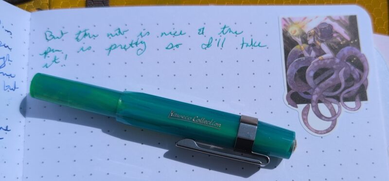
I’m pretty pleased by how well it matches the pen, actually:


Diamine Cool Green wirting sample in my journal with Kaweco Sport pen, fine nib, "marble ocean" colour. Also a cool sticker.

Diamine Cool Green wirting sample in my journal with Kaweco Sport pen, fine nib, “marble ocean” colour. Also a cool sticker.


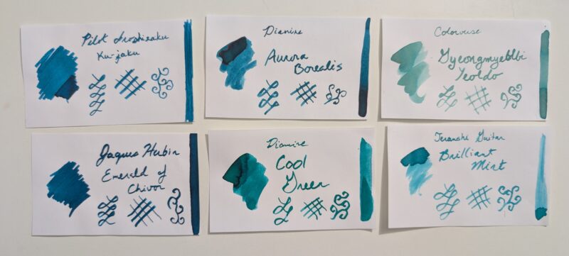
Compared to the my current collection of teal-ish inks, it leans a bit more green.

A set of ink swatches to compare with Diamine Cool Green. Top three, left to right: Pilot Iroshizuku ku-jaku, Diamine Aurora Borealis, Colorverse Gyeongmyeble Yealdo. Bottom row: Jaques Herbin Emerald of Chivor, Diamine Cool Green, Teranshi Guitar Brilliant Mint.

A set of ink swatches to compare with Diamine Cool Green. Top three, left to right: Pilot Iroshizuku ku-jaku, Diamine Aurora Borealis, Colorverse Gyeongmyeble Yealdo. Bottom row: Jaques Herbin Emerald of Chivor, Diamine Cool Green, Teranshi Guitar Brilliant Mint.


In colour tone, I think it’s closest to Teranshi Guitar Brilliant Mint, but it’s much darker and a bit greener.  It’s also pretty similar to Aurora Borealis but again, more green.

I probably wouldn’t have bought this ink separately since I own full bottles of both Brilliant Mint and Aurora Borealis (the rest are unfinished samples) but it’s a really lovely colour and I’m not really sad to have it because I use a lot of greens to match stickers, and my love of plant stickers means there’s a lot of opportunities to use a subtly different green.  Plus it looks nice and behaves well in the Kaweco Sport and I specifically picked up that pen to be a work pen (that’s why the fine nib) so I’m excited to have a kind of matchy ink to go with it.  Though I kind of want one that’s more green/yellow and I definitely don’t have that in my collection!  Anyone found the perfect match for this pen yet?


Creative goals 2026 mid-year checkin

Time for a mid-year check in on how my Creative Goals 2026 are progressing! I’m a bit later than usual because I was busy doing some other creative projects at exactly the 6 month exact-middle-of-the-year point, which honestly feels like a good sign.


1. Set up my new creative space

This has been such a joy!  My new office is still messy and filled with boxes that I haven’t quite figured out how to unpack, but it reached functional early on and has been going through a lot of refinement.

Some highlights:

  • I’ve co-opted the glider chair we bought when I was pregnant and I used for late-night nursing when my kid was little.  It’s now my reading and knitting and writing space and I love it.
  • I put curtains on the window so I don’t have to use the finicky blinds and it’s made such a difference.  They still need hemming but I at least know where my sewing machine is even if I haven’t got it set up so that’s something.
  • I rearranged my vintage yellow table and crummy apartment ikea desk so they function like an L-shaped desk and I’ve got enough space for painting during long corporate rah rah business quarterlies.  Or just painting because I feel like it.  It’s great.  I probably need to upgrade the lousy ikea desk but this works while I figure out exactly what would suit me best.
  • I got a pegboard to put in the tiny space behind the door when it’s open, and the little shelves on those have been great for putting up art and organizing stuff that I’m more likely to use if I can see it.  After I took the picture below I put up two more above and below so it’s a full wall of art and supplies.
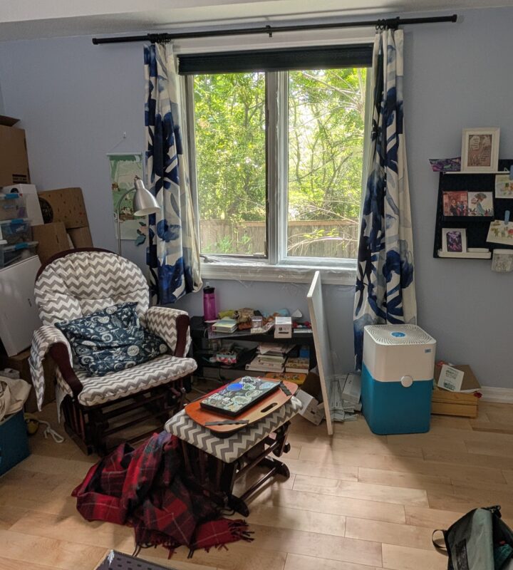
My reading/writing area in my office by the window, showing lots of mess but also the new curtains, the comfy glider chair, and the pegboard art setup on the wall.

My reading/writing area in my office by the window, showing lots of mess but also the new curtains, the comfy glider chair, and the pegboard art setup on the wall.


Some lowlights:

  • The office is noisy when the AC is going strong and too cold in the winter.  It’s got 2 exterior walls and one that backs onto the garage, and I suspect the garage one in particular doesn’t have enough insulation (it was noticeably colder than the two exterior walls), but it could be all three causing varying amounts of cold.  We’ve hacked things by plastic coating the window which helped but I also had blankets and even a small electric heater in here for when it got too cold.
  • I still own too much yarn, so not all of it fits on the shelves.  Having this visible and in my space is really reducing the amount of shopping I want to do, but I’m going to have to make some decisions about how to handle the rest of the shelving because I don’t love having 13 giant plastic bins plus a pile of smaller ones in here that i have to rearrange every time I want something in one of them.
  • I don’t have a setup for my spinning wheel, which is a bit of a shame and it’s part of why I didn’t do tour de fleece this year: I forgot but could have joined late if setting up hadn’t felt like a hassle. I’ve got a new espinner coming and it should fit nicely on the painting table or the table by my glider, so I think that’s going to be the plan for spinning for the next 6 months anyhow while I get to really know the new gear.

Despite those annoyances, I’m really happy with how things are taking shape.  I’ve unpacked all the boxes I found that seemed to belong here and rearranged stuff into various plastic bins for now while I decide what stays and what goes.  I spend a lot of time in my office writing and just enjoying my space on top of the times I need to be in here for work or to play our regular guild wars 2 night.
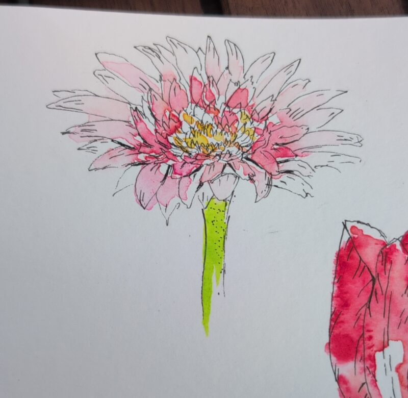
Dahlia watercolour painting (from a book exercise).

Dahlia watercolour painting (from a book exercise).

And on top of all that, kid and I have co-opted the last upstairs bedroom to be a craft room!

  • Nice big table right under the window for painting and drawing, with two chairs for us to sit.
  • Single bed for sitting on and so it can be used as an emergency guest bedroom or “Everyone has allergies and is snoring really loud” option.
  • My sewing machine desk is up here, though I haven’t really set it up yet.
  • I’m slowly migrating the craft supplies into the closet.
  • We replaced the light with one that doesn’t make a horrible high pitched noise that only my kid can hear.  (most of this house has ancient halogens and some of them are bad enough that I can hear them but this particular one was out of my hearing range)

We use this to paint or draw pretty regularly, sometimes because I’m doing daily drawings and just invite my kid to join me, but often he’ll instigate drawing time too.  We got some really cute how to draw chibi dogs and birds books plus I’ve got a rotating set of painting books out of the library, so there’s always inspiration or lessons to try.  I think J had some vision of our craft space being in the basement, but honestly the lighting is so nice in this room that I don’t think we’ll be moving even when we finally get the basement into a usable state (it’s currently a disaster of half-unpacked boxes, but thankfully not an outright disaster since we were spared the flooding that hit a lot of our neighbours).


2. Crafting for my new climate

Made a sweater for me, a fluffy scarf for my kid, and I’m still slowly working on that double-knit dr who scarf for J.  Plus I’m always always making more socks as bus/work/out-and-about knitting.  I kind of want to start another sweater but I think the scarf will never get done if I do so that’s probably all the projects for this year unless my kid wants something.
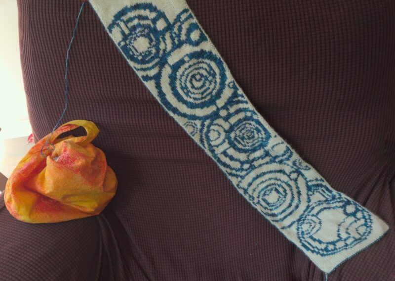
 

Time of the Doctor double knit scarf, about half-finished.

Time of the Doctor double knit scarf, about half-finished.

3. Painting with Fountain Pen Ink

I have done *so* much painting.  Relatively little of it actually included fountain pen ink, but the skills I’m building will transfer so I’m not too concerned that I’ve abandoned this goal.  I had the idea that I’d paint with the leftovers from my pens every month, but it turns out that because I choose fairly contrast-heavy colours they don’t blend well and I did’t like the way they looked when I tried them in a single piece at the end of the month in one of those ink colouring books.  Trying to plan out colours and spread them across a bunch of pages and hope I eventually used inks that went well with them didn’t seem like fun to me, so I’m going to regroup and try something else.  Here’s today’s effort, using some “leftover” ink (Teranishi Guitar Brilliant Mint, I think?):
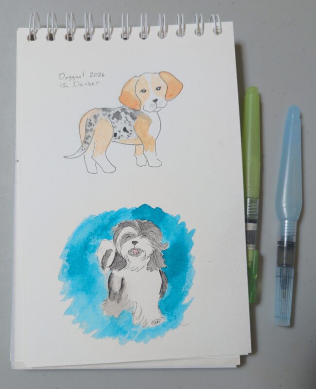
A notebook with two dogs painted in watercolour.  The top one is labeled "Doggust 2026 Dunker" and features a beagle-like dog with a striking grey dappled pattern on middle and tail that contrasts with the tan and white on the rest of the dog.  The one below that is not labelled but features a white and black Tibetan Terrier with long sweeping hair, and the area around the dog is coloured in a bright blue-teal using the Brilliant Mint fountain pen ink.

A notebook with two dogs painted in watercolour. The top one is labeled “Doggust 2026 Dunker” and features a beagle-like dog with a striking grey dappled pattern on middle and tail that contrasts with the tan and white on the rest of the dog. The one below that is not labelled but features a white and black Tibetan Terrier with long sweeping hair, and the area around the dog is coloured in a bright blue-teal using the Brilliant Mint fountain pen ink.

The fountain pen ink definitely beheaves differently than the watercolours (doesn’t quite absorb the same way on the paper) but I think I might be able to have some fun making my doggust stuff more colourful and maybe even sparkly while I make use of some little leftovers in sample vials and inks that I didn’t love in pens.

Other than that, I’m really enjoying painting in general and I’m excited to keep doing that!
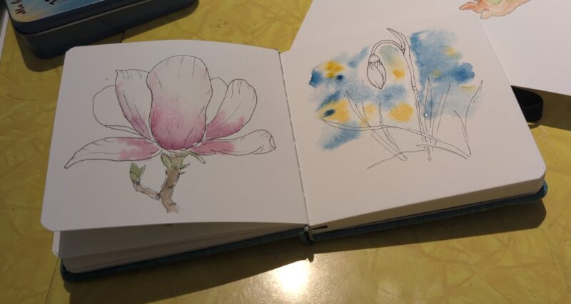
A couple of flower painting exercises on my beloved vintage yellow table. They depict a magnolia and snowdrop.

A couple of flower painting exercises on my beloved vintage yellow table. They depict a magnolia and snowdrop.

4. Write for joy

My biggest writing project in the first half of the year was for a fandom event and I have never ever gotten so many comments on a work.  It was a really playful story and as a result my readers were having fun, I was having fun, it was absolutely the bringer of joy.

Beyond that, I’ve been trying out some weekly prompts, joining events, did a fanfic gift exchange, and I’ve just been having such a good time with fanfic and writing.   I’m constantly entertained that my new fan writer community is not entirely dissimilar to my open source communities — I supposed it’s not surprising since they’re both the sort of people who put things for free into the world, even if the skills they’re sharing are different.  And as I’ve mentioned before, it’s been really motivating to have “sprinting buddies” so there’s folk to write with even if we barely interact other than cheering each other on and gossiping in between timed writing sessions. Having a little community continues to be a source of joy and motivation.


I’m also starting to add a bit writing about life to my monthly posts here.  Nothing fancy and carefully thought out, but it’s nice as a warm up.  I’ve got some ideas for more technical blog posts I’d like to write but haven’t made the time yet because writing fiction is more fun.  That said, I should have some writing opportunities at work and I’m hoping to take advantage of that as I find them!


Overall, I think I’m doing well on goals, but I am going to have to push myself a bit to try more fountain pen ink art experimentation, so hopefully that’ll come up more in the last chunk of the year.  And if not, my painting practice has improved my life regardless of what supplies I’m using!
A Traveler’s Notebook for travelling? Groundbreaking.

I wanted to jot down some techo kaigi style thoughts on what worked out of the notebook setup I took on my last trip.  I don’t travel nearly as much as I used to and my needs have changed a lot from when I travelled on my own to academic conferences and would sometimes have a notebook and sit and write or draw in a restaurant by myself.  Restaurants and cafess are less relaxing when your kid wolfs down his food and then is very eager to leave, alas! I now carry two tiny notebooks with me so we can both draw at the same time while we’re waiting for our meals, but he’s less interested afterwards usually.

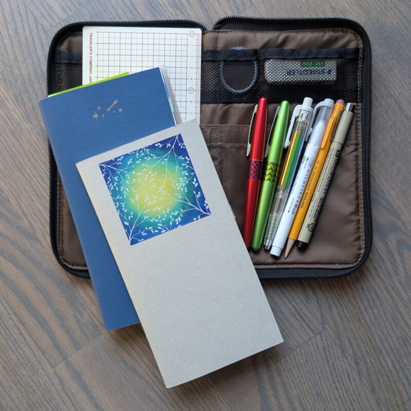
So group one of supplies is almost identical to my usual work planner setup, only I subbed in a personal notebook for my work todo list notebook:

Traveler's notebook (dot grid, weekly planner, and blank), a grid pencil board, two fountain pens, a grey double-ended brush pen, a multi-colour pencil, a regular mechanical pencil, a black fineliner, an eraser, and a tiny roll of thin washi tape, all sitting on top of a large flat pencil case.

Traveler’s notebook (dot grid, weekly planner, and blank), a grid pencil board, two fountain pens, a grey double-ended brush pen, a multi-colour pencil, a regular mechanical pencil, a black fineliner, an eraser, and a tiny roll of thin washi tape, all sitting on top of a large flat pencil case.

You can’t see it but there’s also a zipper pouch with stickers in it attached to the back of the planner.


The notebooks:

  • Dot Grid notebook (the one with Leafy blue/yellow sticker).
    • I use this for journal entries and writing notes, although this particular one also has a bunch of drawings from before I started carrying a dedicated blank notebook.
  • Weekly planner (blue and I put foil transfer stars on it)
    • This is my usual weekly planner that I carry to work when I’m not on vacation.  Its main use is to track headache/migraine related health stuff.  I used to do this in a monthly planner that lives with my journal at home, but I’m experimenting with doing a slightly finer grained morning/afternoon/evening tracking and it’s easier to do that if I have more space per day and if I have the planner with me at work.  I also use it for jotting down todo items for when I get home, occasional other notes from things that amused me at work that I might journal about later, the usual planner stuff, and some work-related tracking.
  • Blank sketchbook (not very visible in the photo but it’s hooked together behind the weekly planner using a Traveler’s Notebook zipper pouch such that one notebook sits “inside” using the plastic like a cover, and the other is “outside” with the cover slipped into one side of the plastic non-zippered pocket side)
    • This one’s just for drawing.  I’ve been doing some daily drawing challenges so that’s most of what’s in here.  This one’s not actually from Traveler’s Company but rather some Canadian company who have cheaper refills.  I don’t like the covers as much but the paper inside is decent for fountain pens and drawing, though not quite enough for more than a teensy bit of watercolour.  Since it seems like a lot of the stationary stores here struggle to keep the actual TN inserts in stock, I’m glad to have another option.


The writing utensils (from left to right)

  • Two Pilot Metropolitan fountain pens – for writing.  At work that’s mostly todo lists and notes about things I want to discuss with someone.  For travel that’s mostly actual journal entries.  I’ve tried a few pens in this setup and the Metropolitian is my favourite because of the colours, reliable nibs, and smaller capacity so I don’t have to spend 6 months with one ink colour (I write a lot less here than in my regular journal).
  • Pentel Multi-8 pencil crayon – For colouring my sketches and making a break to show when a new journal/work entry starts.  It’s a bit finicky to use so my original plan to have it as a fun option in my purse for my kid to use didn’t work out, but I like having a bit of colour on hand that’s easier to use than the very tiny 1″ long teensy pencil crayons that have become my purse staple.
  • Grey “mildliner” brush pen – mostly used for to-do list checkboxes, but also sometimes drawings
  • Normal mechanical pencil – used for drawing and the planner tracking
  • Sakura micron fineliner – inking my drawings

Also the pencil case is a “large flat” one from Lihit Labs that conveniently fits TN notebooks.  I still don’t have a regular TN cover because I prefer things to be zippered so they don’t get damaged in my bag, and this fits my needs.

This worked well — I didn’t feel bad about leaving my usual larger journalling setup at home!


And then because I’ve gotten kind of obsessive about painting, I threw in a little painting set:

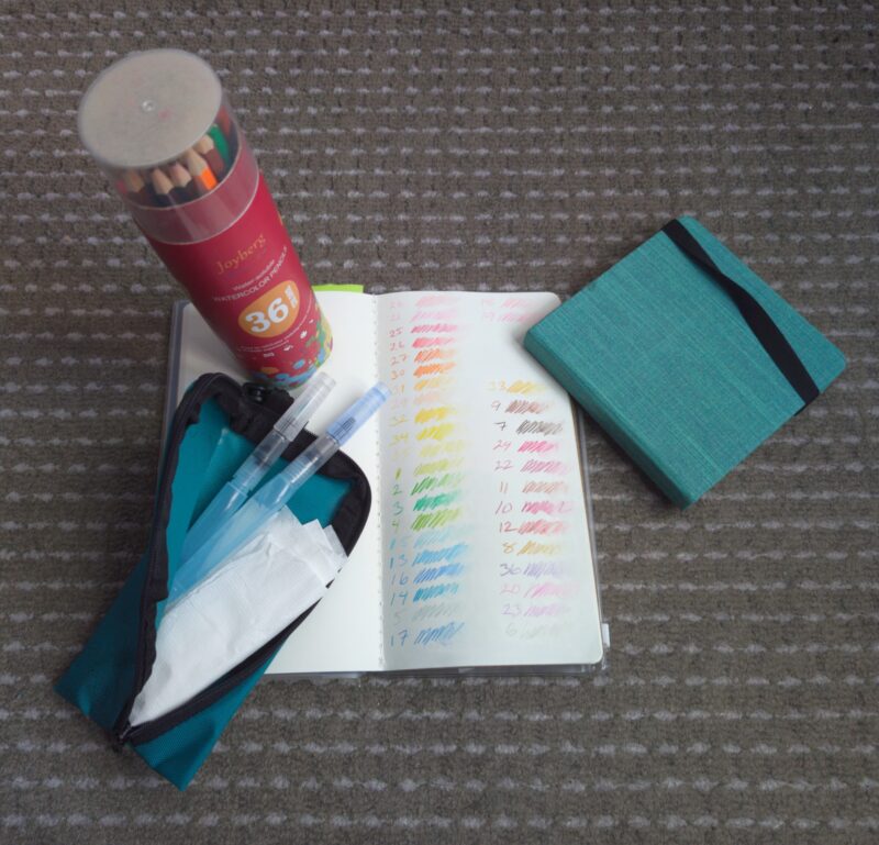
Painting Set: A set of cheap watercolour pencils, a pouch with two water brushes and a pencil sharpener, the open blank traveler's notebook showing all the colours, and a small square watercolour notebook.

Painting Set: A set of cheap watercolour pencils, a pouch with two water brushes and a pencil sharpener, the open blank traveler’s notebook showing all the colours, and a small square watercolour notebook.

That’s the blank TN style notebook in all its glory showing the swatch page for my watercolour pencils.  This is the same one that’s attached to my planner, not a separate one.  The pencils were a kid entertainment buy for a previous trip that didn’t work out super well because neither me nor kid had much time to use them and also my in-laws had insufficient horizontal surfaces available for us to use for art that would take a while to dry and thus would render a table useless for anything else for a bit after.  (I’m so glad kiddo and I have a craft room with a table for our paintings in this new house!  It’s been really great!)

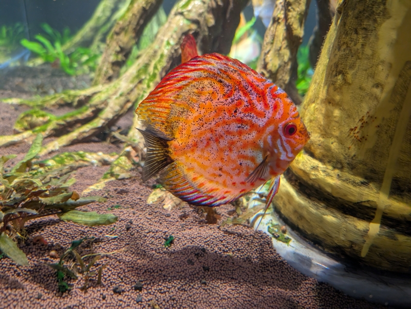
The little green notebook was an el-cheapo online buy for me to try some cotton paper before paying art store prices.  It didn’t explain on the listing, but I suspect it was cheap because the cover has a bit of glue on it that wouldn’t have passed quality control.  But the paper inside is nice!  I already showed some of my other travel paintings in my august post, but here’s one more pair with a fish at the aquarium.  Reference photo:

A bright orange fish with a complicated line pattern on it, seen at the Toronto Aquarium.

A bright orange fish with a complicated line pattern on it, seen at the Toronto Aquarium.

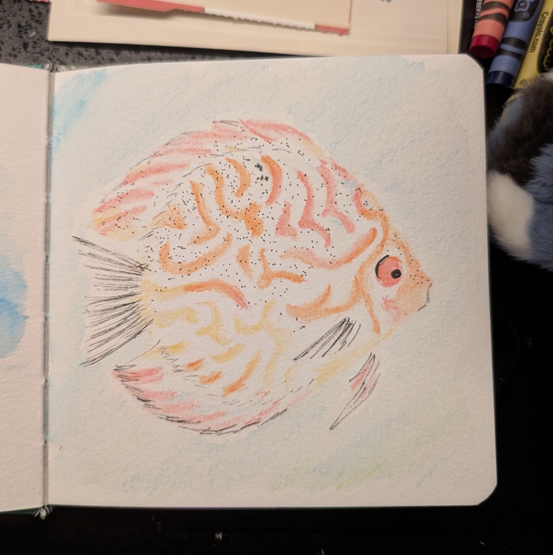
Painting:

A painting of the same bright orange fish with interesting markings.

A painting of the same bright orange fish with interesting markings.


It’s not super obvious in this painting (go look at the one with the sea turtle), but I found I could get different textures out of the watercolour pencils if sometimes I just drew, sometimes I drew and then wetted the drawing, and sometimes I basically coloured onto the paintbrush and used it more like regular paint.  Fun!   You can see the draw-on-the-brush technique where I overpainted the eye because I didn’t like the way it looked drawn-and-wetted.


I’m pretty happy with the Traveler’s Notebook setup for work so it’s not a surprise that it worked well for travel: the whole thing fits into my usual travel purse when I wanted it nearby on the train, though it mostly stayed in the hotel when we were out all day being tourists and I was trying to carry as little as possible.  The painting set I was less sure about, but we were so sore after walking all day that it was really nice to sit and paint while my kid vegged out to videos and my husband got stuck doing work calls.  And I’m starting to get fond of those watercolour pencils for my daily sketches now that I’ve gotten better at using them.  I think I still prefer actual paint when I have time to mix and space for a palette and water and stuff, but for “doing art on a hotel bed because there’s only one table in this room and J is using it” it was absolutely great to have something with way less potential for spills and mess.


Aquatic August 2026: Ink & Life

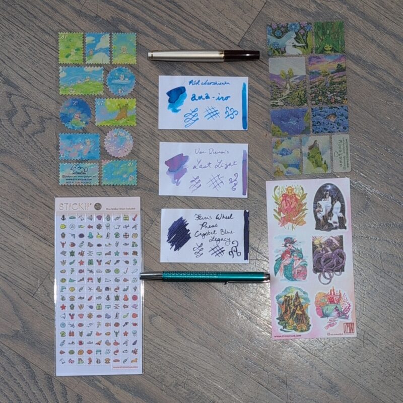
I really wanted to have a sea themed set of stickers for August but apparently I don’t really own a lot of sea creature related sticker sheets, so I made do with what I had on hand.


August 2026 inks and stickers and pens

Stickers

All from stickii this month, though mostly older stuff.

  • Kitty dreams stamps by Jazlynn.art (I think from the 2024 stickii adevent?)
  • Cryptid ladies by so.meudok (2025 stickii advent?)
  • leafy ladies stamps by ameleafy (also 2025 stickii advent?)
  • ocean icons (no artist name given but also from stickii, a past pack but I bought it separately)

Once again, I wish every stickii artist would turn their logo/name into a sticker so I can put these in my journals easily and find their names later when I want to buy more art from them.  Please!

Pens & Inks

After taking this photo I swapped out the purple ink for a green/teal one.  I’d been thinking about doing so anyhow but then I knocked over a completely full new bottle of ink and grabbed a syringe and threw some of what spilled into my newest pen after I was done cleanup.  Thankfully mostly the ink formed a small puddle and didn’t ruin too much on my office table, and I was able to suck a lot of the ink up into a vial for later use.

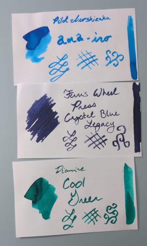
August 2026 Inks: Pilot iroshizuku ama-iro (bright blue), Ferris Wheel Press Crystal Blue Legacy (dark purple/blue), Diamine Cool Green (green/teal)

August 2026 Inks: Pilot iroshizuku ama-iro (bright blue), Ferris Wheel Press Crystal Blue Legacy (dark purple/blue), Diamine Cool Green (green/teal)

  • Pilot E95S <medium> – Pilot Iroshizuku ama-iro (a hold-over from last month)
  • Pelikan Pura <broad> – Ferris Wheel Press Crystal Blue Legacy.
    • This was from an ink sampler I bought ages ago.  I’m pretty unimpressed with Ferris Wheel Press since they’re doing some HP related stuff at the moment (among other red flags), and also I don’t love this ink.  It has some pretty blue sparkles that hardly ever show up and require a lot of agitation, and the rest of the time it’s just kind of a boring dark ink.  I was hoping the sparkles would look better in the Pura since it’s a wetter feed, but this ink is just meh.
  • Kaweco Sport Marble Ocean <fine> – Diamine Cool Green
    • This is the full bottle of ink I knocked over.  Bought a little combo pack of Diamine inks as a reward for finishing a writing project.  I was more excited about the other two colours but this is nice.  A little similar to the Teranishi Brilliant Mint but much darker. Goes well with the new pen!
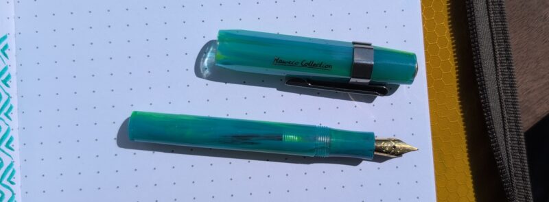
Kaweco Sport Marble Ocean fountain pen. The pen is shown on white paper in bright sunlight so you can see that areas are translucent, enough so that you can see the ink inside the pen and the shadow is clear-ish in spots.

Kaweco Sport Marble Ocean fountain pen. The pen is shown on white paper in bright sunlight so you can see that areas are translucent, enough so that you can see the ink inside the pen and the shadow is clear-ish in spots.

I probably should have gotten a gold clip for the new Kaweco, but the store I bought it from didn’t have any in stock so maybe some future order.  This one is eventually destined to be a work pen which is why it’s a fine nib, something I mostly avoid, but the kaweco nibs have been consistently smooth enough that I didn’t think it was a high risk to try it.  It’s a pleasant little pen and I’m really stoked about the translucence since I’m so bad about checking ink levels in my opaque pens.

Life

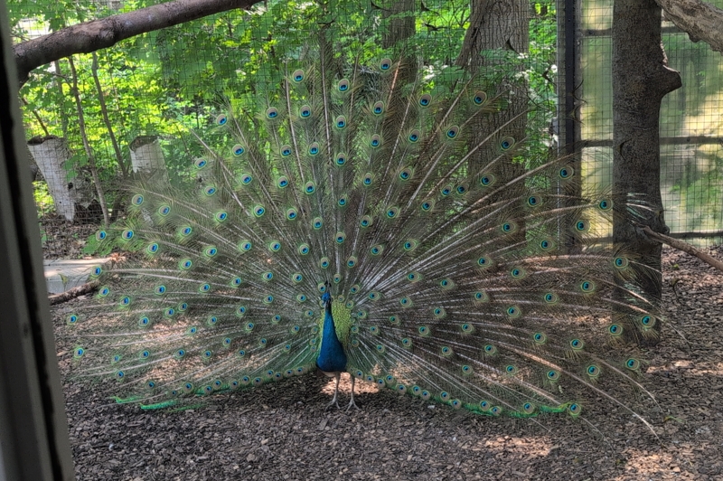
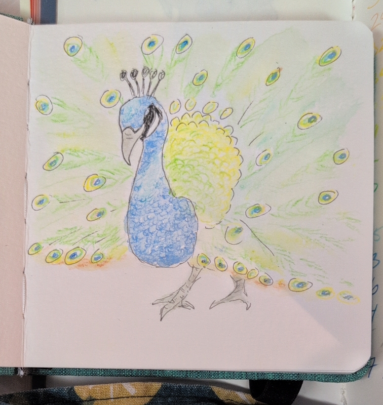
One of kiddo’s big requests for this summer was that we go back to the Toronto Zoo, so we did that in the end of July.  It was very huge and very hot but a decent number of animals were happy to be on display including this lovely peacock who we nearly missed because J searched the app for “peacock” not realizing they’re listed as “peafowl” — thankfully I remembered where they were from last time.  Kid was initially disappointed that they were just hanging with their tails folded but we waited a while and eventually one of them decided to show off.    I brought some watercolour pencils and water brushes and painted in the hotel room, which was nice to do after a long day of walking.  I’m not great with the pencils but it was fun to experiment a bit!

Peacock at the Toronto Zoo. He's displaying his full tail.

Peacock at the Toronto Zoo. He’s displaying his full tail.

Small watercolour painting of a peacock at the Toronto Zoo.

Small watercolour painting of a peacock at the Toronto Zoo.

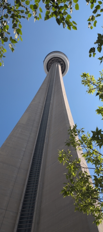
We also hit up the CN Tower, which was less educational than I remembered with more psychadelic art panels instead, but the views are still good.  I miss the signs about how many elephants could sit on the glass floor, though.

CN Tower viewed from below.

CN Tower viewed from below.

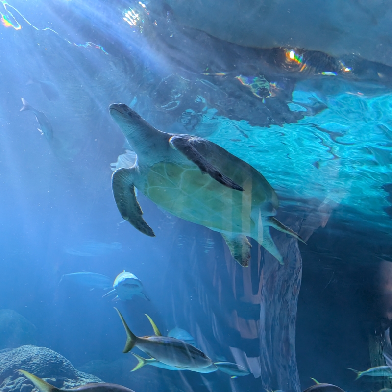
And the aquarium, which I’d never seen before.  It was ridiculously busy, loud, and did not have nearly enough seating for me and my poor sore leg, but the creatures were great.  I think I’d wear earplugs next time to try to keep the overstimulation down.

Sea turtle, fish and sharks in the Toronto aquarium.

Sea turtle, fish and sharks in the Toronto aquarium.

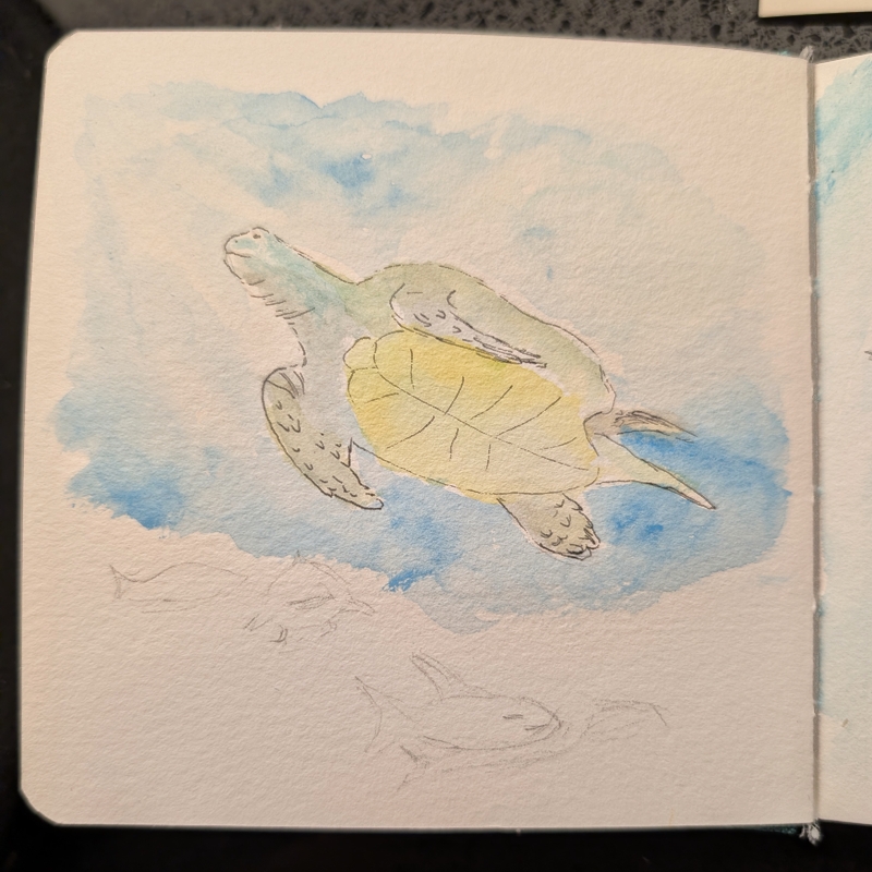
Hotel watercolour painting of the sea turtle in the Toronto aquarium.

Hotel watercolour painting of the sea turtle in the Toronto aquarium.


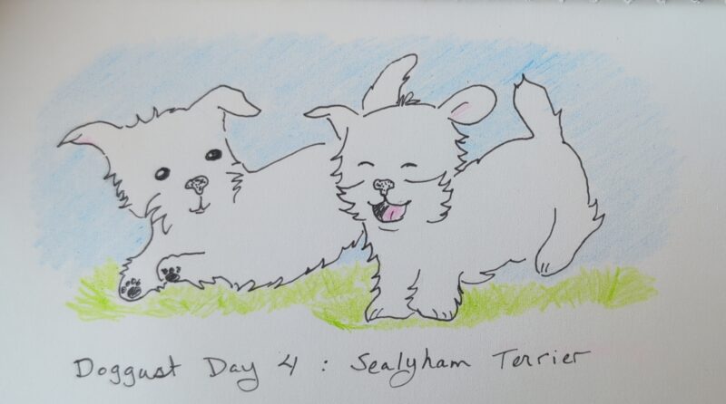
Not as many adventures planned in August, mostly it’s all about going to the pool and enjoying our newly fenced backyard.  Hatch and I are spending some time out there often in the morning in lieu of a walk down the street, and it seems to suit us both.  Also, I’m drawing some doggies for “doggust” again this year.

A pair of Sealyham Terrirers for Doggust Day 4. They're little white dogs drawn cartoon style, frolicking in the grass.

A pair of Sealyham Terrirers for Doggust Day 4. They’re little white dogs drawn cartoon style, frolicking in the grass.


As always, I wish I had more vacation time.  But I’m finding ways to fit art and writing into my life still!