Swatch Wednesday: Dominant Industry Ginger Chicken (Wonder Pens Exclusive)

As promised, here’s the second Wonder Pens exclusive ink I picked up.  This ink is inspired by the other cat.
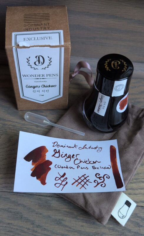
Dominant Industry Ginger Chicken, a Wonder Pens exclusive ink inspired by their orange cat. It's a deep orange/brown colour with nice shading. I've pictured the swatch with the packaging: the bottle with a nice wider round base, suede-like bag, pipette and cardboard box.

Dominant Industry Ginger Chicken, a Wonder Pens exclusive ink inspired by their orange cat. It’s a deep orange/brown colour with nice shading. I’ve pictured the swatch with the packaging: the bottle with a nice wider round base, suede-like bag, pipette and cardboard box.

It’s a nice dark orange-leaning brown, fairly dark in my dip pen but you can definitely see the shading.  It was nice for painting and might get used for some tree branches in art one of these days.  I did try my hand at replicating the characters on the label but I don’t know how well I did.
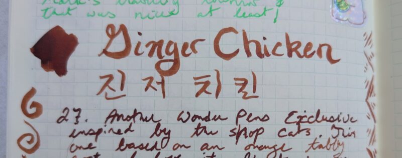
Writing and painting using Ginger Chicken ink in my notebook. It comes out as a deep orange-brown, lighter and more orange in the letting done with a paint brush.

Writing and painting using Ginger Chicken ink in my notebook. It comes out as a deep orange-brown, lighter and more orange in the letting done with a paint brush.

I don’t really have any similar inks, but here’s the closest two I could find in my collection.  Orange Indien is considerably more orange and bright, Antler is a more dusty pink
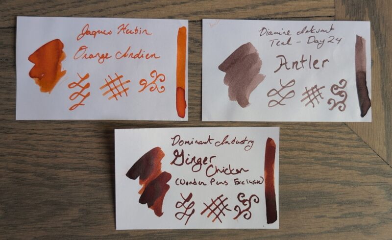
A set of three ink swatches: Jaques Herbin Orange Indien (bright orange), Diamine Antler (dusty pink-leaning brown) and Dominant Industry Ginger Chicken (deep orange-brown with shading)

A set of three ink swatches: Jaques Herbin Orange Indien (bright orange), Diamine Antler (dusty pink-leaning brown) and Dominant Industry Ginger Chicken (deep orange-brown with shading)

I really like this one! It’s a colour I use moderately frequently in art because there’s lots of trees and woody shrubs with a orange/red/brown thing going on, but it’s not at all like any of my existing inks.  It’s darker than I tend to pick but I don’t think that’ll keep it out of rotation because it’s going to match so well with a lot of other colours I enjoy using.   I think I’ll plan to put it in a pen at the end of the week and use it alongside Tuna and Olives in next month’s journal palette, maybe with a blue to round out the set or maybe just using my vintage desk pen since it currently has a blue-black cartridge in it.  I don’t usually swatch cartridges (since mostly I get black ones free with purchase) but I should probably swatch that one so I can compare it when building palettes.
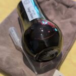
 

Ginger Chicken ink bottle on its side so you can see the light shining through the edge of it and showcasing the dark orange ink.
Ginger Chicken ink bottle on its side so you can see the light shining through the edge of it and showcasing the dark orange ink.
Swatch Wednesday: Dominant Industry Tuna and Olives (Wonder Pens)

I couldn’t resist getting this Wonder Pens exclusive ink inspired by cat eyes.   Isn’t that just the cutest ink concept?  And they did such a great job with the colour! I would have gotten both cat eye inks, but I thought the other one was probably too close to my recently purchased Brilliant Mint, so I regretfully skipped it.

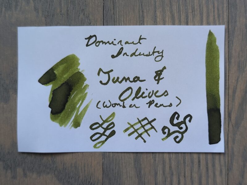
A swatch of Dominant Industry Tuna & Olives, an exclusive fountain pen ink for Wonder Pens. It's an olive green standard ink.

A swatch of Dominant Industry Tuna & Olives, an exclusive fountain pen ink for Wonder Pens. It’s an olive green standard ink.

Tuna and Olives is a nice olive green with a bit of shading.  In my dip pen it’s pretty dark, in the pilot metropolitan I use for work, it’s noticeably brighter, and it’s really pretty on the paintbrush too as well as being lighter again.

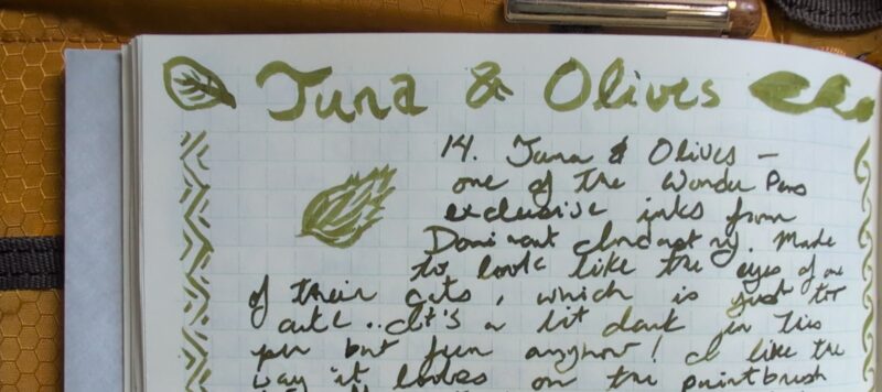
The top of a page of writing using the Tuna & Olives ink. The big lettering and doodles are done with a paintbrush and the rest is with the sailor fude dip pen I use for my swatches. The ink is consistently olive green, shading brighter into a more leafy green on the paintbrush. It shows some shading in the writing as well.

The top of a page of writing using the Tuna & Olives ink. The big lettering and doodles are done with a paintbrush and the rest is with the sailor fude dip pen I use for my swatches. The ink is consistently olive green, shading brighter into a more leafy green on the paintbrush. It shows some shading in the writing as well.

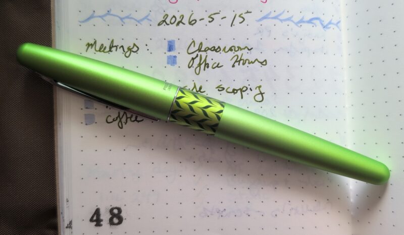
I really like the way it matches my new green pilot metropolitan.  Yes, two years later, I finally decided to buy a second one.  (I still want all the colours; I still don’t need all the colours.) I decided to get a medium nib for work, and I’m really happy with how it’s working out with both the pen and the ink.   I’ve found that I like having a clip on the pens in my work notebook, and I’m less excited about finicky sparkle inks because I often pull out the pen to make notes halfway through a meeting so if it blocks up when I can’t get up and rinse it easily I’m going to be miffed.  So a nice standard ink and a pretty pen is pretty ideal for this purpose.

Green Pilot Metropolitan Retro Pop on top of some unfinished todo list from May 15th in my work notebook.

Green Pilot Metropolitan Retro Pop on top of some unfinished todo list from May 15th in my work notebook.

This is my first ink from Dominant Industry.  They’ve got a cute bottle shape and comes in a cute little soft bag that presumably doubles as padding for shipping and also a way to keep your ink from getting exposed to light if you don’t like keeping the boxes around.  I like the little tag with their ink bottle on it.  It also came with a tiny pipette for filling pens, though I didn’t need it for the metropolitan or my dip pen.

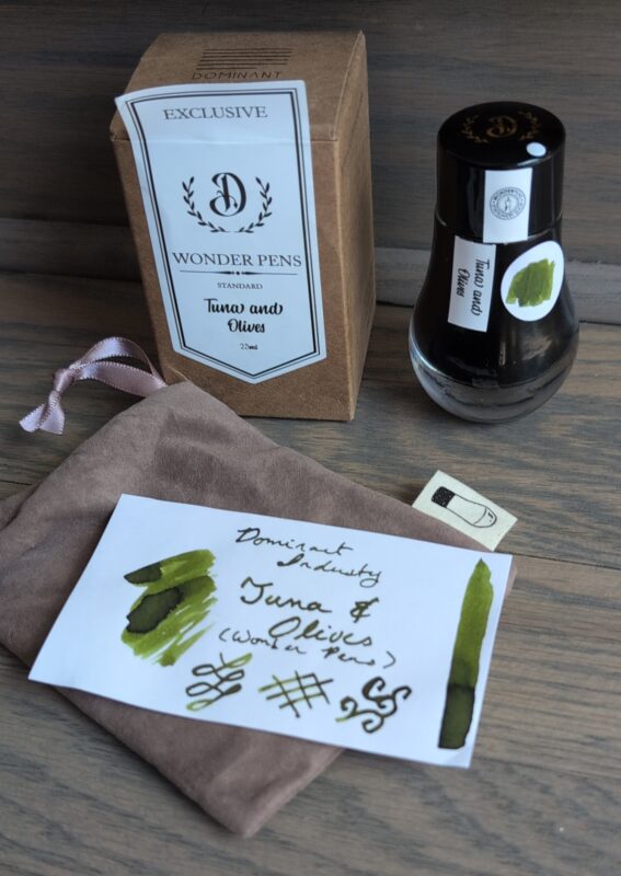
Dominant Industry Tuna and Olives Ink swatch and bottle with packaging. The bottle has a rounded base that makes it look like a water droplet, there's a bag with a picture of the bottle on the label, and a simple cardboard box. I've added a dot with an ink swatch to the side of the bottle, showcasing the olive green colour.

Dominant Industry Tuna and Olives Ink swatch and bottle with packaging. The bottle has a rounded base that makes it look like a water droplet, there’s a bag with a picture of the bottle on the label, and a simple cardboard box. I’ve added a dot with an ink swatch to the side of the bottle, showcasing the olive green colour.

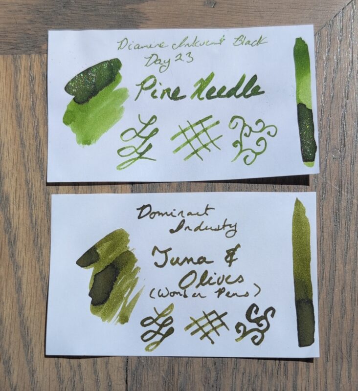
The closest ink I have it Diamine Pine Needle which is… really not very close.  They both have green and shading, but pine needle is a vibrant “new pine needle” kind of green and includes so much green shimmer that I can’t really use it in anything other than my Pelikan pens with extremely wet nibs.  Tuna and Olives is a duller olive green and I expect it’ll work in every pen I’ve got.

A comparison of two green fountain pen ink swatches: Diamine Pine Needle on top has green himmer and is a brighter new leaf green with shading, Dominant Industries Tuna & Olives is an olive ink with shading.

A comparison of two green fountain pen ink swatches: Diamine Pine Needle on top has green himmer and is a brighter new leaf green with shading, Dominant Industries Tuna & Olives is an olive ink with shading.

Normally this is the point where I say I’m excited to try this ink but that probably goes without saying since it’s already in a work pen!  I also picked up a second Wonder Pens exclusive colour while they had them in stock, so expect to see that swatched soon too!


March 2025 ink palette & journal supplies

I took these pictures back at the beginning of March and never posted them, so you get them on the last day instead!

A set of supplies for my journal in March 2025: three sets of dino themed stickers, 1 pencil, 2 thin washi tapes, one wooden mechanical pencil, 5 fountain pens with inks (described further in the post)
Image Description: A set of supplies for my journal in March 2025: three sets of dino themed stickers, 1 pencil, 2 thin washi tapes, one wooden mechanical pencil, 5 fountain pens with inks (described further in the post)

Stickers

  • The cat calendar sticker, as always, is from By Mossy Pine.
  • The dino stickers are all from an old stickii pack I grabbed during a sale called “Rawr!” or something similar.

March’s Fountain Pen/Ink Combos:

  • Kaweco sport <medium> filled with Diamine Twilight, a dark blue-black ink. This ink was a present!
  • Nahvalur Original+ <stub> filled with Diamine Aurora Borealis, a dark teal ink with a very tiny amount of red sheen. This ink was also a present!
  • TWSBI Eco <medium> filled with Diamine Noble Fir from the 2024 inkvent calendar, a bright green ink with shimmer. This one carried over from last month’s palette.
  • Pilot Metropolitan <CM> filled with Pilot Iroshizuku yama-budo, a dark fuschia ink with some green sheen. I’m using a refilled cartridge to see if I like it better than the included converter, and it *is* nice to be able to see how much ink is left, but it means I’m reluctant to change the ink (and potentially wear out the cartridge faster).
  • Pilot E95S <medium> filled with Pilot Iroshizuku ama-iro, a bright sky-blue ink.

Since this is the end of the month, I’ll say that all of these worked out pretty well, but I did have a bunch of hard starts on the Nahvalur pen, likely due to my inexperience using a vacuum pen (I’ve had this since the fall but haven’t always had it in rotation). I’d hoped to maybe use this as a travel pen eventually but I probably should have gotten a thinner nib on it for that to work better, I don’t know. It’s kind of a moot point as travel has become unappealing at the moment.

I’m also realizing that I *really* appreciate the converters when it comes to changing inks every month, and the piston fillers can be kind of a chore in comparison. I may need to rethink how often I change inks and plan my palettes differently so more colours carry over depending on which pen they’re in. I’ve slowed in my pen acquisitions now that I’ve got a range of nibs and such to try, but I did pick up a small box of cartridge-filled ones as an impulse buy at Powell’s so you’ll see at least one of those next month.

I haven’t finished this iroful journal yet, but I’ve decided to leave the rest of the pages for pen testing and ink swatches since I like the paper for that but don’t love it for writing journal entries or todo lists. The plan is to pull out a notebook with faster drying paper for April.