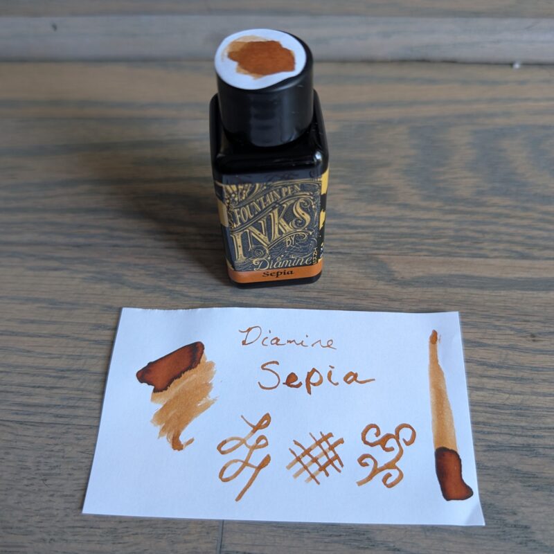
Swatch Wednesday: Diamine Sepia

Last of the set of three inks I bought to celebrate a writing accomplishment! This one is Diamine Sepia, and it looks more or less as I’d expect given the name.

Diamine Sepia fountain ink bottle and swatch. It's a sepia brown/orange coloured ink as one might expect from the name.

Diamine Sepia fountain ink bottle and swatch. It’s a sepia brown/orange coloured ink as one might expect from the name.


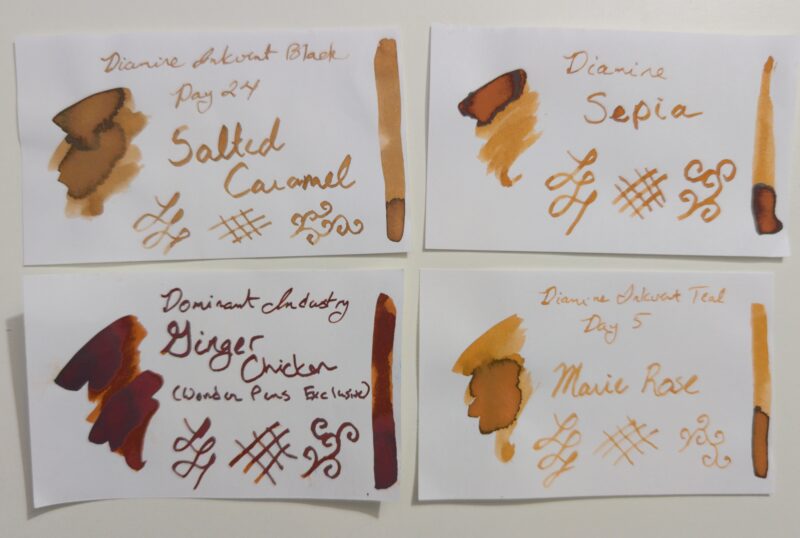
This one has a bit of shading in my swatch, which initially made me worry that it might be close to Ginger Chicken but it absolutely isn’t:

Four ink swatches: Diamine Salted Carmel (from inkvent 2024), Diamine Sepia, Dominant Industry Ginger Chicken, and Diamine Rose Marie (from inkvent 2025)

Four ink swatches: Diamine Salted Carmel (from inkvent 2024), Diamine Sepia, Dominant Industry Ginger Chicken, and Diamine Rose Marie (from inkvent 2025)


Salted Caramel is more brown and has shimmer.  Marie Rose is a bit brighter but very similar.  Ginger chicken is considerably more red and darker, so much so in the swatches that I wondered why I’d thought them similar until I compared writing samples done with regular fountain pens (my most recent swatches are done with a somewhat wet fude dip pen) and while they’re still clearly different they do look closer when run through a regular fountain pen feed.

If it hadn’t been in a 3-pack, I probably wouldn’t have gotten Sepia since I already have a bottle of Marie Rose.  But the inkvent bottles are tiny and I liked Marie Rose a lot more than I expected and Sepia fits well with some sticker sheets I have, so I’m not sad to have gotten it!


And just for fun, here’s my 3 pack of ink together:

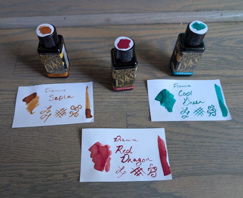
Three fountain pen inks from Diamine with swatches. From left to right the inks are named Sepia, Red Dragon, and Cool Green.

Three fountain pen inks from Diamine with swatches. From left to right the inks are named Sepia, Red Dragon, and Cool Green.

Swatch Wednesday: Diamine Red Dragon

  • This is the second ink out of a set of three I bought to celebrate finishing a longer piece of fiction writing,  This is the colour of the three that I really wanted.  I love red inks, probably a bit of a holdover when I did more editing and marking by hand.  When I was relatively new to the PhD one of my collaborators used to hand papers back with practically every other word crossed out and you’d think that would make me more sensitive to seeing red ink but he was so darned good at it that as a former editor myself I just had to stand there in awe of how absurdly good he was at condensing text so we could fit in more science to a 7 page limit. So it’s definitely more fond memory than grad school trauma!


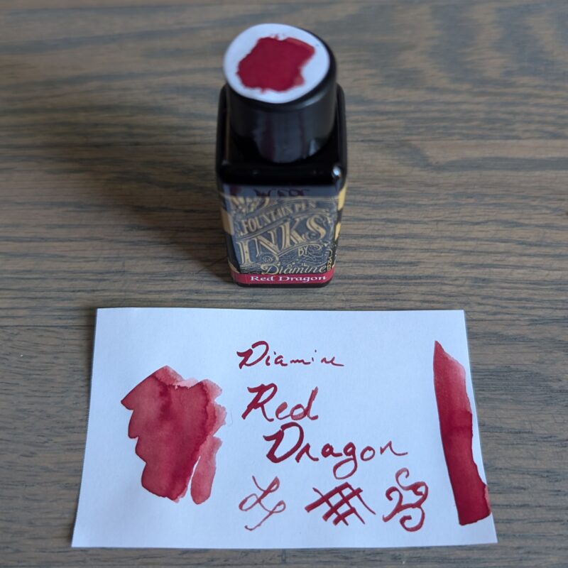
Diamine Red Dragon fountain pen ink bottle and swatch.

Diamine Red Dragon fountain pen ink bottle and swatch.

Similar to Blush (not pictured but basically a shade lighter), I felt like Red Dragon reminded me of blood while I was dong the larger swatches because it has a tendency to look a bit brown at the edge until it dries.  I don’t really notice the effect as much when writing with the dip pen, though.

A lot of the red inks that people recommend on top 10 ink lists are darker.  Colours that are lovely, but they wouldn’t stand out against black text the way I want a red to work because of the editing connection.  So I’ve been slowly collecting brighter red inks.  Perhaps unsurprisingly, the ones closest to this one are other Diamine ones.

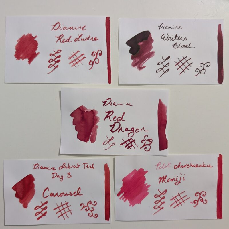
A set of fountain pen ink swatches photographed together for comparison. On the top row is Diamine Red Lustre and Diamine Writer's blood. In the centre is Diamine Red Dragon. At the bottom is Diamine Carousel and Pilot Iroshizuku Momiji.

A set of fountain pen ink swatches photographed together for comparison. On the top row is Diamine Red Lustre and Diamine Writer’s blood. In the centre is Diamine Red Dragon. At the bottom is Diamine Carousel and Pilot Iroshizuku Momiji.


  • Red Lustre has shimmer and has given me no end of headaches in pens so I’ll be glad when the sample is done because I think I’m down to only being able to use it in my Pelikan since it clogged in every other pen I tried to use.  Red dragon looks pretty similar to Red Lustre but without the shimmer, and it may actually the same base?
  • Writer’s blood is beautiful but it’s just not an editing red. That is, it’s too dark to stand out enough against black printed text. Which makes it lovely for the way I actually use it but it doesn’t scratch the red ink itch right for me.
  • Carousel from inkvent has a shiny almost lacquered vibe that I love, but it’s a pigment ink so I’m a little more reluctant to use it in all of my regular writers. It may wind up in my red Preppy when I run out of what’s in the cartridge, probably 3 years from now at my current rate. I didn’t bother to swatch the Preppy cartridge but it’s brighter.
  • Momiji is just outright more pink and I love it but I don’t even really think of it as a red because it’s so pink.


Red Dragon is a nice no-nonsense red that works consistently and while it’s still maybe is still a touch darker than the perfect editing red in my mind, it should be lovely for journal writing which is how I’m actually going to use it.  And generally speaking Diamine inks are on the inexpensive side of things: I paid less than CAD $10 for 30ml before taxes.  Will this be the last red ink I ever buy?  Probably not.  I still think it would be fun to have one that was a touch brighter or one that had a bit more shading.  But I like it a lot and since the idea was to treat myself for a writing accomplishment, I’m happy to have something that gives me more of an “editing red” vibe than a “goth vampire writing” vibe (sorry Writer’s Blood).  Will I ever go back to editing on paper?  Likely not.  But apparently I’m never going to stop loving red ink.

Swatch Wednesday: Diamine Cool Green

Picked this up as part of a set of 3 inks.  I actually wanted the red one, but the vendor had a bundle that made it worth getting 3, and since I was treating myself as a congratulations for finishing up a piece of writing I’d been working on for months, I was willing to splurge a bit extra and get them all.


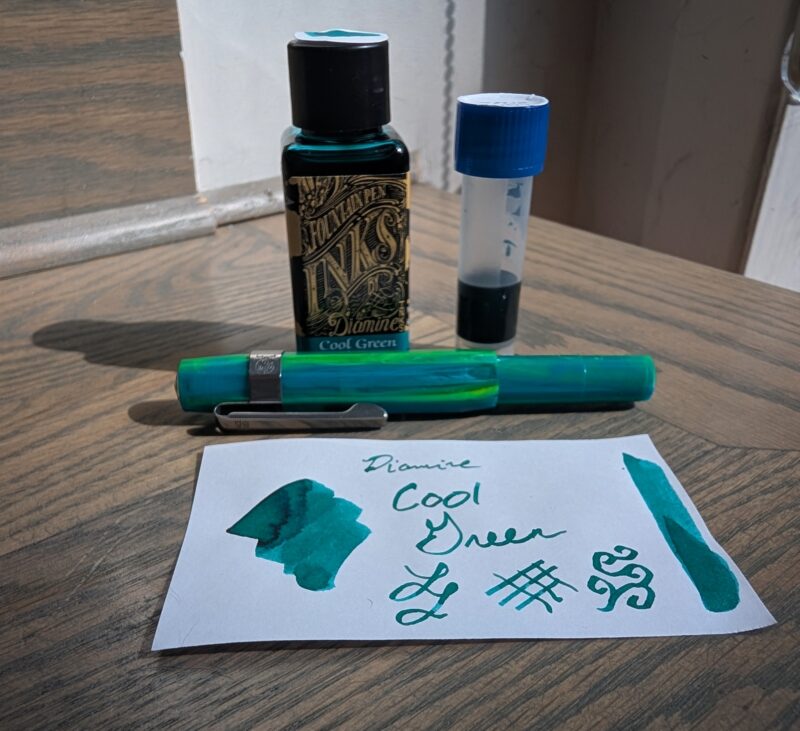
Diamine Cool Green fountain pen ink with swatch, 2ml in a vial that I spilled on the table, and Kaweco Sport pen in "Marble Ocean"

Diamine Cool Green fountain pen ink with swatch, 2ml in a vial that I spilled on the table, and Kaweco Sport pen in “Marble Ocean”


I used this ink immediately after swatching it because I, uh, knocked over the full bottle on my table.  You can see the 2ml I rescued in the sample vial, and there’s a bit more in the pen since I was hesitant to put potentially messy or contaminated ink back in the original bottle.  (It spilled directly over a swatch of Diamine Red Dragon.  Though what’s in the pen doens’t seem to be slightly red or anything so clearly it wasn’t as big a deal as I thought it could be in the moment.)


I’m pretty pleased by how well it matches the pen, actually:


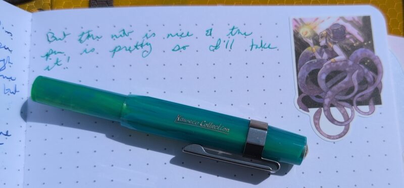
Diamine Cool Green wirting sample in my journal with Kaweco Sport pen, fine nib, "marble ocean" colour. Also a cool sticker.

Diamine Cool Green wirting sample in my journal with Kaweco Sport pen, fine nib, “marble ocean” colour. Also a cool sticker.


Compared to the my current collection of teal-ish inks, it leans a bit more green.

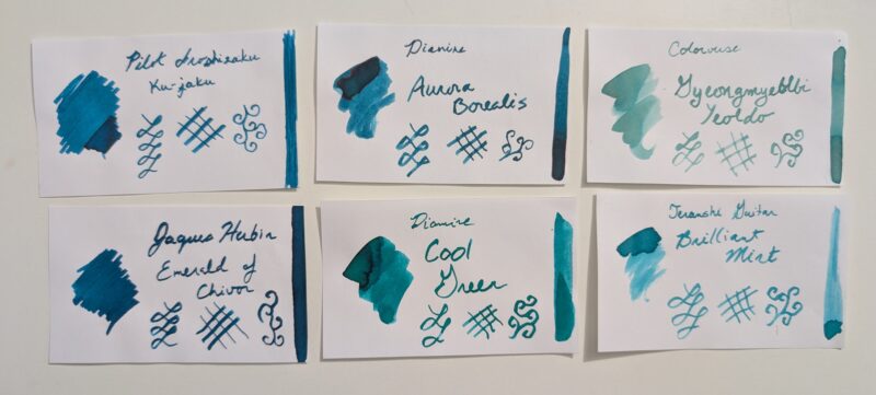
A set of ink swatches to compare with Diamine Cool Green. Top three, left to right: Pilot Iroshizuku ku-jaku, Diamine Aurora Borealis, Colorverse Gyeongmyeble Yealdo. Bottom row: Jaques Herbin Emerald of Chivor, Diamine Cool Green, Teranshi Guitar Brilliant Mint.

A set of ink swatches to compare with Diamine Cool Green. Top three, left to right: Pilot Iroshizuku ku-jaku, Diamine Aurora Borealis, Colorverse Gyeongmyeble Yealdo. Bottom row: Jaques Herbin Emerald of Chivor, Diamine Cool Green, Teranshi Guitar Brilliant Mint.


In colour tone, I think it’s closest to Teranshi Guitar Brilliant Mint, but it’s much darker and a bit greener.  It’s also pretty similar to Aurora Borealis but again, more green.

I probably wouldn’t have bought this ink separately since I own full bottles of both Brilliant Mint and Aurora Borealis (the rest are unfinished samples) but it’s a really lovely colour and I’m not really sad to have it because I use a lot of greens to match stickers, and my love of plant stickers means there’s a lot of opportunities to use a subtly different green.  Plus it looks nice and behaves well in the Kaweco Sport and I specifically picked up that pen to be a work pen (that’s why the fine nib) so I’m excited to have a kind of matchy ink to go with it.  Though I kind of want one that’s more green/yellow and I definitely don’t have that in my collection!  Anyone found the perfect match for this pen yet?


Thawing April 2026, Ink & Life & Space Dragons

We’re in the tail end of winter according to the birds, though there’s still chunks of snow in the shade and every time we think it might be warm for good we get a little bonus freezing rain.  Still, it’s nice to feel the change of the seasons even when it feels like only a tentative moment of warmth.


Three sheets of stickers: cute dragons, large botanicals and weather icons, an ivory covered MD notebook, three ink swatches (Diamine Tundra [grey], Diamine Mint Twist [green with blue shimmer], and Pennoia Selyempezgo [peach]) and fountain pens (Kaweco Liliput, Pelikan Pura, Pilot E95S).

Three sheets of stickers: cute dragons, large botanicals and weather icons, an ivory covered MD notebook, three ink swatches (Diamine Tundra [grey], Diamine Mint Twist [green with blue shimmer], and Pennoia Selyempezgo [peach]) and fountain pens (Kaweco Liliput, Pelikan Pura, Pilot E95S).

Stickers

  • Cute dragon-y creatures by Heather Sketcheroos
  • Botanica pop-art by Maggie Chiang
  • Weather related icons by Neko Mori Arts

Inks & Fountain Pens

  • Diamine Tundra (grey) – in my Pilot E95S <M> (although I had the pens arranged differently before I filled them)
  • Diamine Mint Twist (green with blue shimmer) – in my Pelikan Pura <B>
  • Pennoia Selyempezgo (peach) – in my Kaweco Liliput <BB>

The pennoia ink was a random sample from a fountain pen order a while ago, the other two are both last year’s inkvent.

New Notebook Month!

After many months, I’m bidding farewell to my Leuchtterm notebook, which I started back in October with the plan that it would see me through the move.  It saw me through 6 incredibly stressful months with medical emergencies on top of the expected move, but we’ve made it out the other side and that’s worth celebrating!
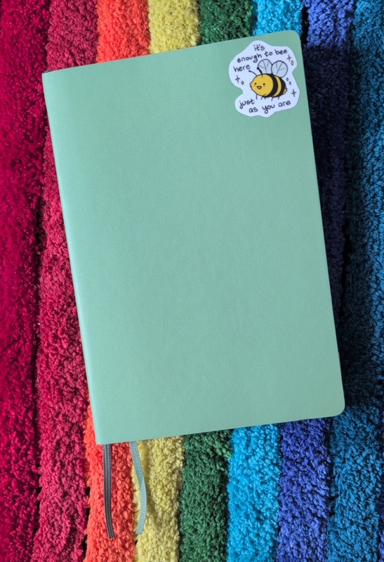
Green Leuchtterm softcover notebook with a bee sticker from The Latest Kate that reads "It's enough to bee here just as you are"

Green Leuchtterm softcover notebook with a bee sticker from The Latest Kate that reads “It’s enough to bee here just as you are”

I liked the Leuchtterm notebook better than expected — it was nice not having to write my own page numbers, and it packs a decent amount of pages into a small size.  I did eventually get used to the ghosting but I didn’t love it.  Still, it’s a relief to go back to something smaller so my journalling setup is considerably lighter.

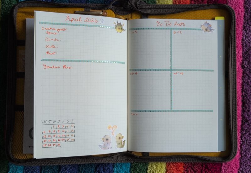
The new notebook is an MD Paper grid notebook.  Cheap and 40-some pages instead of 120-some.  I usually prefer dot over grid but I wanted to try this because the lines looked light enough that it would be pleasant, and so far it’s working nicely and they don’t feel in the way.  I don’t think I’ve shown a monthly spread in a while so here it is in the new notebook:
April 2026 spread in my journal, showing tracking for my yearly creative goals, fountain pens, a calendar, and a set of todo list spaces.

April 2026 spread in my journal, showing tracking for my yearly creative goals, fountain pens, a calendar, and a set of todo list spaces.

My monthly spreads have gotten fairly utilitarian since most of my smaller tracking and notes go on the monthly calendar now that I have space for that.  I still find doing a monthly tracking of the creative goals is useful, and I’m so-so on the todo lists: I use this page so I don’t forget things that I should do this week but don’t have to be done today.  Sometimes everything goes on the day’s todo list and gets done within a day or two so this page isn’t needed.  But other times it’s the only way important-but-non-urgent tasks get done, so it’s staying for now.

I don’t keep a separate commonplace book of quotes and instead just write down quotes in my journal.  Here’s the one from the book I finished this morning:
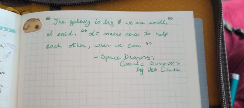
A quote which reads, "The galazy is big & we are small," I said. "It makes sense to help each other, when we can." - Space Dragons: Cosmic Survivors by Veo Corva

A quote which reads,
“The galazy is big & we are small,” I said. “It makes sense to help each other, when we can.”
– Space Dragons: Cosmic Survivors by Veo Corva

I love Veo Corva’s Space Dragons series.  Book two feels especially in the moment, since a lot of it is about trying to figure out what the right thing is that you should be doing, and then doing it even if you’re scared or angry or not ready or don’t know how to make it happen.  And as is a common theme across these books, it’s about finding your people.  But also it’s about a society where space ships are pulled by dragons and if that’s not enough of a pitch I don’t know what else to tell you.  Plus there’s crochet in this one!  https://veocorva.xyz/books/ for more.


And speaking of crafts and space travel, here’s how my latest knitting is going:
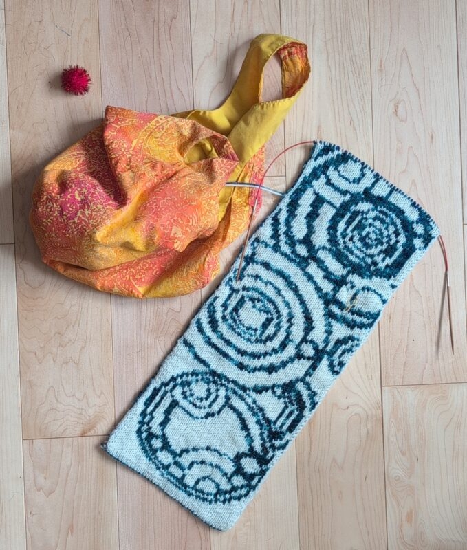
Time of the Doctor Scarf, a Doctor Who themed scarf with Gallifreyan style circle-text.  It has been knit in ivory and dark teal yarn, and there is a a bright orange/yellow batik project bag and a pom pom sitting beside it.

Time of the Doctor Scarf, a Doctor Who themed scarf with Gallifreyan style circle-text. It has been knit in ivory and dark teal yarn, and there is a a bright orange/yellow batik project bag and a pom pom sitting beside it.

I’m getting close to the end of chart 3 out of 10.  This is going to be a gift for John but I’m not sure it’s even going to be ready in time for *next* winter at this rate!  It’s one that nees a fair bit of attention so it’s a bit much if I want to read, but it’s been okay for work meetings when I don’t have to participate much (we have a lot of talks on how to use new internal tools).

Notes from March
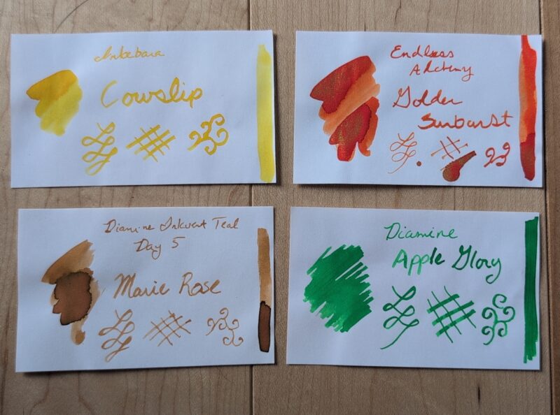
Ink Swatches from March 2026 (described below)

Ink Swatches from March 2026 (described below)

Three of these inks were new last month so here’s some notes:

  • Inkebana Cowslip (Yellow) – This was quite usable in good light but not my favourite when it got dim.  I’ll try playing around with it in art but I’m not sure I’ll use it for journalling again.  I only have a sample anyhow.  I’d forgotten how finicky my Pilot Metropolitan CM nib can be about angles, but I got used to it again pretty quickly.
  • Endless Alchemy Golden Sunburst (orange with gold shimmer) – I liked this a lot more than expected for an ink I really bought to be a fidget.  Super pretty while it’s drying.  Like most (but not all) of my shimmers it takes a fair bit of pen turning if you want to keep the shimmer consistent, but it’s a nice enough colour even with less shimmer so it doesn’t bother me as much as it might.
  • Diamine Marie Rose (peachy brown) – A new one from Inkvent 2025.  I was kind of meh on the idea of writing with a colour inspired by chip sauce, but I actually really liked this one to my own surprise.  Behaved perfectly.
  • Diamine Apple Glory (intense spring green) – This I’ve had for a while.  It’s nice but honestly was a bit too intense a green in this mostly warmish palette which was a pity.  Was nice to pull out the eco with the stub nib for this, though.

I might have a post up soon about some pens I inherited from my grandfather that I’m trying out, but I think that it’ll be its own thing!


Swatch Wednesday: Colorverse Black Hole

This was a gift from a friend who said it was more for the fun little bottle than anything exciting about the ink.  It’s a pretty cute little bottle and I didn’t have one since I think the only colorverse ink I have is a sample.

Colorverse Black Hole ink bottle, which has an unusual teardrop shaped base.  This is the front view showing the bit sticking out on one side. The illustration has a stylized black hole and a little planet saying "SOS" on it.

Colorverse Black Hole ink bottle, which has an unusual teardrop shaped base. This is the front view showing the bit sticking out on one side. The illustration has a stylized black hole and a little planet saying “SOS” on it.

Love that little picture on the front.  The bottle has a teardrop shaped base which I guess makes it a bit less likely to tip over and mostly just makes it interesting.

Colorverse Black Hole ink bottle, which has an unusual teardrop shaped base.  This is thebottom view showing the teardrop shape, though it sits nice and flat because of the flat label on the front.

Colorverse Black Hole ink bottle, which has an unusual teardrop shaped base. This is thebottom view showing the teardrop shape, though it sits nice and flat because of the flat label on the front.


Inside, the ink is as one expects, a pleasant black.  There’s a tiny bit of sheen visible in the swatch on the right, and indeed I can see that in my writing occasionally if I look at it under a sufficiently bright light, but it’s more a cute coincidence than a regular feature of the ink on the paper I’m using.  Might be fun to try it on the iroful paper to see if it happens more consistently there; my current notebook is a leuchtterm.

My swatch card for Colorverse Black Hole, a black ink with a tiny hint of sheen in the bigger swatches.

My swatch card for Colorverse Black Hole, a black ink with a tiny hint of sheen in the bigger swatches.


I’m not too worried about getting the sheen to show up more, though, since the only other black ink bottle I have is a black with sheen from Inkvent Black (uuuh, Good Tidings I think it was called?).  I’m guessing that Black Hole dries quicker, though I didn’t actually test that.  I did, however, have some fun painting with it in the margins of my journal.


Some margin patterns in my notebook using Colorverse Black Hole ink on a paintbrush. One side has curly vine-like shapes, the other a geometric zig-zag with partial triangles.

Some margin patterns in my notebook using Colorverse Black Hole ink on a paintbrush. One side has curly vine-like shapes, the other a geometric zig-zag with partial triangles.


Fun bottle and a nice practical ink.  Overall a very nice present!  And I think this is the last ink bottle or sample I had that I hadn’t swatched in my collection, so I’m all caught up and there’s no ink purchases on my horizon until the weather warms up, and maybe not even then — I’ve got so much to play with now!

September 2025 Ink & Pen palette

Back to school for my kiddo! And I bought the Pelikan Pura to replace my Pelikan Twist and I have zero regrets.

Here’s this month’s stationary supplies:

Stationary supplies for September 2025 including fountain pens, inks, stickers and paper products described in more detail in the post.

Stickers

  • household stuff sheet from Eggtart Studio (via stickii; I think this was an advent sheet)
  • day to day icons sheet from Neko Mori Arts (via stickii, I think I bought this one specifically because I needed more habit stickers. Currently tracking writing days with these!)
  • Calendar from Mossy Pine (as usual; I got a whole year’s worth!)

These were the intersection of being a little bit back to school-ish and also having the right colour vibe to go with the inks I wanted.

Paper Products

  • Campus Diary free monthly calendar (new)
  • Clairfontaine Triomphe blank notebook (going since April 2025)
  • Koyuko campus notebook cover

I already talked about my new calendar for the year, a Campus free monthly diary. It worked great with the fountain pen I used for numbers in September so I’m pretty happy with it so far, and I’ve got it slotted into the green cover (pictured above) on the opposite site of my current journal. Because they’re slotted in opposite sides rather than using strings or clips in the middle, there’s a bit of a gap in the centre. I was worried this would be a problem for writing but so far it seems to be fine. I’ll try some ink testing with dip pens on the back pages when I next do swatching.

Three fountain pens and inks: Pilot Elite E95S with Diamine Aurora borealis, Pelikan Pura with Diamine Snow Globe, Pelikan Twist with Diamine Winterberry
Three fountain pens and inks: Pilot Elite E95S with Diamine Aurora borealis, Pelikan Pura with Diamine Snow Globe, Pelikan Twist with Diamine Winterberry. The latter two have sparkles.

Fountain Pens and Inks

  • Pilot Elite E95S <m> – Diamine Aurora Borealis (dark teal, carry over from last month)
  • Pelikan Pura <b> – Diamine Snow Globe (blue with blue shimmer)
  • Pelikan Twist <m> – Diamine Winterberry (red with red shimmer)

The theme of this month is “omg I finally have pens that work with shimmer ink“. I loved these colours in the Inkvent 2024 calendar but was worried I woudln’t be able to use them.

Since my blog post about the Pelikan Twist I managed to find someone selling the particular model of Pelikan Pura that I’d fallen for with the broad nib I wanted at a sale price, so I decided to jump on it even though I’m unemployed and should probably not be buying $100 pens. But I *love* this pen as much as I hoped I would and it fills a gap in my collection so I don’t feel like I made the wrong choice. The Pelikan Pura anniversary design with the little Y geometric snowflake shape and the pretty teal colour is fantastic, and obviously I’m very excited about having a feed that doesn’t clog up with sparkle. It has a round grip so no issues with that (the way there were with the Twist’s odd triangular grip). I expect this pen will be inked almost constantly since it will likely be my sparkle pen going fowards, and I have a lot of sparkle inks from Inkvent to use. Honestly, this pen jumped immediately into second place in my collection (behind my beloved Pilot Elite).

After this month, the Twist will probably go back to being relegated as a sometimes pen because of the annoying triangle pen, although I’ve been playing with a coil grip thing on it that helps a bit and we’ll see how I feel about it after a month of use.