This was a gift from a friend who said it was more for the fun little bottle than anything exciting about the ink. It’s a pretty cute little bottle and I didn’t have one since I think the only colorverse ink I have is a sample.
Colorverse Black Hole ink bottle, which has an unusual teardrop shaped base. This is the front view showing the bit sticking out on one side. The illustration has a stylized black hole and a little planet saying “SOS” on it.
Love that little picture on the front. The bottle has a teardrop shaped base which I guess makes it a bit less likely to tip over and mostly just makes it interesting.
Colorverse Black Hole ink bottle, which has an unusual teardrop shaped base. This is thebottom view showing the teardrop shape, though it sits nice and flat because of the flat label on the front.
Inside, the ink is as one expects, a pleasant black. There’s a tiny bit of sheen visible in the swatch on the right, and indeed I can see that in my writing occasionally if I look at it under a sufficiently bright light, but it’s more a cute coincidence than a regular feature of the ink on the paper I’m using. Might be fun to try it on the iroful paper to see if it happens more consistently there; my current notebook is a leuchtterm.
My swatch card for Colorverse Black Hole, a black ink with a tiny hint of sheen in the bigger swatches.
I’m not too worried about getting the sheen to show up more, though, since the only other black ink bottle I have is a black with sheen from Inkvent Black (uuuh, Good Tidings I think it was called?). I’m guessing that Black Hole dries quicker, though I didn’t actually test that. I did, however, have some fun painting with it in the margins of my journal.
Some margin patterns in my notebook using Colorverse Black Hole ink on a paintbrush. One side has curly vine-like shapes, the other a geometric zig-zag with partial triangles.
Fun bottle and a nice practical ink. Overall a very nice present! And I think this is the last ink bottle or sample I had that I hadn’t swatched in my collection, so I’m all caught up and there’s no ink purchases on my horizon until the weather warms up, and maybe not even then — I’ve got so much to play with now!
I have done my first stationary order since moving back to Canada! I was looking specifically for a clip for my Kaweco Liliput, which had unfortunately been falling out of my pen case enough that I was worried about losing it, and a couple of extra traveler’s notebooks in the regular size for my commuter notebook needs. I chose Wonder Pens mostly because I liked the Wonder Pens blog, which is a good enough reason for me, and they are at least in the same province. Maybe someday I’ll get to visit them in person, since my kid is very excited about the idea of going to the Toronto Zoo again.
The package came with the prettiest stamp on it:
Wonder Pens Stationary Shop stamp, featuring a scene inside an ink jar with a squirrel writing and a cat reading a book while sitting on top of a stack of books. there are stars sparkling over their heads.
And here’s what was inside:
A set of items from my order: a wide flat case from Lihit Labs, a regular sized traveler’s notebook, a small bottle of stamp ink, a clip and converter for my kaweco liliput pen, a blank passport sized traveler’s notebook with a zipper case to match, and a pretty postcard with a photo of a collection of year of the horse themed stamps on it.
Since it’s what motivated me to do a purchase, let’s start with the clip for my pen.
The Liliput Clip fits nicely and most importantly, has solved my problem. Now the pen clips securely into the pencil case I use for my journal setup and it doesn’t slip out into my bag, the couch, or wherever I’m writing. I love this pen a lot but it was absolutely an escape artist. I decided to go with a more complementary colours vibe instead of getting the silver and I still haven’t made up my mind if that was the right choice (so it probably wasn’t) but I don’t care enough to get a second clip when this won’t transfer to my other kaweco pens. I also picked up a spare folding converter. I already had one of the regular ones and one of the folding ones and I’d been a bit mystified by the folding one because it didn’t make any difference in the kaweco sport — they both fit and have the same ink capacity. But it turns out that if you try to use the old converter in the liliput, the plunger has to be half depressed or it won’t fit in the body of the pen, so suddenly the folding piston thing makes a lot more sense. I didn’t desperately need a 3rd converter but now I’ve got the option if I want to ink all three kaweco pens at once. I do like them for travel because they’re easy to fill and clean in a hotel room and don’t hold much ink, so it might happen!
I’ve been been using a TN sized notebook as a kind of “everything notebook” for work and commuting, and I’d already squashed a few pages when something else in my backpack fell in between them. This happens to me a lot, which is why I prefer zippered holders for my notebooks. I switched to using an A5 “ghost whale” pouch that I already had, the same type I had used for my whole journalling setup for quite a wihle, but it didn’t fit well and I found it unsatisfying. It turns out that the Lihit Labs flat wide case was the right size, so I added it to my order. I also grabbed two spare TN notebook refills, one to use immediately so I could separate my personal and work notebooks, the other on hand for when I filled one or the other up.
My work bullet journal (a lochby TN sized notebook with a TN zipper case used as a cover) slipped into the front pocket of the new Lihit Labs flat wide pencil case. It fits but it it’s sticking out of the top a little.
Just in case you were wondering: one notebook does fit into the front pocket. With the zipper case on, it sticks out a bit, but without the case it kisses the edge of the zipper. I know it’s hard to figure out what will fit from online listings so I thought I’d post a photo. Having it in the front wouldn’t work for me, since I was aiming to keep the notebook from getting banged up in my backpack, but if you’re not stuffing things in your bag in a hurry when you get to the right bus stop, or you just cared more about fitting pens in the case, this would probably work? It does fit better in the inside pockets, though I actually use the inside pocket for a pencil board instead and just leave the notebook floating in the middle for easy “flip open and write” usage.
Inside of the Lihit Labs Flat wide case, showing some pens on the left and a traveler’s notebook pencil board on the right. The latter is also in the inner pocket, showing that it fits snugly but there’s enough room to close the zipper without any difficulty.
Honestly, I could probably do without the plastic zipper case now that the notebooks are protected in a different way, but I like being able to swap pretty stickers into the back where I can see them and it’s fun to be able to “glue” the two notebooks together by tucking a cover into each side of the non-zippered edge. I don’t think anyone cares what notebook I’m writing in at work but it’s nice that I can grab them both when I’m going to sit away from my desk with a coffee for a bit and write whatever’s on my mind. I’ve been doing a lot of writing at work just to organize my thoughts while I’m ramping up and it’s helping with the information overload.
The Lihit Labs pencil case opened to show some pens in the pocket on the left and the same notebook with cover on the right, although the notebook has been flipped over so you can see the stickers inside the zipper pouch. Prominent is one with an animal bones motif (from fireside textiles/tonkai) and some washi dots are visible behind.
Now that I’ve been using both notebooks, I will say that the Lochby refill that I got as a surprise “oopsie out of stock” substitution from The Gentleman Stationer is clearly a slight upgrade over the official TN refill. The paper is a little more resilient against feathering, there’s nice stitching so it lies a bit more flat, I like the rounded corners, and it has a slightly thicker cover. It’s probably not enough of an upgrade to be worth the cost and hassle of cross border shopping, but it was a generous substitution and if I were still in the US I’d probably stock up on them instead of the TN ones.
The passport sized notebook and zipper case were so I could duplicate my “covered notebook with sticker space” commuter notebook in a size that would sit in my smallest purse. Here it is with a little yamamoto ro biki book that I’d been toting around before I got the case. You can see it’s a little squished from use. I use the smallest purse for a lot of trips where I’m going to be on my feet most of the day because extra weight is hard on my body, but it’s nice to have a tiny notebook that my kid or I can draw in if we stop for a snack, and kid’s at the age where people give him stickers and it’s nice to have a pouch to put them in or flexible plastic to put them on because he doesn’t want to lose them. I’m honestly a little miffed that the zipper case in passport size has card sized slots because I think it would look prettier without, but I guess that’s what I get for not actually buying something intended as a notebook cover.
A rust coloured Yamamoto Ro Biki notebook with a stylized tree on it with spindly long branches and round dots for leaves. It has a plastic TN passport “zipper case” over the notebook being used as a cover.
The stamp ink I haven’t used yet, but it’s for this auto-advancing number stamp I got with the intention of quickly stamping page numbers into notebooks that didn’t have them. Unfortunately the ink that came with it takes forever to dry so the process isn’t quick at all and I have to blot the stamps or they take days to fully dry. I don’t know if the midori stamp ink will be better, but since I was already going to be paying for shipping I figured it was worth a shot. I haven’t gotten around to cleaning out the stamp pad and trying it, though.
A close up of a dot grid notebook with the page number “22” stamped inside. You can see that there’s some messy ink transfer from the stamp on the facing page.
I avoided adding fountain pen ink to this order because it was so cold and I didn’t want to risk having a bottle freeze solid and break en route. Thankfully the stamp ink came in a forgiving little plastic container and there were no problems.
Overall, I had a nice online shopping experience, and it was such a relief to find somewhere that would send me “back on stock” notifications for the TN notebooks after it turned out my local dealer either doesn’t carry the dot grid ones or they’re just out of stock all the time and I don’t know which. Hopefully I’ll get to visit Wonder Pens in person some day! And maybe next order (likely when I need a new planner in the fall), I’ll be able to get some ink.
Still settling in to the new house. We’ve prepped a couple of rooms for painting but then the furnace decided it would just sometimes not turn on in the middle of a cold snap, and cold rooms are hard to paint. New thermostat is supposedly coming today and we really hope that’s the problem. It looks like the former owners had some weird zwave kickstarter thermostat that was not great even when it seemed to be working, but it may well be an issue with the furnace itself. Thank goodness for good insulation so we didn’t freeze when it turned off overnight.
Painting continues, so here’s a photo of Hatch who looked at the cardboard I put on the floor and thought “must be a dog bed.”
Caption: Hatch, a black lab mix dog, is sprawled across a cardboard wardrobe box that has been flattened and placed on the floor to protect it during painting. He’s got his face in the sunbeam and is looking towards the window with his head over his paws, while his hind end is sprawled at a “draw me like one of your French girls” pinup pose with his legs stretched out.
And then, immediately, “don’t take my picture!”
Caption: Hatch, a black lab mix dog, sitting on some cardboard with his front half in a sunbeam. He’s sitting up compared to the previous photo and you can see that his front paws are crossed. He’s looking vaguely in my direction with his ears back like he’s not very impressed.
Anyhow, let’s talk inks.
A set of four ink swatches from the Diamine Inkvent Teal (2025) calendar. Day 17 Gala is a bright purple, Day 18 Laurel is deep green with so much red sheen that the green is often completely invisible, Day 19 Overcast is a light blue with pinkish tones, and Day 20 Ambiance is orange with pink sparkles.
Day 17: Gala. A nice shading purple. I really like this one! It’s a little more pink than J Herbin Violette Pensée, which is the closest thing in my collection. I’m pretty much always going to have the My Little Pony song “At the Gala” stuck in my head when I use this, especially since it’s a very twilight sparkle kind of purple.
Day 18: Laurel. Dark teal-leaning green base with so much red sheen that it’s more of a red ink than a green one. I like this one but I do wish it had a little less sheen so you could get more of the base colour, and it is very similar to Vibe from last year so it’s kind of boring in context. Still, viewed on its own it’s a fun ink and I appreciate that it’s a lot more green than all the other pink sheen inks I have. I wonder why I never see a deep red with the pink sheen? Something chemical or it just doesn’t look as cool in product photos?
Day 19: Overcast. A dual-tone ink that’s grey-blue with a pink tone. This one is really lovely, but unfortunately very close to my Fountain Pen Day purchase of Van Dieman’s Underflow. Underflow is a bit brighter and more green so they’re not exactly duplicates just very similar. I’ll use both!
Day 20: Ambiance. A peachy orange with pink sparkles. This one is unique in my collection — the closest ink I have has gold shimmer and despite the photo above making it look more gold, this one is definitely more of a pink shimmer when viewed head-on. I like it!
These are all lovely and will get used, though I feel like Laurel could have been more interesting with less sheen. I think Ambiance is the one I’m most excited to ink up and use in my journal, but probably Overcast and Gala will see more use over time due to the lack of shimmer.
Another belated Inkvent post for swatch Wednesday! I didn’t bother doing inkvent posts in December because of the move, and in theory now that some of our stuff has arrived I could probably be unpacking instead of blogging about ink. But our stuff got separated into two shipments and a lot of the furniture is on the second truck, and in some cases we have bookshelves but no actual shelves so they’re unusable for unpacking. Oh well. We don’t have an ETA yet on the second half of stuff so we’re doing what we can.
And in the meantime, here’s some ink swatches!
A set of swatches from the Diamine Inkvent Teal calendar showcasing day 13 Molten Basalt (grey with red sheen), 14 Mittens (hot pink, pigment ink), 15 Frostbite (dark blue with copper shimmer), 16 Ruby Taffeta (red with green shimmer)
Day 13: Molten Basalt. Grey with a reddish sheen. Normally I’m not a huge fan of greys because they’re either dark enough to mostly look black in practice, or they’re light enough that they’re kind of annoying to read without bringing much joy to my writing. (I like saturated colours!) But the sheen is enough to make this one interesting, and I like the name.
Day 14: Mittens. Hot pink pigment ink. I have no idea what could possibly call for waterproof Barbie pink ink in my life, but I love how saturated and unapologetic the colour looks. This one didn’t stain as badly as Brr! did but I was also a bit more careful about soaking the brush a few seconds after I was done using it.
Day 15: Frostbite. Dark blue with loads of copper shimmer. It looks a bit gold in the picture but its more coppery to my eye. This one’s very pretty and I’d like to see how it does in a pen where the shimmer is likely to be toned down a bit so you can actually appreciate the base colour.
Day 15: Ruby Taffeta. Red with iridescent green shimmer. For some reason the camera picks this up more as a silver but it’s noticeably green to my eyes in real life. This is the red of my dreams, exactly the red I’ve wanted and I’m almost mad that it’s got shimmer because it’s such a perfect red. (Look, I bonded with red pens during my stint as an editor, okay?) This will absolutely get used but it’s gonna be really tempting to not bother stirring it up and using it without the shimmer. Not that the shimmer is bad, but the slightly greenish iridescence isn’t what I would have chosen to go with such a glorious red. If anyone knows of a match for this colour without the shimmer, let me know!
Overall: I love all of these. Ruby Taffeta is probably my favourite, but Molten Basalt may get inked up more often due to the lack of shimmer. I do have some pinks similar to Mittens but they’re not pigment inks so it’s really a different beast. And the rest are all pretty different to what I had before!
We made it! Plan “get the dog and us across the country with an RV and our friend who loves driving” was a total success. We were lucky to get a very nice agent at the border and didn’t even have to have the whole RV searched. It’s tempting to point at the past week of news to explain why I’m so happy to have made it out safely, but if I’m honest with myself I could have pointed at nearly any past week of news in the year or so since we started making more concrete plans to leave and it would have seemed just as urgent then as now. But yeah, I made it and I’m excited for J to have his turn to be the immigrant; hopefully it won’t be as demoralizing for him as it often was for me.
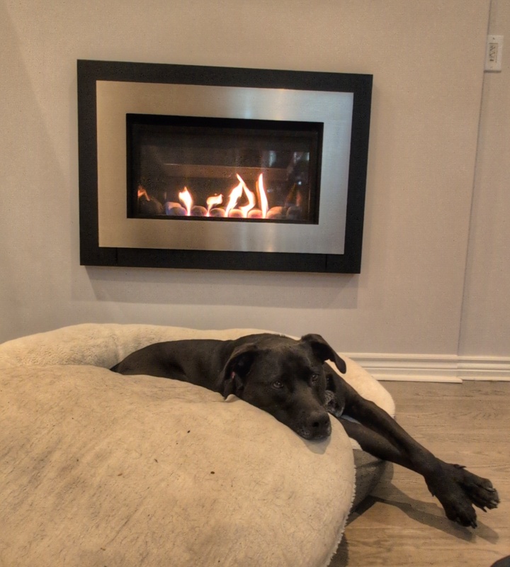
We’re kind of rattling around in a large empty house at the moment, and there’s some stress going on with the moving company and the internet setup, but at this point most of the scariest parts of this adventure are over. Unless you’re our anxiety-ridden pandemic dog, who now has to meet a lot of strangers who come into the house. Thankfully he’s got lots of other nice things to enjoy that make up for the stress. He particularly likes the kid’s new game that he calls “melt the dog” which involves turning on the fireplace next to the dog bed and watching Hatch slowly sprawl out. I’m not sure why the kid thinks this is hilarious but Hatch obviously doesn’t mind. We’re giving kid a few more days of vacation to sleep and adapt before getting him registered in school but that’ll be soon.
It took me a bit before I sat down and made some stationary choices for this month, mostly because cleaning up the remaining drywall dust and flooring sawdust and whatnot took precedence. Also sleeping. A lot of sleeping. And figuring out how things work and where to put stuff. And people stopping by (good for everyone but poor dog).
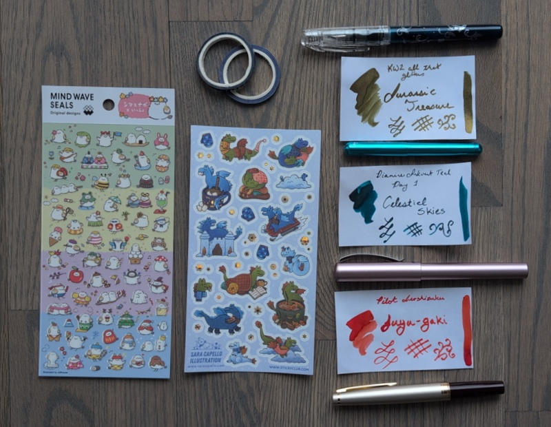
Stickers
Japanese birds in costumes for all seasons (Mind Wave)
Winter Dragons (Sara Capello Illustration for Stickii)
I’ll probably need another sticker sheet but I may just use up some leftover bits. We’ll see how much I write once I’m tired from work.
Fountain Pens & Ink
Platinum Preppy Wa – Koi pattern <F>. This has the original black cartridge in it.
Kaweco Liliput <BB> – KWZ Jurassic Treasure
Pelikan Pina Colada <M> – Diamine Celestial Skies from Inkvent.
Pilot E95S <M> – Pilot Iroshizuku fuyu-gaki
Two of these are new pens, both from Fountain Pen Day sales but I hadn’t gotten them inked with the chaos of December.
The Liliput has been on my wish list for a while as a shiny upgrade to my kaweco sport pens, which get regularly rotated in and out because I like writing with them but the aesthetics of them have never grabbed me. I’ve only written with it a bit but the nib is lovely and I suspect I’ll get used to having to screw the cap onto the back of the pen though that’s not my favourite. Still, I love the feel of it, so light and satisfying to hold. And the shiny blue looks just as good as I hoped it would. I wasn’t sure if the double-broad nib would be too much, but I rather like it, especially with this super smooth and shiny ink.
The Pelikan Pina Colada was more of an impulse buy because it was cheap and used the same converter I have for the Pelikan Twist. It feels light and maybe looks a bit unappealing because of the plastic, but it has a really nice clip and the grip is more comfortable for me than the one on the Twist. I’ll withhold final thoughts until I see if it handles a month of writing with sparkly Diamine ink. So far it’s not really bringing the sparkle as much as the Twist did, but I don’t think this ink itself is quite as sparkle heavy as the last thing I used in the Twist so who knows. We’ll see if it clogs.
KWZ Jurassic Treasure and Pilot Iroshizuku fuyu-gaki are both inks I’ve had a while but I’m not sure I’ve inked pens with them. I bought the rest the KWZ “all that glitters” line when it came in stock because it is my favourite sparkle ink that works in every pen and it only has 4 colours — I’ve used the blue/silver and orange/gold ones, this is gold/gold and there’s also a green/gold. I hope they make more. I’d love a purple/silver. Fuyu-gaki came in a little set of Pilot inks and I wish it was more red and less orange (the swatch is a bit darker than my writing with a non-dip pen) but it’s a fun colour even if I was really hoping for a good red.
Celestial Skies was possibly my favourite of this year’s Inkvent Teal calendar, so I figured I should ink it first. It’s nice that the gold sparkle goes well with Jurassic Treasure for a lightly matched ink palette.
Notebooks and Bags
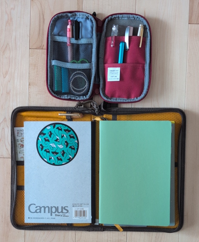
This setup hasn’t really changed since I last posted, I think, but here’s a picture since it’s been a little while:
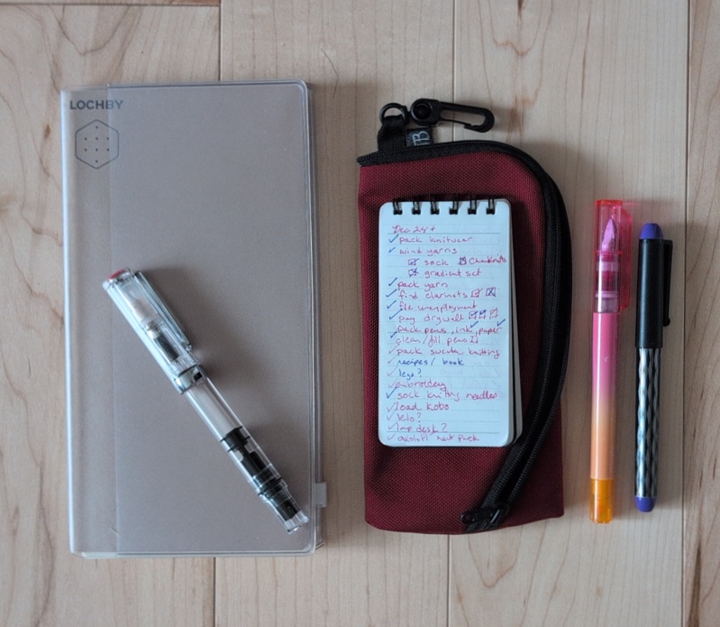
My current notebook setup: Lihit labs pen case with fountain pens, washi, stamps and scissors above, Lochby Field Folio case with a Campus free monthly calendar on one side and a Leuchtturm notebook on the other. There’s a wooden pencil in the pen slot and a sticker sheet barely visible on one side.
All of this is working well for me: I used one of the calendars in the back of the campus diary for swatching inkvent and was impressed at how well it handled even some of the wetter swatches. The Leuchtterm is about half full from my start in October and it also handled some paintbrush swatches of ink. I won’t say I’ve completely gotten used to how much more ghosting it has than some of the other notebooks I’ve tried, but it’s usable and I could see myself using it again if I wanted a higher page count. Mostly I want less page count so I don’t have to carry as much with me, though. The pen case and A5 Field Folio are both great. I’m tempted to try some of Lochby’s other offerings, but they’re a bit thick for what I want out of a purse notebook so this bigger journal setup may be the only place they fit in my life. Oh, also I’m using a little midori calendar stencil instead of calendar stickers this year for the little monthly calendar I put at the start of each month for a quick “what day is it again?” check.
Commuter Stationary Planning
I’m going to be commuting to my new job on the bus several days per week, and I decided that rather than just transferring my existing little purse-backpack notebook back and forth, my commuter backpack should get its own notebook. Not sure yet if I’ll use that for work or it’ll just be for doodles on the bus.
A Lochby TN size notebook tucked into a TN zipper case insert, with a clear TWSBI eco sitting on top of it. Beside it is a small maurman flip notebook with a todo list in it from december, sitting on a Tom Bihn ghost whale pouch. there are two more fountain pens beside it: an Ooly duo and a pilot varsity.
Right now I’ve put together a TN-sized notebook from Lochby and my TN zipper case and stuck them together so the zipper case serves as a notebook cover (I used to use this zipper case stuck to the back of my calendar to hold stickers). I’ll probably fill up my TWSBI Eco with something non-sparkly so I don’t have to worry about clogging. Maybe pull out the bottle of Nitrogen for a bit of sheen, not sure yet.
In practice, the only stationary I really used in my last job was my running todo list notebook. I’ve yet to find a digital to do list that works as well for me as a little paper notebook does. Not sure if that will still be the case but I threw it in the picture with the commuter notebook because there was space. I’ll see if I wind up using it for work or if it will be only for personal lists. Mostly I stick two or three pens and the notebook into the pouch and then into my pocket and use it around the house on days when I will absolutely forget to do things if I don’t write them down, or when I need a little boost of checkboxes to keep me on track.
Stationary Shopping in Canada
Shipping even small stuff from the US seems to cost about $25 minimum so I’m unlikely to do many orders from the US in the future, stationary or not. That’s definitely not a surprise, since before I left it was pretty common for people to put together big group buys of stuff to defray shipping costs. And with the political situation in the US, Canadians are kind of aggressively refusing to shop American and support the whole war machine, which rather makes sense. Thankfully it’s not much of a concern if I can’t shop where I used to: I’ve got a comfortable amount of supplies after my enthusiastic shopping since I started using fountain pens again in 2024, and I could probably write happily without buying anything new for a year or two. Still, I’m intending to find some Canadian stationary/pen stores to shop at, online and maybe offline (I know there’s one near my old apartment that has a small selection). If you know if great stores in Canada that carry fountain pens and ink, let me know!
I don’t have a big wishlist at the moment: maybe some standard inks to balance out my collection which is very dominated by inkvent holiday inks? No pens on my radar right now, since the Liliput was the last one. A friend may be storing his pen lathe in our garage so maybe I’ll get a kit and try turning a pen or two if we get that set up. I’ve got paper and stickers enough to last for probably over a year at my current journalling rate, though I’m always open to stickers when I find new artists I want to support.
New Job
New job starts next week and I’m excited! This was the best team I interviewed with and I’m looking forwards to getting to know them. I’m also very much looking forwards to having income again as we deal with the last moving bills and no doubt new expenses as we figure out what we need in the new house. I’m less looking forwards to a long commute to the office three days a week, but I also have no furniture for my office and for some reason the flooring guys forgot that room so I also have to wait for a new floor… which is all to say that I’m going to be glad to have a desk and proper chair!
Mom, I’m bored
I feel like I should wrap this up somehow but my kid is telling me he is BORED so I guess that’s that. Happy new year!
I knew that this month was very likely to go off the rails with our upcoming move, but that didn’t mean I didn’t have hopes even as I tried to build slack into my plans. One of the things I’d hoped was that I’d be able to take a little time out of my day and do Inkvent swatches and journalling as a bit of a meditative practice in the face of chaos. Turns out chaos was stronger than that and I’ve been mostly offline for the first few days of the month, but I’m catching up and getting into it now.
Ink
No ink palette for this month — I’m writing half of my journal entries with the day’s Inkvent ink using my dip pen with the reservoir and finishing them out with whatever pens I still have inked. I might swap inks eventually but there’s basically no colour scheme going on here.
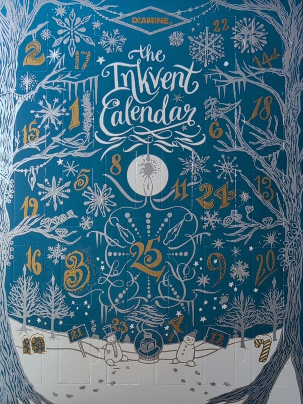
The front of the Diamine Inkvent Calendar, Teal edition. It’s a box with numbered doors on it and each one has a new mini vial of ink behind it. The design features a wintery scene.
I am making swatches of each ink as I go, so I’ll probably start posting those in groups or something if things have really settled down enough to allow for that.
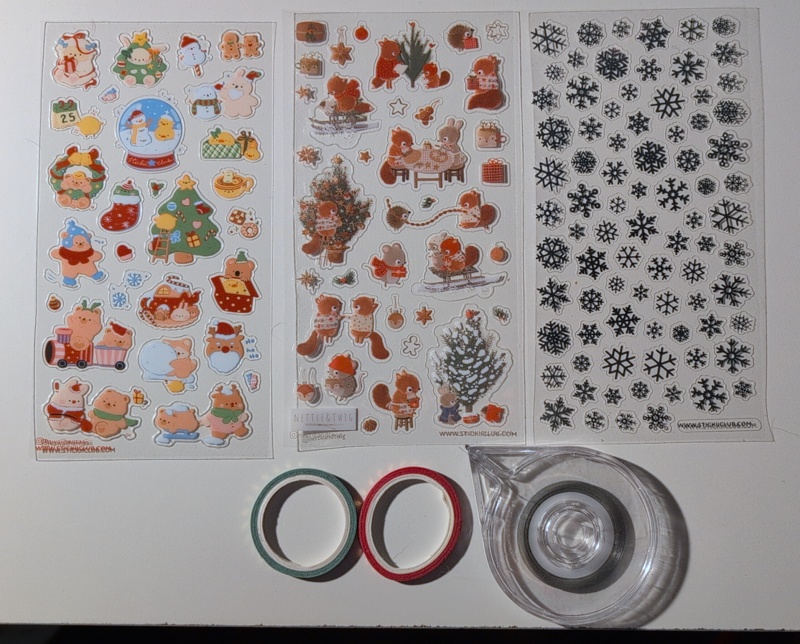
Stickers:
Christmas bears by Kawaiihentaii
Holiday squirrels by Nettle & Twig
Shiny snowflakes don’t list an artist, just stickii.
Other Stuff
It’s been a rough month and we’re only a few days in, but I’m still working on holiday knitting and haven’t started the advent-style knitting I had planned because emergencies took precedence over winding yarn. The house is starting to look like we’re prepping for a move with boxes starting to pile up, and kid’s got a big countdown chain to help him visualize how many days before the end of school I’ve got a cough at the moment that has kept me out of choir, which honestly is a bit of a blessing because it’s one less thing to worry about. But we’re surviving and we were lucky enough to have a friend visiting when the worst went down, so I’m feeling tired but supported and hopeful that we’re making our way through it all.
Going with a spooky kitty theme this month, since I had a pair of good spooky kitty sticker sheets from last year’s stickii Halloween countdown. (I didn’t get this years halloween countdown because I still had plenty of spooky stickers.)
Stationary for journaling in November 2025. There are two stickii sticker sheets with ghost cats, witch cats, then a fall mushroom themed set of sheets from MU and another stickii sheet with happy raindrops on leaves and stuff. There are four fountain pens and ink swatches below that: a Pelikan Pura with Diamine Baltic Breeze (blue with pinkish sparkle), a Pilot Metropolitan with Diamine Twilight (dark grey), a Monteverde Ritma with Van Dieman’s Last Light (purple-blue), and a Pilot E95S with Sailor Mayo Asagiri (pink). Below that are a set of 4 thin washi tapes in blue/purple/pink.
Stickers
Fountain Pen ghost cats by Yudoart (from stickii halloween last year)
Witchy sticker sheet by November Rush (from stickii halloween last year)
MU “print on stickers” (transfers, really)
Droplets sheet by Starriesena (also from stickii)
Pens and Ink
Pelikan Pura <b> with Diamine Baltic Breeze (blue with copper? sparkle)
Pilot Metropolitan <cm> with Diamine Twilight (dark grey)
Monteverde Ritma <flex> with Van Dieman’s Last Light (purple-blue)
Pilot E95S <m> with Sailor Mayo Asagiri (pink)
The Van Dieman’s Last Light is a new sample I picked up from their line of two-tone inks. I actually really like the way this ink works other than the fact that I keep thinking it’s too light to read while I’m writing but it does dry darker as so many purple-ish inks do. It’s especially nice in this particular flex nib, which basically lets you pour out more ink with bit of extra pressure, and a bit more ink in this case gets more of the dual colour effect.
Using the Metropolitan right after using the Maple pen last month has cemented that the Metropolitan is significantly easier on my hands, so my ranking continues to stand.
Thoughts on last month’s selections
Some thoughts on what worked and what didn’t from last month. The architect nib in that maple pen is very fun to use but definitely tires my hands out. Not sure if that’s primarily due to the nib or it’s also the heavier and larger pen. It worked really well with Southwest Sunset except that I’d forgotten that this particular ink leaves little dots that take forever to dry, so I smeared it a few times. I had this trouble with the other noodler’s ink I had as well, and wound up giving the rest of that sample away. I like the colours of Southwest Sunset enough that I’m keeping my last tiny bit of sample but I’ll try to remember that it’s kind of annoying to use even if the shading is super pretty.
The combo of Wearingeul Frankenstein and my TWSBI Eco worked, but it was clear that all the shimmer was getting stuck in the feed and very little made it to the page, so next time that ink goes in the Pelikan to see if I can get a better effect. It is really nice without the shimmer, though, so not too sad.
Using KWZ All that Glitters Firecracker reminded me how much I enjoy their easy to use shimmers that work in all my pens. Since they’re only $10 per 30ml bottle, I just went ahead and bought the two colours I didn’t have. I don’t think they’re as pretty as the two I bought first, but I think I’ll enjoy using them anyhow!
The Pelikan Pura made Diamine Pine Needle work much better than last time I used it. Very happy with how much the Pura improves my ink collection!
The Leuchtturm1917 is working well. The paper definitely is a bit thinner so I found myself rearranging inks so the dark purple Frankenstein was mostly used on the left hand page and I wasn’t writing on something with seriously visible ghosting. I don’t find it too disruptive but it’s there and I notice and think about it regularly. It’s been nice enough for writing, though — not too slow to dry or anything. I do really love the pre-numbered pages and the way the top and bottom have wider margins, though, so the layout is great. I think my perfect notebook would be this dot grid page layout with thicker paper in a smaller page count, but I’ve still got a small collection of notebooks to try so maybe I’ll find something I enjoy even more.
Pen collection changes
Three fountain pens: the first one is a large, teal Jinhao 100, the second a dark blue marbled Noodler’s flex nib, the third a light purple Hondgian M2 that is a pocket pen (as in, much smaller than the other two pens).
I passed 3 pens on to a friend this month. From left to right:
Jinhao 100 <fude>: This one has to be held at a steep angle for the width of line I want, which made it not super useful for regular use since my normal writing angle produced very thick lines. It’s probably tuned for calligraphy? It would have been nice for making cards or something, but I seldom do that. It’s a pretty pen but it really wasn’t working for me, and I have a few other fudes in my collection. My friend is a lefty and it worked better for her, so off it goes.
Noodler’s Creaper <Flex>: This is actually the only fountain pen I’ve ever had which I hated the feel of the pen body rather than the nib. It constantly gave me the vibe of one of those cheap conference giveaway pens that didn’t quite fit together right. No idea why, it wasn’t actually loose, maybe it was something about the shape. But it’s been sitting in a cup because I don’t want to use it, so I’m glad to pass it along where it might get used!
Hongdian M1 <ef>: The extra fine nib in this felt like I was writing with a toothpick, scratchy and too small. Actually, I think I’ve painted with toothpicks that I liked better than this. I’m not a huge extra fine fan, but the other ones I have don’t feel as bad as this one did to me. Could have replaced the nib but I decided it was better to give it away.
I’d intended to reduce my pen collection by not replacing these, but then Fountain Pen Day sales happened and I picked up a couple of cheaper pens on my wish list. A paragon of restraint I am not, this month. Which is fine, my unemployment can cover a few pens and inks if a bit of retail therapy is helping me survive a month of solo parenting and all the preparation for an international move and dealing with job interview stuff. I’m still feeling less burned out as a whole, but the past few weeks have been A Lot.
Countdown time
In other related news: I wound up buying both the Stickii Advent and the Diamine Inkvent calendar.
The stickers were an easy choice: I’ve used most of last year’s, and with my regular usage at around 2.5 sheets per month a December countdown isn’t so many stickers that it’s going to overwhelm me for the year. Unlike the halloween collection, these aren’t all wintery so I used last year’s year-round easily. I love picking out stickers and matching inks every month, and the stickii ones are a bit thinner, smaller and more convenient for journal use than some of the others I get from individual artists. I’d probably like their subscription club too but that one is more stickers than I use per month so this fits my life better plus I get a cute binder to store my sheets in. I use last year’s a lot.
The inkvent calendar was a harder choice: I use maybe 2ml of ink in the average month, so I strongly debated just making myself a 12-sample pack to enjoy over the holidays which would match up better with my ink usage. But then I kind of overwhelmed myself trying to pick 12 colours and the ones I chose kept going out of stock and I realized I wasn’t actually having that much fun with that plan. So in the end I decided to just get the Inkvent set and stop fussing over picking things. It’s “too much ink” but I really loved the experience last year and the excuse to swatch and use a new ink every day. And I know I won’t be sad about having more colours to use in my monthly palettes, since I know I sometimes struggle with finding something to match my chosen stickers. In hindsight, I should have just planned to trade ink samples with my friend and use those, but I didn’t think to do an ink swap until nearly a month after I ordered the inkvent calendar. Whoops.
Not sure how I feel about the sparkle-sheen gimmick for Inkvent but now that I’ve got the Pelican pens that seem able to take advantage of my shimmer inks, I’m sure they’ll get used.
Also, it’s got me thinking about painting with fountain pen inks as a way to enjoy them more. I’ve been doing a bunch of watercolour painting by going through lessons in various books I’ve gotten from the library, and it’s been really pleasant and I’m starting to get some paintings I’m proud of even if they’re just duplicating the exercises. Inks are more complicated pigments than I’m used to using but I can learn and experiment. So ink painting might go on next year’s “fiber goals” though it’s a little less fiber-y.
Speaking of fiber, I skipped out on bigger yarn advents but did get the 8 day Chanukah set from ChemKnits again because I love supporting her videos and 8 minis isn’t too much yarn. I haven’t always knit with these right away because I’m usually doing advent stuff that starts earlier in the month, but since this will be among the yarns I have with me when I get on the plane in December, it makes sense to plan some socks in January or something.
I have to actually plan a few months of projects in advance so I have the right yarns and tools on hand during the move. I usually do have rough plans of what I want to knit next, but it’s definitely different when almost all my yarn and half my tools will be packed and on a truck! So far I’ve got a half formed plan to do Grand Opening with a mini set from my stash, but I’ll figure out more soon!
I’ve been thinking a bunch about my fountain pen collection lately. I’m up to around 25 pens (I should probably count or something) most of which are relatively cheap ones that I got with the idea of trying a specific thing: a different nib, brand, filling mechanism, body material, size, etc. At this point I know a lot more about my preferences than I did a year ago, so as a “new school year” kind of thing I wanted to record which pens I’m reaching for most and what’s working for me right now. That way I’ll have a record for next year when I want to see if things have changed.
Current Top Pens (S tier, Pokemon style)
Pilot E95S <medium> – My most expensive pen and only gold nibbed one. It gets an emotional bonus for being a birthady gift from my husband. I like the odd pockiet pen shape and it has a consistently lovely writing experience although I am afraid to put sparkle inks in it thanks to my experience with my other pilot pens. I don’t think it’s going to inspire me to upgrade to gold nibs everywhere but I’m very happy to have one for the experience.
Pelikan Pura <broad> – SPARKLE PEN! This is my go-to shimmer ink pen now and I’ve only had it a few weeks so it feels a bit weird to put it here but I love it so much. Beautiful turquoise with a Y/snowflake pattern that reminds me of quilts but most importantly I like the grip more than the one on the Twist.
Pilot Metropolitan <CM> – I really like the way my writing looks with their cursive italic nib, which is smaller than my other stub pens. If I could get a few more stubs at this width I would, it’s a perfect balance of fun to write with but usable even in smaller notebook spacings. I’ve seen it marked as a 1mm vs a 1.1stub but I think it’s more like a .7 in practice? This was one of the first pens I bought (alongside a TWSBI eco) and I still love it. Turns out I’m a big fan of the shiny metal look. Often when not in use this one still sits in front of my computer to look pretty (the rest are in a pen cup nearby when not in use). I still kind of want a bunch of the other colours in the retro pop line.
TWSBI Eco glow green <medium, stub> – It glows in the dark, which makes it better than my other two TWSBI pens. This is one that sits on my nightstand so I can watch it glow when not in active use. It’s really taught me that it’s worth being finicky about getting a colour I like, since it’s functionally the same as my other TWSBI pens but I just love it more. I bought this with a medium nib but am swapping in a stub from my other eco.
Platinum Preppy Wa Koi pattern <fine> – My todo list pen. I like the texture of the pattern under my fingers and the fact that the cap seals so well that I don’t have to worry much about it drying out. I don’t really like fine nibs in general but this one is nice and sometimes I want to write very tiny things in the flip book I use for daily todos.
Except for the Pura (which is very new) these are basically the pens I reach for most often. The Preppy and the Pilot E95S are almost constantly inked, the others rotate in regularly as I’m trying different inks and experimenting with other pens. I usually have 3-6 journal pens and 2 todo list pens inked and if I don’t rotate I’d basically never use any other pens.
A tier pens (as in, second rank)
These pens are good and write well but basically they aren’t as pretty so they don’t get used as often. These are the ones that sometimes go in my purse or on trips with me because I like the writing experience but I won’t be as sad if I lose one.
All the “less pretty” versions of what I have in my favourite pen list. So that’s my other TWSBIs (an ECO-T and a Swipe), my Pilot Kakuno and Varsity, my other Platinum Preppy. These all write well and consistently and get used sometimes but I’m gonna reach for the prettier one most times. I will give a shout out to the TWSBI Swipe which has a smaller converter instead of a piston so it gets used more often than the ECO when I’m using up ink samples.
Ooly Duo <fine?> – These are todo list pens that I impulse bought at the book store. They are refillable on the fountain pen side, not sure about the highlighter side. Great for todo lists, I like the colour, and the one I opened months ago is still going strong with no sign of drying out. Honestly, I’d recommend these to people looking for a fun starter fountain pen for planner use.
Jinhao Shark Pen <fine> – Nice todo list pen or purse pen. The shark look makes it especially good as kid distraction purse pen.
Kaweco sport (I have 2 bodies and and 3 nibs in M, B and stub) – I like these and I particularly like how easy it is to clean them and swap nibs, and the very small converters use about a month’s worth of ink at my current usage, so that’s nice. They get pulled out for travel and rotated in as purse pens because of their size.
Hongdian maple leaf pen <architect> – This is a lovely pen but it mostly loses out to the Pilot Metropolitan because I like it a bit better and they have a similar niche. I should probably get this pen into rotation more; it’s barely been used since I bought it.
B Tier pens
These pens are ones I like but have things that irritate me. They get rotated in for specific purposes but tend to get rotated out early because I’m tired of using them.
Pelikan Twist <medium> – Fantastic sparkle ink pen, but the twisted triangular grip isn’t a good ergonomic fit for me so I actually use this with a gel wrap over the grip if I’m going to write for a while. I did finally have a sparkle get stuck in it but it recovered without needing a full nib cleaning. Still significantly better than my experience with the same inks in my TWSBI or Kaweco pens.
Endless Phantom retractable <fude, medium> – Dries out too fast for my regular use. I need a pen that can stay wet for 4 days because I rotate between journal colours, it only consistently stays wet for 2. I may yet find a use for this one because I like the fude nib I got with it, and I don’t have another fude I like except on my dip pen. May just come out on months when I have 2 colours going, or I may accept that it should move down into the forgotten tier.
Monteverde Ritma <flex> – This pen is so beautiful and I love the feel of the magnetic cap, but it is SO HEAVY. But it’s really pretty and while I know it’s not a “true” flex nib I really like the way this one can lay down extra ink so you can have fun with sheen and I’ve had some luck with shimmer too. I should probably rotate this one in a bit more often now that I’ve got a better idea of what inks suit it.
Nahvalur Original Plus <stub> – Good for travel, but this vacuum filler has such a large ink tank that I get tired of the ink long before I finish it even on a lazy non-full fill. Also, I don’t know if it’s a vacuum filler thing but it seems to dry up a bit mid-writing no matter how open I have things so I have to shake a bubble out of the way every once in a while.
Everything Else
And then there’s… everything else. Cheap pens that broke, things with fine/extra fine nibs that I hated (which is basically F/EF nib except the Preppy and the Ooly pens listed above). Most of these I should just give away, although there’s a couple in there that I haven’t really given a fair shake to because they didn’t wow me after one month (e.g. I should probably give the Conklin Durograph I got on super sale another go, I think it was a bad ink combo that landed it here).
Things I’ve learned about my fountain pen preferences
Preferred filling system: Converter. I usually have a few pens going for journal use and use less than 1ml of ink in each pen, so small converters are pretty great for me in terms of switching most of a palette of inks monthly. I don’t have any filling system I hate, though the jury is still out on the vacuum filler.
Preferred nib: I like having a variety in my journal pens so I can sometimes write fast with an easy medium nib and sometimes take my time with a stub. Turns out I like broad and should probably try a double broad. I hate almost every extra fine nib or fine nib I’ve tried, and I now have enough todo list pens, so I should probably never buy another F or EF unless it’s something really special.
Preferred size: I really love pocket pens and smaller pens, probably because I have small hands. I haven’t actually had ergonomic issues writing with bigger ones other than maybe my stupidly heavy Ritma but I definitely find myself wanting to go for smaller and lighter.
Preferred materials: I really love shiny coloured metal. Anodized aluminum, I guess? I thought for sure I’d be more into the sparkly resins since that’s more like my taste in jewellery, and don’t get me wrong, they’re pretty, but I really love the bold colourful metallic pens. Might be partially because resins and whatnot are a bit heavier? Knowing this has helped me avoid buying those fancy benu pens.
Preferred inks: I like a variety, and prefer saturated colours with less black and blue. I need less shimmer and more shading inks in my collection at the moment, I think, and I’d like to finish a few more samples so I have space for new ones in the box I use to organize them (I could get a second box but I probably shouldn’t). I really like smaller size bottles and samples so I can have more variety, so a lot of my preferred inks are just because they come in 30ml or smaller sizes.
Preferred Notebooks: A5 size, smaller softcovers. Ideal size is probably under 100 pages. I’m waffling on dot grid vs blank but probably one of those. I didn’t love the more coated iroful paper for journal writing (though it was delightful for playing with inks) but everything else I’ve tried has been good. I’m currently enjoying the Clairefontaine Triomphe notebook I’ve got going. I do wish more notebooks came pre-numbered because I don’t love writing numbers myself but it’s a minor issue. I’ve given up on indexing since it turned out to be minimally useful and not fun for me, but I use the page numbers to estimate how long I have left in a given book and see if I’m writing a lot more or less than usual. I was previously more picky about the quality of the notebook cover itself because it impacted how easy it was to write in weird places (I don’t often use a table) but now that I have a slipcover and writing boards that’s been not such a big deal.
Special editions: I’ve been trying to avoid getting really into the “collecting” part of fountain pens as a hobby, but looking at my top pens, it’s clear that “pretty” factors a lot into what I love the most, especially in cases where I have similar pens. So it’s good to know that it’s worth waiting for my favourite colour to come into stock or occasionally to splurge on a special edition if that’s the one calling my name. Which isn’t a surprise since one of my favourite scientific results is the “pretty things are more usable even across cultures” one but it’s nice to put it in action for myself.
We’ll see how I feel about all these preferences in a year or two, but that’s where I’m at right now!
Back to school for my kiddo! And I bought the Pelikan Pura to replace my Pelikan Twist and I have zero regrets.
Here’s this month’s stationary supplies:
Stickers
household stuff sheet from Eggtart Studio (via stickii; I think this was an advent sheet)
day to day icons sheet from Neko Mori Arts (via stickii, I think I bought this one specifically because I needed more habit stickers. Currently tracking writing days with these!)
Calendar from Mossy Pine (as usual; I got a whole year’s worth!)
These were the intersection of being a little bit back to school-ish and also having the right colour vibe to go with the inks I wanted.
Paper Products
Campus Diary free monthly calendar (new)
Clairfontaine Triomphe blank notebook (going since April 2025)
Koyuko campus notebook cover
I already talked about my new calendar for the year, a Campus free monthly diary. It worked great with the fountain pen I used for numbers in September so I’m pretty happy with it so far, and I’ve got it slotted into the green cover (pictured above) on the opposite site of my current journal. Because they’re slotted in opposite sides rather than using strings or clips in the middle, there’s a bit of a gap in the centre. I was worried this would be a problem for writing but so far it seems to be fine. I’ll try some ink testing with dip pens on the back pages when I next do swatching.
Three fountain pens and inks: Pilot Elite E95S with Diamine Aurora borealis, Pelikan Pura with Diamine Snow Globe, Pelikan Twist with Diamine Winterberry. The latter two have sparkles.
Fountain Pens and Inks
Pilot Elite E95S <m> – Diamine Aurora Borealis (dark teal, carry over from last month)
Pelikan Pura <b> – Diamine Snow Globe (blue with blue shimmer)
Pelikan Twist <m> – Diamine Winterberry (red with red shimmer)
Since my blog post about the Pelikan Twist I managed to find someone selling the particular model of Pelikan Pura that I’d fallen for with the broad nib I wanted at a sale price, so I decided to jump on it even though I’m unemployed and should probably not be buying $100 pens. But I *love* this pen as much as I hoped I would and it fills a gap in my collection so I don’t feel like I made the wrong choice. The Pelikan Pura anniversary design with the little Y geometric snowflake shape and the pretty teal colour is fantastic, and obviously I’m very excited about having a feed that doesn’t clog up with sparkle. It has a round grip so no issues with that (the way there were with the Twist’s odd triangular grip). I expect this pen will be inked almost constantly since it will likely be my sparkle pen going fowards, and I have a lot of sparkle inks from Inkvent to use. Honestly, this pen jumped immediately into second place in my collection (behind my beloved Pilot Elite).
After this month, the Twist will probably go back to being relegated as a sometimes pen because of the annoying triangle pen, although I’ve been playing with a coil grip thing on it that helps a bit and we’ll see how I feel about it after a month of use.
Back to school! As I’ve mentioned before, I’ve decided to use September as my “new year” because it works well with my kid’s school stuff. So it’s time to bid farewell to last year’s calendar, and set up a fresh one! I’m moving from the Traveler’s Notebook free monthly calendar to the KOKUYO Campus one, mostly because the latter is a bit bigger. (Spoiler: the squares are about 18% bigger.)
Last year’s calendar was a Traveler’s Notebook blank monthly calendar. I love the idea of the system of inexpensive refill notebooks and accessories in a planner cover that stays with you, but I wasn’t sure the slimmer form factor was going to work for me.
Traveler’s Notebook blank monthly calendar with stickers on the front and a zippered pouch attached to the back cover. The biggest sticker is a shiny aurora over a mountain. On the upper left there is a smaller sticker of a fox-person sitting in lotus position with the caption “breathe” and in the upper right corner there is a sticker with a cat sleeping beside a witch had with the caption “today is a good day for getting cozy”
Overall, I thought it was a great little calendar. I liked the textured cardstock cover, and I liked the whole setup even more when I picked up the zippered pouch that I have attached to the back cover and use for stickers.
Traveler’s notebook calendar with plastic zipper pouch accessory attached to the back. In this photo it’s flipped open so you can see the sticker sheets I have stuck in there.
I particularly liked this format when travelling this summer, when I decided to use the blank back pages I hadn’t used for testing pens as the place for travel journal entries rather than dragging my regular A5 journal around with me. The tall-thin format is pleasantly easy to pull out of a bag.
Traveler’s notebook calendar with zippered pouch accessory attached to back cover. This shows the loose stickers I have in the pouch.
But when I’m *not* out of the house (which is most of the time) the calendar is just a little small. I use my monthly calendars for tracking a bunch of things, and while some days there’s enough space, that’s not true of all days when I have more stuff I want to record. I’ve also found that a lot of my favourite “small” stickers that I use as habit trackers take up a lot of space. (The dogs below were marking days that I’d spent time writing.)
A peek inside my calendar showing fairly full calendar squares including some tracking runes, dog stickers, washi tape (marking longer events) and a note marking my last day at Intel.
Since I already use an A5 notebook for my journal, I decided I might as well match it for the calendar this year. Honestly I wanted to do that last year but a lot of the A5 options are Monday start and I thought that might be annoying when Sunday start is the more common format around here. The Traveler’s refill lets you fill in your own days of week. But this year I’m just gonna lean into Monday start. I conceptually like it better so I’ve changed my phone and stuff and we’ll see if I start having off-by-one errors.
So my new calendar for the 2025-2026 school year is a KOKUYO Campus Diary Free Schedule monthly calendar. I should note that although this is a blank calendar, the year overview pages are Jan-Dec still so … I dunno, I guess I could cover the labels or just start in the middle, but I apparently barely used those overview pages last year so I’m guessing it’ll just remain blank or I’ll doodle on it or something. While the book itself is clearly bigger, the layout is such that each day’s square is a bit shorter but wider.
Here’s some size comparisons:
The KOKUYO Campus blank monthly calendar with the Traveler’s Notebook blank monthly calendar sitting on top. The Campus notebook is noticeably wider and the squares are bigger, although not as much as they might be since the Campus design leaves some blank space around the edge and the Traveler’s does not.
I did some measuring too:
Measurements comparing the squares in the Campus blank monthly calendar to the Traveler’s one. Numbers in post below this image.
Traveler’s Calendar: 27mm wide by 33mm tall (total 891mm squared)
Campus calendar: 34mm wide by 31mm tall (total 1054mm squared)
So the Campus notebook squares are about 18% bigger, I guess. I don’t know yet if that’ll be enough, but I’m unlikely to start carrying around anything bigger than an A5 notebook so if this doesn’t work out I’ll likely have switch to a weekly planner for at least some of my tracking. My calendar seldom leaves the house but I carry it from room to room and into the backyard in my knitting bag, and A5 is my preferred size for that.
The Campus notebook is cheap enough that it won’t be a tragedy if I bail on it part way through the year. It looks like I paid $5.50 for the Campus one and $11 for the Traveler’s one, so it’s half the cost but also neither of them is exactly going to break the bank. And yes, I did intentionally buy this earlier in the year to help me resist getting too curious about fall planner launches.
The cover is considerably less nice (thin enough that I will need a flat surface or pencil board to write in this, no pleasant texture) but I have a cover for A5 notebooks that should compensate for the thin cover, and I already own several pencil boards that I use with my current journal, so neither of those is deal breakers at this moment.
Campus Monthly free Diary cover. It’s grey and has a picture of some calendar squares on it.
I’m also curious to see how I like the Campus paper. It’s supposedly decent enough for fountain pens, and although I only use those for date numbers currently, I’ll be using the pages in the back of the calendar for ink testing. I’m curious to see how I like it, mostly for the fun of testing a different paper. Although they do have a lot of other cute paper products geared at students that are quite reasonably priced, and I’m never sad to have options.
Some things that did work well this year:
Thin washi tape for marking longer blocks of vacation and events. I love the way it looks even if it takes up a few precious mm of space.
Sticker “rewards” for habits. I’m amused by how much more rewarding these are than drawing tracking icons.
Switching to pencil for calendar writing. I tried pen for a while but didn’t love it.
Getting a pen shaped eraser so it fits in my pencil case better.
Getting a pencil board and using it also as a bookmark so my calendar always opened to the right page.
The zipper pouch for stickers.
I may keep the zipper pouch for stickers even though it won’t be stuck on a notebook any more (I mean, I could, but I’m going to try having both A5 notebooks in a single cover so it would be kind of in the way).
I haven’t actually written in the new calendar yet (I’ll be setting it up on labour day and I’m writing this the night before it posts) but I’m excited to try it out!
I own a few of the cheaper pens that people said worked for them, and the one that had been giving me the least trouble had been the TWSBI Swipe. But even “least trouble” meant that I could use the pen, but it felt like it was getting a shimmer particle stuck somewhere on the regular, so I’d have skipping and low ink flow and the whole thing felt scratchy and annoying to use. You can kind of see it in my journal writing:
A sample of writing using my TWSBI Swipe and Diamine Wishing Tree ink. There are noticeable dents in the paper where the pen was giving me trouble.
Note that this ink *is* shimmery but I couldn’t get an angle of light that showed the paper dents and the shimmer at the same time so you’re not seeing much of it in these writing samples. This is on white Clairfontaine paper in my current journal.
Someone on mastodon (sorry, I forget who but it might have been @paradoxmo?) mentioned that they liked Pelikan for shimmer inks, but the ones they used were pretty pricey. But I had a Pelikan Twist I’d bought ages ago. So I wanted to know would the feed take shimmer as well as their more expensive pens? I can’t answer that because I don’t have any of those, but I can tell you that it’s worlds better than the TWSBI Swipe, or any of the other pens I’d gotten in search of the One True Shimmer Pen for my collection.
Sample of handwriting using Diamine Wishing Tree Ink. The first two lines were done using my TWSBI Swipe fountain pen and have missing sections and dents where the pen wasn’t working correctly. The bottom two lines writen with the Pelikan Twist pen are ver smooth in contrast and show no skipping or dents.
I don’t know if the photos convey how different the writing experience is between these two pens. The TWSBI Swipe feels most often like I’m writing with a mechanical pencil: lots of feedback, very scratchy. It also tends to get finicky about angles. It’s not consistent: I think it’s happening when a particle gets stuck somewhere, so it’ll write fine for a word and then just choke. But basically it works beautifully for a day or two and then it feels like it’s running out of ink half the time.
The Pelikan Twist on the other hand, writes like, well, a fountain pen, even with the same shimmer ink. It’s smooth and the ink flows consistently. I can leave the pen for a few days without having to run the nib under the tap to get it going again. It is everything I wanted out of the writing experience but had never been able to achieve when using shimmer inks in any pen.
Pelikan Twist pen in red. It’s a pen shaped like a long trianglular “tube” with a gentle twist so the ends are offset by about 1/3.
I’m really pleased, but also confused: lots of people love the TWSBI pens for shimmer, and I have 3 of them all of which eventually did the same half-clog thing. None of my other pens fared better, including the Wing Sung 698 I’d bought especially for this purpose. (To be fair, that one had other problems so I may have just gotten a bad one.) I still don’t know if I’m doing something wrong or if I’m just significantly more picky about my writing experience. The former is entirely possible, the latter seems unlikely given how fountain pen users are. I am rolling the pen periodically to keep the shimmer moving as I write, and making sure the ink bottle is shaken so the shimmer is suspended in the ink before I fill the pen.
For all that I now love it, the Pelikan Twist is a weird pen. I think it cost me about $20 and only came in medium (which is fine, I like medium). I had some trouble finding a converter that actually fit it. The internet said it should fit a standard international converter but nothing I had on hand worked; thankfully the fine folk at Jetpens have more precise recommendations so I picked up something from them and it’s great. (I could also hae refilled the cartridge that came with it, but I like converters better.) I will say that the plastic on my Twist is already kind of dinged up (if you look closely in the photos you can see some grey areas), probably from when I carried my pens around in a pencil case that didn’t keep them separated.
Pelikan Twist pen in red with teh cap off to show the triangular grip section, which continues in line with the twisted pen body.
Unfortunately, the reason this pen never made it into regular rotation when I bought it to try many months ago (because it looked weird and was on sale) is that I don’t love the feel of the triangle grip. It’s not unbearable, just slightly off from what I find most comfortable. This got it most often relegated to “to do list pen” for months while I used up the cartridge, then got it forgotten in the pen cup until my shimmer problems made me pull it out.
But even *with* a grip that doesn’t perfectly suit me, it’s worlds better with shimmer ink than any other pen I own, and I’m really happy because this means the Diamine Inkvent inks I’d been struggling to use now have a dedicated pen and will be coming out significantly more often than they would have if I’d had to use a dip pen with them.
Another sample of writing with the Pelikan Twist fountain pen using Diamine Wishing Tree ink. Again, the writing is smooth and shows no misbehaviour from the pen. there’s also a sticker with a strawberry macaroon shaped like a sea turtle on the same page.
I should note that it’s not *all* shimmer inks that give me these headaches. I’ve been having a delightful time with the KWZ All That Glitters inks in pretty much any pen I try. But my ink collection is very small so it’s pretty dominated by last year’s Inkvent calendar at the moment. Still, the problem was bad enough that I’d been refusing to buy other shimmer inks and had taken the Diamine inkvent 2025 calendar off my plans for this year because I didn’t want to pile up more inks I could barely use.
Anyhow, I’m very happy with discovering that even this cheap Pelikan pen has a feed that takes shimmer better than anything else I own! But I will admit that it made me go look at other Pelikan pens and of course I feel in love with one that’s considerably more expensive and limited edition to boot. I can’t really *blame* companies for making money and no one manufactures exactly the same thing forever, but this hobby can be a bit much with the special editions to keep you buying. Ugh!
We’ve reached August! House hunting is going ok but we’re back in the US while we push offers through our real estate agents. It was a good trip but I’m very happy to have air conditioning again: I had a few days without headache for the first time in two weeks once I got home. I was definitely a lot more irritable than I should have been this trip, but knowing it’s because of the heat doesn’t really stop it from happening. Thank goodness for the city pool and my mother’s house full of old toys my kid has never seen before.
Fountain Pens & inks
Since I have the vacuum pen filled with yama-budo, I made this palette from that as a starting point. I do love a teal + dark fuschia vibe.
TWSBI Swipe <1.1 stub> – Diamine Wishing Tree from Inkvent black, day 9. (Grey with green sparkle.)
Pilot E95S <medium> – Diamine Aurora Borealis (dark teal with a bit of red sheen)
Nahvalur Original Plus <1.1 stub> – Pilot Iroshizuku yama-budo (pinkish burgundy)
We’ll see if the shimmer ink drives me crazy in a week.
Stickers
August calendar from By Mossy Pine
Overly sparkly sea creature ice creams from Stickii (I want to love these but honestly I find the holographic effect hard to look at. The art is cute, though!)
Tiny dessert stickers from Mind Wave (for calendar tracking)
And some small washi tape that my kid would describe as “cyan” because he thinks everything blue-ish is cyan.
Now that I’m back at home, I’m working on some paperwork and pull requests and trying to finish “The Grimmoire Grammar School Parent Teacher Association” before it has to go back to the library. It’s been a pretty funny book since a lot of the “what the heck is going on, why are you giving the adults homework” vibes of “my kid is starting kindergarten” are very familiar to me even if *my* kid isn’t a werewolf in a magic school. I should probably work on my resume soonish but I’m choosing to give myself more time without recruiter emails while I deal with house stuff. So next week might be “do new crafts” week instead, plus writing time! But so far today has been “play Breath of the Wild” day and honestly I think it’s as important as anything else on my todo list because I *really* need to work through the burnout and I know games are a thing that works for me.
I decided to be a bit lazy with July’s stationary choices, so we’re continuing 2 pens from last month and just adding in the pen that I had been using for todo lists, and repeating the bunny sticker sheet that I hadn’t finished. I did get some new puppy stickers for my calendar (I’m currently tracking which days I spend some time writing). It’s a bit of chaos here this month as I finish my job, work on writing for a little fanfic event I decided to join, and then do some travel to visit family, so I don’t think I’ll be doing much actual journal writing.
Inks & Fountain Pens:
Pilot Metropolitan <CM> with KWZ Gummiberry
Pilot E95S <M> with Pilot Iroshizuku kon-peki
Ooly duo with original pink cartridge and orange highlighter
Stickers:
Meowashi bubble tea dogs
Stickii books and bunnies
Mind Wave puppies
The Latest Kate elephants
No changes to paper this month either!
Notes from last month:
I picked up an Endless Phantom retractable fountain pen during their kickstarter and it arrived. Unfortunately it seems to dry out constantly, so I’m going to try reseating the gasket (they have a video on how to do this) and we’ll see if I have better luck after that. I spent a bit extra to get a fude nib and it writes beautifully when it writes, but it’s been pretty frustrating!
Trying two new inks this month, and a new book cover for my journal! Also, if you’ve got tips for using shimmer inks better, one of my pens is already acting a bit clogged and we’re not even two weeks into the month, so I’d be happy to hear any advice!
New stuff
I picked up a KOKUYO journal cover for my current softcover journal. I also picked up a KOYUKO campus A5 calendar that will fit in there with it, in preparation for the end of summer when I need a new calendar. I keep an academic year calendar partially due to my own habit (getting a PhD and then doing a postdoc means I spent a lot of years in school) and also because I have a kid in school now so it’s nice to be able to have his whole school year on hand when planning stuff. The cover adds just enough extra rigidity to the setup to make it easier for me to write journal entries when I’m not using a flat surface, which is honestly most of the time for me as I typically write entries on my lap when I think of stuff. I’d previously been using writing boards for this but they tend to slip out so I think it’ll be less hassle overall. The only problem is that it’s just enough bigger that I can’t fit my pen case and journal into the same A5 pouch I’d been using, but that hasn’t annoyed me as much as I thought it would. I don’t think I’ve reached what I consider a *perfect* setup yet, but I definitely feel like the cover is a good addition.
The two KWZ inks are new: Firecracker is another “all that glitters” ink with the very small shimmer particles that make it more like a metallic gel pen than my other inks. I love it so much. BUT I will note that I used another ink from this line in my TWSBI Eco and had a lot of sparkle residue left over in the feed that caused mild problems, so I made sure to use this in a converter pen that should be easier to flush.
Gummiberry is less exciting as far as inks go, just me trying out a slightly brighter purple because I’ve learned that I mostly find darker inks disappointing. I didn’t pick up this hobby to then have writing that I could get with just any pen. I want bright colours, sparkle, drama! But I’ve been having a rough time with shimmer inks lately (possibly because I’m writing more on the computer and less by hand) so I’m trying to enjoy some options that are less of a hazard. This one is nice and I like it.
I picked up a second Kaweco Sport pen with a broad nib (it’s the yellow one) and got a calligraphy nib for my existing blue pen. The broad nib is an utter delight with the Firecracker ink. It feels absurdly smooth and looks beautiful. The 1.1mm calligraphy nib seems to be a bit less forgiving for everyday writing than my existing stub nibs, but it’s kind of fun when I use it right. I suspect, again, that I’m having more trouble with it because of the shimmer ink I’m using — lots of small skipping problems with the ink flow. But I’ve seen a few reviewers comment that the feed has trouble keeping up with the wider calligraphy nibs on this pen so it might not be the ink, I don’t know. I’ll try it on something less sparkly eventually. I like the size of the Kaweco Sport because I’ve got small hands but also because the tiny converter makes it closer to the amount of ink I actually use in a month. Who knew I’d be so into small converters?
Not new but I don’t think I talked about it before: I picked up a Lihit Labs “Compact” pencil case to hold my pens so they wouldn’t get so scratched up (the reason my existing Kaweco hasn’t been in rotation was that it was getting kind of beat up in my previous pencil case). A lot of the pen cases I looked at were very expensive and lots of them were made of leather. I like leather in general, but it’s heavy and seemed likely to get really torn up the way my journal supplies wind up in the bottom of my knitting bag that I then carry around the house all the time. This was reasonably priced and solves the problem, though I likely want to find a thinner eraser-pen thing so it fits in there, because my existing eraser has a bulky little case and honestly I mostly erase tiny calendar stuff so smaller would be fine.
Stickers
purple bunnies from TheLatestKate’s patreon
bunnies and books from PinkPafu via stickii
bunnies and flowers from Dai and Qin via stickii
I think both the stickii ones were from this year’s advent. I’ve been thinking about advents since the yarn ones are starting preorders now, and I think I’d probably do the stickii one again, but I’m less sure about the Diamine ink one because I definitely won’t have made as much of a dent in using the inks as I have the stickers unless I start writing a lot more. But the inks were more fun actually *in* December than the stickers were because I enjoyed all the swatching. It may be all a moot point as work is figuring out layoffs right now so who knows if I’ll even have a job to be spending money on advent stuff, but I find it good to think about these things in advance so I don’t get trigger happy when things come up for pre-order.
Fountain Pens & Inks
Kaweco sport <b> – KWZ All That Glitters – Firecracker
an orange-red ink with gold shimmer. More like a metallic gel pen than most shimmer inks. The “gimmick” is that it’s suppose to need less agitation and it’s true. I find it a lot easier to use as an everyday writing ink.
Kaweco sport <1.1> – Diamine – Pine Needle.
Green that honestly isn’t quite like either new or old pine needles, but it’s a nice colour anyhow. Lots of gold/green shimmer. Was an absolute dream to use the day after I put it in the pen, but I think the feed is slowly clogging up with the shimmer because it’s already getting less fun to use. I’ll probably try to use it more for my todo list/craft tracking and see if the problem is mostly that it’s getting used every 4 days instead of more often, but it may just need more agitation before I try writing.
Pilot E95S <m> – Pilot Iroshizuku – kon peki
A repeat from last month. Still the nicest nib I own and I love using it.
Pilot Metropolitan <cm> (not pictured because it was getting cleaned) – KWZ Gummiberry
A nice bright purple with a bit of shading. Easy to use.
Honestly, I was planning to phone this one in and just use some pens that had ink in them already because I was feeling so burned out partway through a week of solo parenting, but then I pulled out the stickers and the dopamine hit was good enough that I had a nice time putting stuff together instead of feeling like it was a chore or something. This writing a blog post part felt like a chore then but I’m a bit more relaxed today and also I have to sit here with a heat pack on my neck for a bit to get the muscle to relax so I might as well type.
Fountain Pens and Inks
Pilot E95S <M> – Pilot iroshizuku kon-peki. At least it will be once I finish the last few drops of ama-iro that are in there right now.
Pilot Kakuno <M> – Sailor Ink Studio 750. Because I wanted the pen cap and ink to match.
Pilot Metropolitan <CM> – Pilot iroshizuku yama-budo. This is the cartridge that’s been in there a while, and I think it might be drying out because the ink is showing up as a lot more brown than in the original swatch, but maybe it’s just that the sheen is really working on this paper. It actually looks *great* with the stickers so I’m not sad.
TWSBI Eco-T <stub> – Colorverse Gyeongnyeolbi Yeoldo. This pen apparently had some sparkle stuck in it from the KWZ stardust so it’s got surprise shimmer ink going on until that runs out. The ink is slower to dry than I expected but I like the colour.
I’d been intending to pull out a Pelikan Twist I’d been using for todo lists, but apparently it has run out of ink so it went into the cleaning pile instead. I’m going to see if I have a converter that will fit it or maybe refill the cartridge, but I’m not going to worry about that right away.
Stickers
Science kitties from Taylor_ross1 via Stickii
Calendar & flowerpot kitties from By Mossy Pine
Bees and crocuses from The Latest Kate
Notes from April
The blank Clairefontaine Triomphe notebook is working out pretty well even though I don’t really write straight. I did a tiny bit of drawing in it and liked it for that as I’d hoped.
I tried a Hongdian M1 in April but it had a super scratchy nib so I pretty much hated it. Worse than my other fine nibs. I’ve cleaned it out now but haven’t sat down to see if it’s fixable or what. I liked the form factor okay but I think it was pretty much a waste of money for me.
Let’s try getting this posted before the end of the month this time! Here’s what I’m using for journal/calendar stuff this month, with some mini reviews of the supplies I’ve used already.
Notebook
As I mentioned last month, I’m starting a new notebook for April even though my iroful one isn’t quite full, because I wasn’t loving the slower dry time for day to day journalling and decided to use the last pages for playing with new inks instead. The new notebook is a Clairefontaine Triomphe, which is blank inside. I used to prefer blank notebooks because I liked them better for doodling, but I’ve spent a few years using dot grid ones now so we’ll see how this goes. So far, the paper is nice and I like that I can use very differently sized pens and write in different sizes easily (in dot grid, my stub nib writing feels a bit cramped), and the dry times are short enough that I’m not constantly smearing my todo lists when I flip back and forth. I would like a slightly stiffer cover, but I’ve got a couple of pencil boards stuck in there the same way I did with the Iroful notebook, and it’s working well enough. I wish the Hobonichi one had a darker set of guide lines on it so I could use them (they’re too pale to show through this paper) but I can always print out my own guide lines if I decide I want them. For now I’m just letting my writing be what it is.
Fountain Pens & Inks
I impulse bought an “Ooly Writer’s Duo” set for US $13 from Powell’s when I was getting the new Seanen McGuire InCryptid book. These are fountain pens on one side and highlighters on the other. The fountain pen side uses a cartridge, I don’t think the highligher side is as easily refillable. I don’t know if they’re a standard size and I haven’t bothered to look it up since it’ll take me a few months to use each cartridge. I’m currently only using the pink/orange one since I don’t want to have too many cartridges open at once and I already have a few pens in rotation that have them. It’s approximately a fine nib, but thankfully not too scratchy. The fountain pen colour is less bright than the pen and the highlighter is more bright, but both are nice enough. Maybe I’ll remember to take more photos later, but so far I’d say they’re a nice deal for $13 and will likely find a niche as todo list or calendar pens, though I think they’re smooth enough that they’ll be ok for longer journal entries too if I want.
The other pen ink combos are repeats from last month:
TWSBI Eco <medium> – Diamine Noble Fir (bright green with shimmer)
Nahvalur Original+ <stub> – Diamine Aurora Borealis (dark teal with red sheen)
Pilot E95S <medium> – Pilot Iroshizuku ama iro (sky blue)
We’re a week in to the month and I’ve already had to pull the Nahvalur out of rotation for cleaning because it went from “occasional hard start” to “annoying to use” pretty quickly. I’ve replaced it with a new pen:
This is my first time using this M1 and I don’t love it. It’s got a scratchy nib that feels like writing with a mechanical pencil, which isn’t great for me ergonomically so it makes my hand ache after a while. I’ll give it at least a few more tries but it may get pulled from the rotation before the end of the month too. The ink is lovely as always, though!
Stickers
All from stickii again! Flower party dogs, snail stamps, and cute little critter icons. The last one I’m using for calendar tracking. I need more sources of tiny stickers for that!
I took these pictures back at the beginning of March and never posted them, so you get them on the last day instead!
Image Description: A set of supplies for my journal in March 2025: three sets of dino themed stickers, 1 pencil, 2 thin washi tapes, one wooden mechanical pencil, 5 fountain pens with inks (described further in the post)
Stickers
The cat calendar sticker, as always, is from By Mossy Pine.
The dino stickers are all from an old stickii pack I grabbed during a sale called “Rawr!” or something similar.
March’s Fountain Pen/Ink Combos:
Kaweco sport <medium> filled with Diamine Twilight, a dark blue-black ink. This ink was a present!
Nahvalur Original+ <stub> filled with Diamine Aurora Borealis, a dark teal ink with a very tiny amount of red sheen. This ink was also a present!
TWSBI Eco <medium> filled with Diamine Noble Fir from the 2024 inkvent calendar, a bright green ink with shimmer. This one carried over from last month’s palette.
Pilot Metropolitan <CM> filled with Pilot Iroshizuku yama-budo, a dark fuschia ink with some green sheen. I’m using a refilled cartridge to see if I like it better than the included converter, and it *is* nice to be able to see how much ink is left, but it means I’m reluctant to change the ink (and potentially wear out the cartridge faster).
Pilot E95S <medium> filled with Pilot Iroshizuku ama-iro, a bright sky-blue ink.
Since this is the end of the month, I’ll say that all of these worked out pretty well, but I did have a bunch of hard starts on the Nahvalur pen, likely due to my inexperience using a vacuum pen (I’ve had this since the fall but haven’t always had it in rotation). I’d hoped to maybe use this as a travel pen eventually but I probably should have gotten a thinner nib on it for that to work better, I don’t know. It’s kind of a moot point as travel has become unappealing at the moment.
I’m also realizing that I *really* appreciate the converters when it comes to changing inks every month, and the piston fillers can be kind of a chore in comparison. I may need to rethink how often I change inks and plan my palettes differently so more colours carry over depending on which pen they’re in. I’ve slowed in my pen acquisitions now that I’ve got a range of nibs and such to try, but I did pick up a small box of cartridge-filled ones as an impulse buy at Powell’s so you’ll see at least one of those next month.
I haven’t finished this iroful journal yet, but I’ve decided to leave the rest of the pages for pen testing and ink swatches since I like the paper for that but don’t love it for writing journal entries or todo lists. The plan is to pull out a notebook with faster drying paper for April.
People actually responded to my January ink palette so I’m encouraged enough to post one for February! I’m starting with just 4 inks this month. My current plan is to also rotate in some of the other pens I have inked if I want a few more colours (I have a few on my desk for todo lists/work notes plus a few more in my backpack for when I’m out and about).
(Image description is below with better formatting)
February Inks
Diamine Cranberry (from Inkvent 2024)
Diamine Noble Fir (from Inkvent 2024)
KWZ All that glitters – Stardust Blue
Pilot Iroshizuku – Momiji
KWZ All that glitters is meant to have a special formula that helps keep the shimmer in solution longer and I’m hoping to compare it with how the shimmer works in Noble Fir, so they’re both in the two TWSBI demonstrator pens.
February Pens
Hongdian N8 Maple (long blade nib)
Pilot Elite E95S (medium)
TWSBI Eco-T Clear (stub)
TWSBI Eco Glow Green (medium)
The Pilot Elite was my birthday gift and I love it so much. It’s a weird shaped pen with that long long cap but it works really well in my hand. The Hongdian N8 is new because I had a gift cert from work and I wanted to try the long blade nib, which I gather has line variation similar to a stub but the direction in which it’s thick vs thin is reversed. I only just inked it up so I can’t say much more yet!
February Stickers
frogs and food (stickii advent 2024, Sinnin Studios)
something valentines-y (stickii advent 2024, Neko Mori Arts)
dogs with sweaters (stickii, didn’t have an artist name on the sheet, at photo in bottom of post)
February calendar cat (By Mossy Pine, in photo at bottom of post)
polar bears (The Latest Kate, not pictured)
This is *probably* more stickers than I’ll actually use but I’ve had some problems with the iroful journal paper having fingerprint-like sections that don’t really retain ink very well, so I’m keeping extra stickers on hand so I can cover those up and not be irritated by them as I find them. I’m guessing that they are actual fingerprints of the folk handling the paper during coating since the marks have ridges and whorls if I inspect them closely, but I don’t really know.
A side note: the iroful paper has been a fun experience for showcasing sheening inks, but it’s just irritating enough as a journal that I probably won’t buy another one: there’s the fingerprints where ink won’t take, the fact that the signatures are glued together so periodically it won’t lay perfectly flat, the thinner cover so I have to have a separate rigid writing board in when I’m writing, and the slower dry times for the coated paper which isn’t so bad for most of my journal use but is obnoxious when I’m adding art or flipping back and forth to todo lists and book review sections. I might swap to a new journal after February and save the remaining pages for ink testing depending on how many pages I use in February and how grumpy I am about the paper by then. I’m currently about halfway through the journal after 1.5 months.
Washi tape
purple with gold hearts 3mm
fuschia 1mm
I originally bought the teensy shiny tapes for nail art, but since I haven’t been doing that lately they’ve become great as a replacement for drawing lines.
February Ink palette + stickers
Inks:
Diamine Cranberry (from Inkvent 2024)
Diamine Noble Fir (from Inkvent 2024)
KWZ All that glitters – Stardust Blue
Pilot Iroshizuku – Momiji
Stickers:
– dogs with sweaters (stickii)
– Calendar cats (By Mossy Pine)
February has historically been my least favourite month because it’s when the darkness is starting to get to me and the weather is all over the map, and living in the US right now isn’t the greatest, but I’m trying to focus on things that bring me joy so I’ve got the energy to quietly (and non-publicly) deal with the stuff that doesn’t. I’ve been making some inroads into improving some stuff that wasn’t working for me at my day job, and I’m slowly recovering from the flu (or maybe it’s covid again) that my husband brought back from a work trip. Glad to spend some time appreciating inks and stickers and doggies in sweaters.
I’ve started following more pen/planner blogs and a few of them mentioned the concept of “Techo Kaigi” which apparently translates roughly to “Planner meeting” and the idea seems to be that you take some time to evaluate how a system is working for you. I’ve seen people doing it more as an annual review, but since I’m using small notebooks and mine’s 2/3 done I think now’s as good a time as any to reflect on how the “new” setup is working for me.
Image description: All the things in my journal/planner set up laid out: two pouches, a Travler’s notebook calendar with a zipper pouch attached to the back, a pencil + lead + eraser, a blue A5 notebook, and 6 fountain pens.
Current setup:
A5 dot journal (nominally a bullet journal but at this point I’m mostly using my own personal system)
Monthly calendar Traveler’s Notebook standard size (A5 slim)
Traveler’s Notebook zipper pocket for storing stickers (attached to calendar)
Fabric Zipper pouches: one for notebooks, one for pens
~6 fountain pens
Pencil with my name lasered onto the side, eraser (in a penguin-shaped case) and a box of pencil lead
The Traveler’s Notebook calendar turned out to be a great choice, and despite my worries it seems to be (just barely) big enough for me. I really love it with the zipper pouch attached for sticker management. I was worried that the thinner paper might bug me, but it’s working ok with the pencil I use since I tend to move things on the calendar sometimes. I’m getting into the habit of using washi since a lot of my stickers are too big to really fit in there. I suspect the calendar is going to really shine as I start to swap the bullet journal notebooks out more quickly for the next while. But it’s already been handy for an overview of school and kid related stuff!
Image Description: The inside of my calendar notebook, showing a few upcoming days and some cute hedgehog stickers I got at Powell’s.
I’ve been using my remaining monthly calendar stickers to make smaller spreads in the bullet journal because they’re too big for the Traveler’s notebook. But I don’t really *need* those calendar spreads in two places and I don’t want to keep more than one paper calendar updated. I’m debating some sort of art page as a month section break, or maybe this is time for some of my bigger stickers to shine?
Thinner A5 Journal
The smaller size of my new tiny softcover sewn-spine Rhodia notebook has meant that I carry the journal around a lot more than my old corgi journal. It lives in my knitting bag and even came on my last trip. So the smaller size has worked exactly as I hoped: big success!
But it’s maybe a bit more of a success than I was planned for: between the fact that the book is always close at hand *and* my new collection of fountain pens that makes it more fun to write, I’m filling this up faster than I realized I would. The notebook is only going to last 2 months instead of the 5 I estimated when I bought it many months ago before finishing my old journal. And that’s even though I moved a lot of tracking into the calendar notebook! If I add in stuff like a daily drawing challenge I’m quickly going to wind up with 1 notebook per month.
Image Description: A stack of notebooks in different thicknesses. On the bottom is my original corgi journal that lasted two years which is the thickest of the 4 notebooks. Above that is my current 2-month journal which is the thinnest. On top are two more notebooks both about twice as thick as my current book. The red one says “Clairfontaine” on the spine and the teal one says “Rhodia”
I don’t know if that bothers me that the notebooks won’t last too long. I like the convenience of the lighter weight little notebooks, and I’m not too sad to have an excuse to switch notebooks multiple times a year and get that “fresh start” feeling. I guess it’s more expensive, but not enough to be a problem for me.
I’ve already picked up a few similarly sized notebooks, and also a few that are around double the thickness. (Thank you sales; you can see a few of the thicker ones in the picture above.) It might be logical to swap between thin and thick so I never wind up carrying two thick ones, but I think given the success of this notebook, I’m going to plan for another thin one next and see how the switchover goes.
I picked up one of those Iroful books that have paper designed to show off fancy ink and I think it might be fun to use that one next in conjunction with the Diamine Inkvent calendar since I’ll be using new inks every day for most of the month. But I’m going to swatch some of my current pens in there first to see how the whole thing feels before I decide for sure. I did decide that I’m going to start swatching pens in the *back* of notebooks because then there’s space to grow.
Inks
I did have my first pen + ink + paper combo complete fail with Octopus Sheening in Fairy. It worked beautifully in my dip pen on the sheets I bought for doing swatches (A white Rhodia pad), but was a disaster in my TWSBI Eco on the Rhodia ivory paper and it bled through everything. It was even worse in Tomoe River S notebook I sometimes use for pen testing and scribbles when I don’t want to break up a journal entry. (It was nice on my old journal with the 120gsm paper, but that’s not very helpful since there are no blank pages left in there!) I wound up clearing out the Eco and put a tiny amount in a Platinum Preppy and the fine nib has made the Fairy usable, but I’m not really getting sheen. Thankfully it’s a really nice colour so I’m happy to use what little is in there, but I’ll probably try it again when I switch paper.
Image Description: A pair of images side-by-side showing the front and back of a page in a Tomoe River S notebook. At the top you can see a bunch of scribbles in Wearingeul 1984 in a Nahvalur Original Plus, including some thick blobs. On the bottom is some Octopus Fairy ink also with some blobs and writing. On the reverse side of the page, you can see that the 1984 does not show through although it has made some wet waves on the page, but the Fairy has bled right through the paper in a lot of places.
Overall, I’ve learned that while I’m usually team sparkle, the shimmer inks tend to either unpleasant to use (my Robert Oster Rose Gold Antiqua sample *squeaked* on paper in my Eco and caused a lot of hand strain) or underwhelming with only occasional peeks of shimmer in the first few lines (such as Robert Oster Emerald of Chivor, which was also at the edge of bleedthrough sometimes, and Ferris Wheel Press Crystal Blue Legacy which is 90% boring with occasional spectacular blue). I did like the Wearingeul Frankenstein and 1984 even without much luck on the shimmer actually showing on the page, at least. I’m slowly learning which pens go best with which inks and how carefully and slowly I have to write for shimmer inks to get the best effect, but it’s a slow learning process. I don’t think I’m ready to give up on shimmer inks entirely, but I think the annoying factor is going to change how I plan to use shimmer inks — more ornamentation, less journalling, and maybe not too many inked at a time.
I’m not too worried about having a few lousy ink experiences, though. That’s the point of trying samples! But also, most of these aren’t going on my list of full-sized bottles to buy.
One sparkle success story, though: I tried the Diamine Red Lustre that I hated in my Metropolitan again in November, this time in the TWSBI Swipe. I did have to dilute the ink a bit and I still don’t think it’s a nice journalling pen, but it’s been fun for section headers and drawings.
Image Description: A drawing of a cartoon polar bear holding a heart. All the inks used have shimmer, but the gold shimmer on the red heart stands out particularly well.
And I have been enjoying a lot of inks, though! I finally swatched all my samples (maybe more on that in a future post) and I’m down to only 6 that haven’t made it into my journal rotation. At this point those will likely wait until January or later, since I’m going to be playing with inkvent inks in December.
Stickers
I picked up a Halloween countdown from Stickii and have been having a lot of fun using those stickers! I also dug out some other stickers I had around and have been using them in the journal. I do think it means I tend not to draw as much on my own when I have art to just paste in, but the stickers delight me regularly and it’s nice to have art *especially* when I’ve been making my hands sore from ink experiments and I wasn’t going to doodle with a pen/ink combo that’s making me cranky. Plus, it’s nice to have a relatively inexpensive way to support artists without winding up with piles of prints building up in my house. I have a substantial box of prints I don’t even have space to display, so it’s nice to use up sticker sheets every few weeks.
I’m debating getting a regular sticker subscription from stickii for my birthday, but I might wait until spring since I’ve got their advent binder to open in December and I’m definitely not going to finish all of that in one month!
Image Description: Zipper pouch attached to to traveler’s notebook calendar. This shows the front of the calendar with the zipper pouch sticking out to one side. There’s a sticker from BSides PDX featuring a sasquatch holding a jack-o-lantern, and stamp-shaped one from Oblation Press with a dog in fall scene on it in the zippered pouch. On the front cover of the calendar there is a big round shiny sticker with an aurora over mountains, and a smaller sticker with a orange hat wearing a witch’s hat that reads “today is a good day to get cozy”
Sticker storage was a bit of an issue because sometimes they got a bit rumpled from me pulling the other notebooks in and out of my pouch, but I got a Traveler’s notebook add-on that I’ve slipped over the back cover of the notebook that gives me a couple of pockets that are the right size for the sheets I have from a few different people.
Image Description: View of zipper pouch attachment on back of my notebook, flipped “open” so you can see that some loose stickers are in the pouch and sheets are held in a pocket against the back cover.
Pens
I now officially have “enough” pens for my usual needs: I wanted 4-6 for journalling, 2 for my backpack, and I added a couple to my desk for work todo lists. I used to do the work todo stuff digitally but it wasn’t working well so I decided to go analog to help myself break out of a rut. So far it’s helping!
From starting in May with my 1 wood pen, I’ve acquired about 2 more per month so I’ve amassed more than a dozen pens. Most of these are under $30 (often a lot less) so they’re in that “I don’t really have to think too hard about this purchase” level of things for me. I’ve tried to focus on trying different brands and different nibs and making sure I think about the ergonomics and use them a fair bit before letting my feelings about them really gel.
Thoughts on nibs:
Not a fan of Fine or Extra Fine for long-form writing, but being able to use them on cheap old notebooks is kind of great so they’re still useful to me.
Medium is convenient for maintaining some form of legibility when I want to write a little faster. It’s often my go-to on nights where I only have maybe 5-10 minutes to journal and don’t want to think about how I write.
I don’t own any Broad or extra/double broads myself, but I tried a few in store and decided they weren’t as much fun as stub nibs or as convenient as mediums. Maybe I’ll get some and change my mind eventually but it didn’t seem worth prioritizing.
I’m still loving stub nibs: the line variation is fun, they force me to write big, and as long as I’m a bit careful about my in choices of ink and how I write they can be pretty smooth.
I only just got a flex nib and have written with it twice, but it seems nice? I think the pen is too heavy for me though.
I really liked the fude nib on my dip pen, so I may have to invest in a regular pen that has one.
Thoughts on pen aesthetics:
Other people seem to care a lot about clips but I don’t think I’d miss them with my current setup. In fact I think the clips might be what scratched up one of my smaller plastic pens!
I do love sparkle on the outside even if I have mixed feelings about it on the inside.
I really like having at least a small window to view ink. (Especially the sparkly inks!)
I can handle much heavier pens than I might have guessed. Only one of my pens seems to be too heavy for longer use and I was well-warned about it (but decided to try it anyhow because it was on sale).
I do like the light weight ones, though! I was worried because I saw people talking about pens feeling “cheap” but so far only one of my plastic pens feels not great to me and it’s far from the cheapest of the lot.
Thoughts on filling mechanisms:
I often switch ink at the end of the month before pens would naturally run out of ink, so huge reservoirs aren’t super important to me right now. They might matter more when I’m not operating mostly off samples, but I suspect not because picking palettes for each month is something I really enjoy *and* because it’s good to be in a habit of cleaning the pens monthly.
It’s really convenient to use a syringe + converter to use the last of any sample vial rather than tryign to use a piston pen.
The converter pens are also pretty fast to clean compared to the piston ones. But my kid enjoyed cleaning my piston pen anyhow.
I haven’t tried to clean my one vacuum pen so no thoughts there yet. I’m intending to run it right out of ink which may take a while even though I tried not to fill it too much.
It takes me forever to empty a cartridge (in part because they’re such boring colours) so I haven’t tried refilling those yet.
I think it’s safe to say that I have an actual *collection* of fountain pens now. It’s not just the 6 you see but the other 8? or so scattered around my house. Maybe I could have saved some money by testing more pens in store, but I wouldn’t feel as confident about my choices if I hadn’t forced myself to use each pen in rotation for a month before moving on. And tester pens don’t tell you much about filling mechanisms, which I wanted to learn too. I’ve covered a lot of the things I wanted to try and I’ll probably give away a few of the pens that don’t suit me well as I replace them with ones that suit me better. I do think I’ll buy more pens: they’re smaller than yarn! But I think have a reasonable variety now and that’ll be perfect for experimenting with inks in December. And maybe I’m at the tipping point where I’m ready to be more picky about my choices which may help me resist overdoing it in the sales to come! (Well, one can hope.)
Bags
I remain a ridiculous Tom Bihn devotee and like being able to clip this whole thing into my knitting bag for easy retrieval. I spent a lot of time looking at notebook covers seeing if I could find something I’d like better than the A5 pouch and so far the answer is no. This cover has protected my setup really well and I’m really happy with how it worked out.
The small pouch works well as a pencil case, but I did notice that one of my smaller pens did get a tiny bit scratched up and the position of the scratch makes me think that it came from another pen’s clip. It’s not a big deal, but I will probably use this as an excuse to shop for pretty fountain-pen padded cases (or make my own). For now the one pen that’s prone to scratching has been moved to another pocket of my knitting bag but I may make a tiny sleeve for it so I don’t take up brain space thinking about it.
I am debating adding a second small pouch so I can have scissors and washi tape on hand too, but sometimes the washi tape gets kind of banged up if I carry it around. Since I usually only want those things at the beginning of the month when I’m setting stuff up, it’s just as well to have them live elsewhere in the house, but maybe I’ll find a tin of the right size in my knitting stash to solve the problem.
Overall
The pouches + notebooks + pens setup is working better for me than the larger planner in an organizer bag was. The new pouch comes around the house with my knitting, it’s easy to grab and throw into my suitcase, or even just to take out and put on my lap so I have my usual tools at hand. I did have to add some sticker storage but otherwise it’s pretty much as I’d planned before I started using it.
We’ll be testing how I handle more rapid journal swaps sooner than I expected, but I’m excited to try more paper and the calendar should help with continuity, so hopefully that’ll be fun instead of annoying.
I’m really delighted with having such a tangible way to show how fountain pens are changing my habits in an enjoyable way. So much more writing and a bit more drawing! And I’m also happy to be having fun with stickers, which I’ve always enjoyed but there’s only so much room on my laptop and the like. It’s funny to think that when I started journaling, I was thinking a lot about doing a gratitude journal because my grandmother had been keeping one to help with her mental health. But even when I wind up using the journal to grump about work or whatever, I’m getting a lot of joy from the process of picking up a pen and making the ink flow. It’s been a grumpy couple of months and I’m glad to lean in to stuff that’s fun and low-key creative.
It’s a fountain pen shaped like a shark! It’s made by Jinhao, who are known for making cheap but often decent fountain pens. It sounds like not all of their pens are winners because quality control isn’t great but if you’re willing to roll the dice and don’t mind that the design may be a total knockoff, sometimes you get a pretty decent pen at a discount price.
Image description: A shark-inspired fountain pen sits on my desk with two kitty pencil sharpeners. The shark pen has a shark shaped head with eyes, gills and a small dorsal fin. There is no tail on the other end of the pen; it tapers to a slightly smaller cylinder. The pen is made of a silvery blue/grey plastic with a clear section in the middle so you can see the ink. This section is a bit thinner than the rest of the pen and has some dents to support a triangular grip.
My shark pen cost $4 and was an impulse add to hit free shipping or something, but you can get them considerably cheaper from Ali Express or Amazon — search for Jinhao 993 or Jinhao shark pen. If you buy a pack of them I think they’re less than $2 each, which is pretty sweet for a pen with an included converter. It’s a bit longer than most of my other pens. Here’s a photo showing it with the Platinum Preppy and Pilot Varsity, both similar pens appreciated for their cheap prices.
Image Description: Jinhao Shark Pen, Platinum Preppy Wa, and Pilot Varsity. The shark pen is longer than the Preppy which is in turn longer than the Varsity.
I’m impressed at how nicely it writes. It’s got a very fine tip, so it’s not ergonomically great for *me* but as long as I’m not writing pages of stuff it’s pretty decent for notes and todo lists, and still a bit easier on my hands than a ballpoint. It’s thin enough that it works nicely without show-through on my thin-paged calendar and on cheaper notebooks without fancy paper. Well, it doesn’t show through in normal use: my kid definitely managed to get it to bleed, but that was very intentional on his part as he was exploring how the pen worked.
Image Description: Shark pen sitting on my Field Notes (larger size) notebook that I carry around. It has been filled with kid doodles while my kid was playing with the pen, including a stick dog which has been labelled “dog” a butteryfly, a rainbow, a happy face and more. Most has been drawn with the shark pen although he’s added some accents in purple (using my Pilot Kakuno)
I bought it with the intention of it being a fun pen to have in my backpack for kid entertainment, and I particularly appreciate that it’s got a bit of plastic covering most of the nib, which makes it considerably less messy to hand to my child. (I’m not sure all versions of the pen have this, but mine does.).
Image Description: Shark pen unchapped on my book. You can see that there is a black “hood” over the fountain pen nib. It is sitting on a notebook where you can see that my kid was delighted to discover that if he held the pen at the right angle he could get the ink to bleed through. Hands on learning!
It is worth $4 for me but I’m mildly regretting not shopping around and getting a set instead, especially since there’s a good chance my one pen will wind up meeting an ignoble end while providing child entertainment. Oh well, maybe I’ll get a set next time if that happens!
Image Description: Jinhao Shark Pen in blue/grey. It’s a pen with a shark head shaped cap.
I had a little bit of solo time on my way home from BSidesPDX in October, so I stopped by Oblation Papers. I couldn’t remember if I’d ever visited before — maybe once when I was visiting before we moved to the area? Anyhow, it’s very pretty:
Image Description: The inside of Oblation Papers, a stationary shop in Portland. There are calendars and notecards arranged on a table in front, a mobile made of white paper flowers (?) hanging from the ceiling, an ink bar barely visible on the right, and more products including wrapping paper visible in the room beyond.
I mostly went to look around, but I did have one intended purchase: I wanted to take a look at the Traveler’s Notebook line they had to see if I could find a nice way to hold my Stickii sticker sheets with one of their folder-y things. It was really nice to see the options in person. I decided to grab the zippered pouch and after a bit of experimentation have hooked it over the back cover of my calendar and stuffed the stickers inside like so:
Image description: A Traveler’s Notebook regular size monthly planner with a “zipper pouch” slipped over the back cover and stickers slipped inside. The zipper pouch itself is empty but has a large knitting/crochet “progress keeper” shaped like a lollipop sitting on it to hold it open for a picture. There is a sticker sheet with magical cats and fountain pens (designed by Yudoart) sitting on the top of the small stack of stickers stuffed into the pocket.
I’m glad to report that it fits both the stickii halloween stickers I got and just barely fits the pipsticks ones I use for some tracking since the sheet they’re on is a bit wider. The new A5 bullet journal I switched to in October doesn’t have a pocket, so this is my new solution! I actually like it better than the pocket of my old journal because the stickers are visible which helps me remember to use them and also adds some fun to the back of my calendar without me having to commit to seeing the same stickers all year. Although I did finally choose a couple for the front!
Image Description: A beige traveler’s notebook monthly planner in the regular size. You can see the zippered edge of the pouch sticking out on one side. On the front there are two stickers: a sleepy orange cat with a witch’s hat that reads “today is a good day for getting cozy” (from The Latest Kate) and a large circular sticker with mountains, stars, a moon, and a purple to blue aurora that practically glows due to the reflective nature of the sticker. It’s even prettier in person, and was made by Tonkai / Fireside Textiles.
I did debate getting an actual Traveler’s Notebook leather cover to go with my calendar and took some time to feel the ones they had on display and think about it. I *think* they’re a bit too heavy and thick for what I want at the moment. I love the idea so much that I might try it someday anyhow, but I have to be fairly careful about adding too much weight to what I carry on the regular, so I settled for the cover and a shop souvenir sticker instead.
I also took some time to try out some oft-recommended beginner pens that were on my potential to-buy list as well as whatever else they had out. It turns out that I don’t actually love the feel of the Lamy Safaris, which isn’t too disheartening since I also don’t love most of their designs. Plus, some weeks after the day I was shopping they went and announced their new pens in partnership with the transphobe fantasy marketing machine (aka, HP) so I’m not feeling bad about taking them off the shopping list.
I had more luck with the Kaweco Sport: I do indeed like the feel of the pen, and after experimenting with the testers they had out, I’ve decided that double broad and broad are probably a bit too much for me, especially if I wanted to use it as a pocket pen. I don’t know that it’ll replace my space pen, but it seems like a viable contender. I wasn’t up for paying full retail the day I tried them but I did keep an eye out and later snagged one during the Fountain Pen Day sales so I might have more to say about that after it gets here. I did try a few other pens but none of them stood out enough to buy one.
Image Description: Another view inside Oblation Papers, this time showing a different table with 2025 calendars and a large display of cards near the front windows.
I did debate getting a bottle of one of their 4 shop-exclusive inks, but it was pretty busy that evening so I talked myself out of getting someone to get a bottle for me while I was waiting to check out. I feel like I have very little ink left because my sample vials are mostly empty, but I’ve bought a Diamine inkvent calendar so I’m going to have more than I can use next month.
Oblation papers was a lovely place to visit. Unfortunately, it’s more than an hour on the train and their prices and shipping are more expensive than some of the places I shop online, so I don’t think I’m going to suddenly become a regular customer even though it’s “local” to me. I do think being able to look through their ink swatch book in person might be handy for some ink purchases, but a few dollars for an ink sample seems like something I’m much more likely to do than a 3hr shopping trip. But I could see myself going down for an event or stopping by on those rare occasions where I’m down near the Pearl on my own!
It was likely inevitable that I’d start thinking seriously about having some travel-specific fountain pens. I’m no longer the world traveller I was in my 20s when writing papers and going to conferences to present them was a key part of my job, but I have a certain amount of travel-specific stuff in my life. (I’ve been cataloguing and reviewing some of my favourite travel gear here on the blog.)
Image description: My travel stationery setup: Field Notes notebook, Pikachu mechanical pencil & 2 pikachu gel pens from Zebra, Platinum Preppy Wa with koi, Pilot Kakuno in purple, a teensy pencil crayon set, an eraser in a orange case with ears, Burt’s Bees lip balm, a Fisher space pen, Lanisoh lanolin, all packaged with two Tom Bihn ghost whale pouches and a key strap to clip them into my bag.
For pens, I didn’t want to have something that only got used a few times per year, so I decided my travel pen(s) would need to do double-duty in my backpack for out and about jotting down of notes and doodling in restaurants/airports/cars to keep my kid amused. The picture above shows my travel setup except that I forgot to include the Traveler’s Notebook calendar that I’m currently using for tracking headaches, etc. Sometimes I carry all of that in my backpack, sometimes I slim it down and only carry the pencil and eraser, depending on how much I expect to be on my feet vs sitting. Most of this I already had for my summer trip, the fountain pens are the only part that’s actually new.
Before making any decisions on fountain pens, I read up on a lot of really solid recommendations on types of fountain pens that tend to be better for travel:
Vacuum filling and Japanese-style eyedropper pens are less likely to leak in flights despite their larger capacity.
Smaller pocket pens could be lighter for toting around, and might be less of a mess in case of a pensplosion because they had less ink.
Finer nibs use less ink, if you need what you’ve got to last.
And then some tips for just travelling with what you’ve got:
Travelling with a full pen or a fully empty one both made air pressure changes less risky.
Having pens nib-up during flight would reduce risk of ink blooping out since air could escape more easily.
Having the option to use cartridges instead of bottle-filling could be convenient and less messy.
I’m really not sure about the cartridge thing — sure, it’s convenient on the way out, but for short trips I’m highly unlikely to finish a cartridge and there’s no way to stopper most of them, so I felt like I’d still be stuck flying with an open reservoir on the way home. But I guess it works for some people who either write more or are more willing to throw away a half-filled cartridge than I am?
After much internal debate and online shopping, I decided I wasn’t ready to buy a more expensive vacuum filling pen (yet) or even a nicer “sport” or “pocket” pen. I felt like buying an expensive pen would undercut my plan for handing this to my kid for distraction and doodles. But I also hadn’t loved my existing stub-nibbed pens with my travel notebook so I didn’t want to just travel with what I had again. So I went the $10-15 starter pen route instead for my trip to Google Summer of Code mentor summit in October.
Pilot Kakuno
First on my travel list was a Pilot Kakuno. I already had the converter for this since I’d intended to try it in my Pilot Metropolitan eventually. I went with the medium nib for personal ergonomics reasons and also because I was still fussing with the Metropolitan CM nib so this gave me an excuse to use the medium and have the option to swap them later if I never got the hang of the CM. The CM and are are getting along fine now, but I did this purchase earlier in September before I was reasonably confident with it. The medium is significantly less fussy than the CM, so much so that my kid and I didn’t have much difficulty drawing stuff with it.
Image Description: A doodle of a Corgi ready to dig in to a plate of bacon and eggs with a fork and a knife. This was a quick copy of some cute artwork we bought in San Jose Japantown.
I really like this pen. Since it’s plastic, it feels absurdly light compared to the Metropolitan, and that was absolutely a feature rather than a drawback for a pen I intend to carry a lot. The medium nib is more user-friendly than the CM (not that CM would have been an option on this pen, just that it’s what I was used to). I chose better on my ink, which also helped. I’ve got Jaques Herbin Violette Pensée in there because it matched nicely and because I knew I’d want a purple ink in my October planner palette anyhow.
Image Description: Pilot Kakuno pen disassembled to show the CON-40 converter I’m using and the fact that after the trip I’ve got more than 1/3 of a tank of ink left.
The CON-40 converter that I have is pretty small (it’s one of the big complaints about it), but for a weekend trip with two pens getting rotated this was more than enough. And having a smaller reservoir does mean less risk in case of total pen failure at altitude.
Platinum Preppy Wa
Second was a Platinum Preppy Wa. I could have chosen a cheaper, less fancy edition of the Preppy, but then I wouldn’t be me. (It wasn’t that much more expensive anyhow.) It also amuses me greatly that this is the “Wa” edition as my kid decided when he was learning to speak that “wa time” was his term for nursing, so I spent quite a lot of time hearing that syllable even though it’s obviously a different word. Add on the “Koi no Taki-Nobori” fishy pattern being associated with the koi banners flown for children’s day and, well, clearly this particular pen was the one for me.
Image Description: Platinum Preppy Wa Koi no Taki-Nobori version with koi fish in silver on a dark blue barrel. The cap is off so you can see the spring mechanism a bit more clearly.
Like the Kakuno, the Preppy Wa feels absurdly light compared to the others in my collection and that’s a definite advantage for my purposes. I got a fine rather than medium nib so this would be different (and also because it’s what was in stock) and while I definitely don’t love the fine nib as much for writing, I was really happy to have it for drawing:
Image Description: My drawing of a Western Conifer Seed Bug, done mostly in fountain pen with some pencil for shading.Image Description: A Western Conifer Seed Bug sitting on a green poinsettia leaf. It’s a large elongated shield-shaped bug with long antennae and a pattern on the back that looks like a sketch of a mountain range.
The fine nib is also undeniably nice in my smaller travel notebook and on my calendar, though I mostly use pencil in the calendar anyhow.
I also was amused to see that the patented cap design mentioned in their ad copy includes a spring that’s pleasantly visible through the clear plastic cap, so I can watch it clip into place. Very satisfying. The artwork on the barrel is also raised and textured. I find it pleasant to touch but I do worry that it may get rubbed off over time. I guess I could make/find a sleeve for it?
I don’t own a converter for the Preppy Wa and I’m currently planning to try refilling the cartridge with a syringe. I don’t know that I’d feel super comfortable flying with a cartridge that had been refilled many times (I assume after a while they probably wouldn’t seal as well against the nib) so I’ll likely either buy a converter or a fresh cartridge for the next plane flight. We’ll see how I feel about it once I’ve actually tried a refill.
Flying with the pens
I tried to learn from my experience flying with the TWSBI Eco-T where I did have a leak, so I was more careful about making sure that I tightened the piston before my pens were packed, which probably helped. I also moved things around in my bag so my ebook reader (which I always pull out before takeoff) was sitting next to the pens so I wouldn’t forget to move them to be upright.
I flew to California with the Kakuno very full of purple ink using the converter and the Preppy Wa without a cartridge installed. I managed to put the Kakuno in my pen case upside down, so I flew with it nib *down* (pretty much the least recommended position) instead of the nib-up that I’d planned, but I suffered no leaks anyhow. Though the idea of making sure the air is at the top for pressure changes makes some sense, this makes me wonder how much it really matters in a modern pen. There are ball bearings in that converter to limit flow when it’s nib-down, for example, so my particular setup may not have been hugely different than a ballpoint when nib down. If you’ve ever heard of someone doing a proper scientific experiment on fountain pen orientation vs leakage in flight, I’d love to know about it! (If I had a lot of pens and a pressure pot I’ll bet I could design something…)
I flew back with the Kakuno less full and the Preppy Wa with the original black cartridge installed. This time I was a bit more careful about my pen orientation so they both flew tip up, and again no leaks. Yay!
Image Description: A Platinum Preppy Wa (Koi pattern) and Pilot Kakuno (purple) sitting on my notebook, which is open to a page with info about the Clapotis shawl I’ve started knitting, written in purple ink. The notebook is being held open with help from a brass clip/stencil ruler from Midori
In conclusion…
Both pens worked out great for writing, drawing, and even for amusing my kid. They both flew with no leaks and have tootled around town in my backpack being useful with no incidents before and after the trip. They weigh hardly anything because they’re plastic.
One mild surprise was that I used a lot more ink in the Kakuno than I expected, largely because I wrote more than expected. That does give me an excuse to look at pens with larger reservoirs if I’m planning to be gone for more than week or if I expect to take more notes. But with a larger reservoir would come more weight, so a vacuum filler might wind up in a different niche in my collection — airline travel and journalling at home rather than airline travel and backpack pen.
Though I still do want to try some fancier pens, I don’t feel like I need to get a vacuum filler or japanese eyedropper before I jump on a plane again. With the magic of zipped plastic bags I don’t really feel worried about taking these two on a plane. I don’t really expect leaks, but no harm in being cautious.
In short, these worked out well for both air travel and around town use! Almost too well because now I have less excuse to buy more pens, but I can live with that.
Honestly, I mostly bought this pen because I wanted a glowing pen for October. I usually keep this one by my bed so I can see it glow, rather than in the case with the rest of the pens I intend to use for the month. Perhaps there is a deep psychological insight that can be gained from the fact that I choose to see a glowing fountain pen just before I fall asleep, but honestly glowing things are just cool and I like getting them for myself instead of just my kid. (I have some cool glowing stickers from an artist I like also near my bedside, and I’ve made two quilts that glow.)
Image Description: TWSBI Eco Fountain pen, glowing just a little in half-shaded light.
My daily journal setup is very similar to the travel stationery setup I showed in my travel bags post, so if I left it in the pen case it’d hardly ever get any light! It does mean I sometimes have to walk upstairs to get it if I decide that is the pen I need for the moment, but I can handle that in exchange for GLOW PEN.
From a functional writing perspective, there’s not much new to say about this versus my other TWSBI pens, except that I went with a medium nib this time so this could serve as a replacement for my mystery wood pen. Some kind folk made good suggestions on how I could fix the mystery wood pen when I’m ready, but I’m tired of fighting with it and decided I just wanted a pen that was easier to use. (I still intend to fix it eventually, but I’m waiting until I’m feeling more excited about the experience, so for now the pen is cleaned out and put away.)
The medium nib here is noticeably thicker than on my original pen (see image below), which is closer to the Pilot medium than the TWSBI medium. It might have been a fine nib if it had a label, but it didn’t, so I’m guessing. The bigger nib works for me: as I mentioned previously, it’s ergonomically easier for me if I write bigger and the wider nib helps encourage me to do so.
Image Description: My green glow-in-the-dark TWSBI Eco sits on a small notebook open to a page where I’ve written samples from a bunch of different pens/inks. The relevant part is that the TWSBI Eco sample at the bottom is thicker than the mystery wood pen writing at the top of the page, but you can also see samples from a couple of pilot medium nibs (both thinner than the glow pen), a pilot CM nib (similar width to the glow pen but more line variation), and the 1.1 stub nibs from my other TWSBI pens (both thicker than the glow pen).
I’m really happy with this pen: I love the glow. I can write long journal entries with it just like I do with the stub nibs without any weird hand twinges, and I don’t have to be careful with it the way I have to with my Pilot <CM> to make sure I don’t lose the ink flow. (Though the Pilot Metropolitan <CM> is getting more instinctual as I practice now that I’ve got more compatible ink in it, so the difference in writing with it may be moot eventually.) I’m glad to focus more on what I’m writing than how I’m writing it. I don’t think I prefer the medium nib over my existing 1.1 stub ones, but I like having the variety available when I go to pull a pen out, especially for doodling, so I’m glad to have this one in my collection.
The Glow Pen is a lovely replacement for my original pen and what it lacks in history and character, it makes up in being incredibly easy to use and did I mention it glows? I don’t think I can mention that enough.
Fountain pens make me think a lot about Don Norman’s Design of Everyday Things, the konmari “does it spark joy?” question and especially a follow-up study I read about the “pretty things are more usable” effect that I’m too lazy to find a link for right now but the gist of it was “sure, Japanese people find pretty things more usable, but surely Israeli users wouldn’t see this effect” but then the results of the study were that even their study participants found the pretty ATM interface more usable and I loved the way the researchers reported this faithfully with such gentle grumpiness about their results. Which is all to say that science says that my love of the glow probably makes this pen work better for me, and I’m happy to lean in to that effect!
As expected, I finished my bullet journal, just barely managing to fit an entry for Sept 30th, 2024 on the last page. It was started on January 1, 2023, so it lasted just under 2 years. The corgi design is from Kela Designs, and I bought it for myself on the condition that I actually *use* it and not have it wind up in the unused notebook stash.
Image Description: A pair of A5 journals and a clear writing board. On top is my new journal, a Rhodia softcover, and underneath is my hardcover corgi journal from Kela Designs. Both are sitting on a quilt a friend made for my wedding.
I’d never actually done a bullet journal when I started this, though I’d written short journal entries on and off since I was a kid. I hadn’t really made much effort in tracking stuff but it seems like such a part of bullet journal culture that I figured I’d try it out, and some of it worked for me and other parts didn’t. It was great treating each month as a new event where I could set up different pages and iterate rather than sticking with a layout preset for the whole year. Those big blank pages also gave me more space for doodling, stickers, washi tape and eventually fountain pens.
Image Description: A doodle of a husky dog with hearts, drawn in fountain pen with some pencil for colour. It is surrounded by some red text from a journal entry.
Mostly my journal is for me and me alone, but in celebration of this one getting filled up I thought I’d share some doggust doodles and other marginalia as a bit of a send off. Most of these were drawn from random cute dog pictures I found via image searches.
Image Description: Doggust drawings from 2023. Doggust is a “draw a dog every day in August” art prompt series. Here I’ve pasted in a dog drawn on a scratch-off note card, and a painting of rainbow spotted dalmations.Image Description: A doodle page in my bullet journal with fountain pen drawings. It features a corgi, miscellaneous house items, leaves, stars and abstract shapes, a copying of an alphabet/number font, and another small dog.Image Description: A small cartoon potted plant with a happy face on the pot. It is drawn in green and purple fountain pen, and is surrounded by other text in my bullet journal.
And a bonus: my kid’s first fountain pen drawing! He wanted to try my new glow in the dark pen, although alas I don’t have glow in the dark ink.
Image Description: A small smiling sun drawn in green fountain pen by my then 6 year old kid. His first time using a fountain pen! If you look closely you can see where he made a dent in the paper instead of a line near the top of the sun.
While half of the “bullet journal method” wasn’t for me, I’ve found that I do love the dot grid format, and I’ve got a new journal set up to go for October now! My post about auditioning new bullet journals can tell you about how I chose my new notebook, and I also talked about the calendar part of my bullet journal journey in I hate the “future log” of my bullet journal. So this time I’ve got a smaller calendar and a listing of my fountain pens/inks for October!
Image Description: A beginning of the month page in my new journal, featuring halloween themed stickers, a small calendar, and a list of pens and inks. There’s a green TWSBI Eco fountain pen with a glow in the dark green cap propped against the next cream coloured bullet journal page.
I’m excited about my new setup and thankful for my first journal for the past two years together!
I picked this pen up at the same time as my TWSBI pens (Making this pen 5 in my collection), with a similar vision in mind: trying the big stub nibs. This one sports a CM / Italic / 1.0mm stub. My first impression upon getting the pen was overwhelmingly positive: this is a solidly built pen and the Retro Pop Red colour was very much like a larger version of the red Fisher Space Pen which had been my stalwart companion through the huge amount of solo travel I did in my 20s as a graduate student.
Image Description: A pair of red pens with scissors and washi tape also in the picture. the pen on top is the Pilot Metropolitan Retro Pop Red and the one below is a Fisher Space Pen. Both pens share a similar “cigar” shape and red metallic body, but the Metropolitan is wider and longer.
I was even delighted to see the bladder filing mechanism, as that matched the pen I’d used as a teenager and I didn’t even know anyone made those any more!
My first day writing with it I was just as happy as I was with the TWSBI pens. I was imagining buying a small set of different colours and having them inked up in thematic colours for each month of my journal. It was going to be elegant and perfect.
And then the next day I went to use it, the pen stopped working.
I’ll save you the journey of frustration I had and say that there were a few things in play here:
The ink I chose was not a good fit with this pen. I hadn’t realized when chose an ink sample in lower light that it was going to be so sparkly. I spent a lot of time cleaning the pen.
The reservoir was small enough that I was also running out of ink.
I couldn’t always tell which thing was going wrong.
After a month of fighting with it, I felt like I’d spent more time cleaning and refilling than actually writing with the thing. I kept “running out of ink” (or getting clogged) halfway through journal entries. The low ink/dried out feel was leaving me with a scratchy, unpleasant writing experience, and I was starting to wonder if I had a bad pen or what. So I swapped in the ink cartridge that came with it, thinking it was probably going to give me the best experience with the pen anyhow.
… and it promptly ran dry in the middle of the sentence the first time I tried to use it.
In hindsight, I probably needed to wait for the ink to saturate the nib more, or maybe I got unlucky with a bubble? I hadn’t used a cartridge in years and the instructions basically just said to give it a gentle squeeze or two, which was clearly not enough. I put the pen nib-down for a rest and left it there for a couple of days until I was done being mad at it.
And it’s been perfect ever since.
Image Description: A pair of red pens with scissors and washi tape also in the picture. the pen on top is the Pilot Metropolitan Retro Pop Red and the one below is a Fisher Space Pen. Both pens share a similar “cigar” shape and red metallic body, but the Metropolitan is wider and longer. This time the pens have both been uncapped into a regular writing configuration for me, showing that the space pen with the cap “posted” on the back is of similar length to the unposted Metropolitan.
It would be funny to just end on that note, but I’ll add a bit more: I am slowly falling back in love with this pen now that it’s got appropriate ink in it. I picked up some Pilot Iroshizuku ink samples since many people recommended them as being better “behaved” so I’m hopeful that I’ll have a good experience when the cartridge runs out, and if those work out I’ll spring for bottles. I’m unlikely to buy cartridges but I’ve got a syringe so I might try cleaning and refilling this one — I think it’s holding a lot more ink than I was getting in the bladder-thing. I guess I could try using the syringe to top up the bladder so running out of ink doesn’t happen as often? I also picked up a clear converter so I can try that out and see if being able to check ink levels quickly makes my life better.
When it’s writing well and not having ink issues, the Pilot 1.0 stub is very similar to the TWSBI 1.1stub that I loved (see previous post) but being a bit thinner, it fits better in my calendar pages and results in a slightly more legible handwriting for me. I feel like it’s less smooth, but I can’t decide if that’s because I keep expecting it to run out of ink now or a real thing.
In summary: this pen and I had a really rough start, but I learned a lot about pen cleaning and ink and I think we’ll work well together now. I still kind of want to collect all the colours, but this one highlighted that I should probably try a few more nibs and that maybe the Pilot wasn’t going to be the pen of my dreams for trying all the most sparkly ink. But wow, it’s a lovely pen, and I’m glad I can finally understand why it makes so many people’s beginner fountain pen lists.
After a few months of using my mystery wood pen and the Pilot Varsity that I picked up when I bought ink for the first pen, I decided I was clearly having enough fun that I should add a few more pens to my collection.
Image Description: A pair of pens and washi tapes sitting on my bullet journal from Kela Designs which is green and features a drawing of a corgi embossed in gold. The clear pen on top is the TWSBI ECO-T and the light blue one on the bottom is the TWSBI Swipe.
So pen number 3 and 4 were a pair of TWSBI pens. I chose the ECO-T specifically because of the triangular grip since I suspected I could use some grip help. Then I saw the estimated shipping date and realized I might not get it before my next trip, so I panic-bought the Swipe from another vendor, justifying it because it has an interesting set of filling mechanisms. I probably should have gotten different nibs on them, but I was really excited about trying the 1.1mm stub nib so I got it on both. I also picked up a Pilot Metropolitan with a 1mm stub at the same time so that’s number 5. (How long before I give up on assigning them numbers?)
Back when I was a teenager with a repetitive strain injury, I’d been told that I should write bigger, try a fountain pen, and adopt a “messy” and more flowing cursive to make things easier on my hands. Yes, my “bad” handwriting was medically recommended! The 1.1 stub sounded like it could well be the perfect nib for my teenage self to force the big writing, and although that initial injury has long healed, I still rely on my hands to do my day job and my hobbies and well, everything. Spending months unable to use your hands correctly really showcases how many things you do with them. (I 100% do not recommend this experience.) I’ve been very cautious about hand over-use and very aware of how my hands feel ever since, and it’s been good for my other hobbies and work ergonomics.
The TWSBI pens and the 1.1 stub nibs turned out to be everything I hoped. It did take a bit of practice to remember to write more in a calligraphy style and watch the direction in which I dragged the pen, but I had taken calligraphy classes as a child so I actually had a lot of experience writing with a wider nib. I did have a few incidents where I forgot to let the page dry a little bit since these pens put out so much more ink than my first two pens, but thankfully there wasn’t too much smearing and spotting before I got into the right habits.
I will say that my handwriting continues to be illegible, but it’s definitely worse with the big nibs in some ways. I wrote a birthday card to my mom with the ECO-T and making it legible was harder than usual but also kind of more satisfying because it felt like calligraphy. Given my history, I’m totally fine with my handwriting being what it is so it doesn’t bother me, but it does point to me maybe choosing a different pen when I’m writing cards and letters or being very intentional about my writing.
What does matter to me is that I write a lot more with this pen. I’ve been writing journals for years and years, but switched to a bullet journal style at the start of 2023 (just a bit shy of 2 years ago) so my journal entries suddenly became more variable sized instead of “mostly fitting into a pre-printed daily/weekly journal slot” and there are more todo lists involved. At the start of 2023 I was typically writing a few sentences, but since I got the fountain pens and especially the TWSBI ECO-T, I find myself writing more. It started because I had to write a bit bigger so I had to take up more space, but since I got these pens in July I can see my entries getting longer and longer as it became easier and more fun to write with them. (And they were already longer in May-June with my first two fountain pens!) We’ll see if that keeps up over the next year, or whether it’s mostly a “new obsession” kind of thing. My interest in journalling tends to wax and wane normally so I’m not going to fret if I start writing less in future.
The filling mechanisms made less of a difference in writing, but I’m still constantly amused by watching the ink dribble over the big spring in the TWSBI Swipe as I flip it over, so it serves a purpose as a fidget. Because the ink tends to get “stuck” on the spring, I find myself tapping it every time I use the pen. So that was a surprising little bonus: I’d expected entertainment once per fill, not once per write!
Both of my orders arrived in time for the flight, and I did try bringing the TWSBI ECO-T on the plane but made a noob mistake about tightening and then forgot to put the pen upright and I wound up with a tiny leak on the way out. I was pretty annoyed with myself since I’d done a bunch of reading before the flight and thought I knew what I was doing! The leak was well contained in a plastic bag so no big deal. Unfortunately, my other mistake was that I’d grabbed a Field Notes notebook for the trip but didn’t try the pen with it, and it turns out I kind of hated them together. Some of it was that I’d gotten a bit of water in the pen when I cleaned it up after the flight, so the ink was more watery and bled through, but some of it was just that the very wide nib and the dark ink left a lot of ghosting and having gotten spoiled with the thick bamboo paper in my usual bullet journal I just felt like I’d made bad choices and wound up using gel pens and pencil on the trip after all that fuss of getting a pen in time so I would actually write on vacation. You can see the difference on my pen testing page below:
Image Description: A variety of pen names and ink names writen on a testing page of my notebook. Of particular note is the “organics studio nitrogen” sample which shows a dark blue ink with pink edges, then hte one below which says “organics studio accidentally diluted?” and shows a much lighter blue ink with less sheen. If you read them all you can get a preview of the other pens I’ll be talking about later in this series.
Oh well. I won’t blame the pen for the leaks (it was fine on the way back), but I think I’d want a smaller nib for the smaller notebook, and probably lighter ink in my travel pen so ghosting wouldn’t bug me so much. If I switch notebooks, though, I might want to consider taking the Swipe and cartridges as an option with less risk of leakage on the plane. I expect I’ll iterate over my travel setup quite a few more times before I’m through. (And as I said in a previous entry, I’m always happy to hear about other people’s travel setups if you want to share a link or a personal recommendation!)
Back home after the trip I made friends with the pen again and all was well. Some of that was helped by the Organics Studio Nitrogen ink I have in the ECO-T to this day, which I thought was going to be a boring blue when I put it in the pen because I was just grabbing samples out of a bag without looking them up. But it has this glorious pink shiny thing going on and I love it. I had a moment of panic when my sample vial ran low and I couldn’t find it in stock anywhere, but it came back in stock and I’ve now got my first full ink bottle in my collection. I think I’m going to have to clear out the drawer with my washi tape & stickers and make some space for inks!
Image Description: A much smaller notebook’s pen testing page, showing my wood pen in Diamine Marine (teal ink), the TWSBI Swipe 1.1stub in Noodler’s Southwest Sunset (orange ink), the Pilot Metropolitan 1.0 stub in Diamine Red Lustre (red ink), the TWSBI ECO-T 1.1. in Organics Studio Nitrogen (blue/pink), the Pilot Varsity (dark purple), the Pilot Kakuno in Jaques Herbin Violette Pensee (light purple), and the TWSBI Eco M in Diamine Apple Glory (green)
I feel almost like I should apologize for not having bigger writing samples to show here, but since I mostly use the pens for journaling I don’t really have anything I want to post pictures of on the internet! I’ve been rotating through lesser-used crafts as part of my fiber goals this year, and while writing wasn’t exactly on my original planned list, I declared this month “writing month” and I’ve been trying to do more unfiltered writing about my day and stuff as well as things like these blog posts. Yes, I chose writing for this month in part because it fit well with my new pen obsession. I used to write a lot as a hobby and part of the Geek Feminism blog, but I fell out of the habit for a bunch of reasons: some of it was good choices in self care, some was fear of harassment, a lot was about having a kid and not getting as much time to sit with a keyboard anymore. It’s been fun to skip the keyboard for part of this month’s goals, but it does mean a lot of writing that I don’t want to share. Maybe I should take up what other people do and copy some poems or a book as part of my pen testing to make these more interesting? Or maybe I should let it go and just focus on the written words I want to share instead of making more work for myself. Since you’re seeing this without extensive pen testing, you know what choice I made.
These two pens very quickly became my favourites, which is maybe not a surprise since their initial competition was “a wooden pen with a nib that could be better” and “a disposable fountain pen” but it was still lovely to have them work out so well. If I’m going to write a longer entry, these are the pens I grab.
Having these two pens that I like so much did raise the question of “what do I actually want my pen collection to look like?” — I could probably buy 1-2 more of these and cover my basic needs for journalling, spend money on cool inks, and be pretty satisfied in theory. But I know me, and I’m going to want to try more things to see if there’s anything I like better. I have a large collection of knitting needles of different types and shapes, and I used to sample some at the local yarn store as well for the same reason. Ergonomics can be deeply personal and I know the knitting setup that works best for endurance for me took a while to build, and I expect the same will be true about writing and fountain pens. Plus, just like knitting, I’m expecting to want different pens for a few different things: see my problems with these pens as travel companions, for example. Since there’s a variety of cheaper pens available, I expect that I’ll keep rotating through different nibs and brands for a while. And I’ll enjoy having some options for doodling even if they don’t all wind up as my regular writing pens. So this could easily have been the end of my pen journey, but I think it’s likely going to be a journey I’m on for quite a while.
One of the ideas from the “bullet journal” method that never really worked for me is the “future log” one. The idea seems solid: you need a space for writing stuff that’s coming up but maybe not in the current month or week or however you divide your journal. It’s a solid idea and it was very handy. But every time I actually looked at it, it felt… messy? hard to read? It bothered me more than I expected when stuff I jotted down wasn’t in order. I didn’t like not being able to immediately see if there was a conflict in dates I was jotting down. I made it a bit better for myself last year by reading through this future log blog post for inspiration and adding mini calendars into my journal so I could circle or highlight dates and stuff.
Image description: My 2024 “future log” with mini calendars and notes about upcoming things of interest beside it. The entry for April 2024 is shown and it lists the 12th as no school, 18-29 as Gnome MKAL14, and 26 as Romi Clue #1.
But I still didn’t love it. I knew this was something I’d be iterating on again with my next journal. And then after deciding to try one that was considerably smaller than my old 2 year monstrosity, I faced another problem: this journal was likely going to last less than a full year, and it might even last less than my kid’s academic school year. (See choosing my next bullet journal for more about why I chose that.) I was almost certainly going to need to write out a future log now and then another one in probably 6 months.
Image description: A pair of A5 journals stacked one on top of the other. The top one is green and features a gold corgi on the fabric cover, and runs 160 pages. the one underneath is blue and has only 64 pages which are also thinner than those in the big journal.Image Description: Another view of the same two journals stacked one on top of the other. In this case the photo is taken edge-on and you can see that the bottom journal is approximately 1/4 the width of the top one.
I spent a lot of time drawing dots in my current journal and measuring and trying to figure out how to fit usable calendars into the future log, and wondering if I was wasting my time if I wrote in a full academic year calendar into the small journal.
Image description: A page in my bullet journal with dots and initials for days of the week written in different sized grids.
As August rolled around, suddenly people were talking about Hobonichi and other beloved planner systems that would be coming out in the fall. Two years of bullet journal have taught me that I like having variable length entries and not having empty days glaring at me when I didn’t feel like writing. But I love the idea of pre-printed planners and I used them for many years, so even though I knew they weren’t the best fit for me right now, here I was reading about entire systems that I knew I’d never buy. I could claim it was some sort of planner research (and indeed, I do get good ideas from these articles sometimes) but mostly it felt like the stationery nerd equivalent of reading trashy celebrity magazines. I just couldn’t resist.
Eventually, I came back to the idea of the Traveler’s Notebook. As I mentioned in my post about auditioning notebooks, I love the whole vibe of their system: reusable cover, relatively cheap inserts and accessories so you could customize your experience. I tried out the passport size thinking maybe it could be a travel notebook, but it was too small and to this day I’ve only really used it for testing pens. (It’s got nice paper and it’s a good size for that, though. I may actually keep it as a pen and ink testing notebook so I’ll have a nice collection of writing samples.)
I was somewhat convinced that the regular sized Traveler’s was going to be too tall and still not wide enough, but I’d learned a lot from getting the tiny notebook. What if I got an undated calendar insert in the bigger size and tried it out? Rather than getting frustrated with the whole “future log” setup, I could just have a monthly planner that went with my bullet journal. The info would be organized the way I wanted it, and it would hopefully be small enough to tote around with my new, smaller bullet journal. And I could quit drawing dots in my notebook trying to make it work.
Lucky for me, I actually prefer my year to start in September, so the timing was good. (Look, I have three degrees and a postdoc — most of my life that’s been the “real” beginning of the year and with my kid in school now it’s when I get the biggest pile of new dates to write down too.) So I picked one up in August before the planners dropped. This might have been an attempt to head off the temptation before I went and bought something that I knew deep in my heart wasn’t going to suit me.
Image description: A Tom Bihn A5 ghost whale pouch containing a Field Notes larger black notebook, the Traveler’s notebook Monthly calendar (cream coloured), my blue/turquoise future bullet journal, a pikachu mechanical pencil and an eraser in a plastic case with a kitty face and ears.
I was delighted to find that the monthly book fits comfortably in one of my A5 Tom Bihn ghost whale pouches — the measurements made me nervous that it would feel tight around the zipper but it doesn’t seem to be a problem since nothing in there is too thick. I’ve written about how I use the ghost whale pouches for travel, and when I’m not travelling that one of the A5 pouches lives either in my knitting bag or my purse/backpack. The goal is eventually to have my bullet journal in there on the regular once I switch to the smaller one, so I threw it in so you could see the size differences in the picture.
I left it in the knitting bag for a week to see if it stuck out or got destroyed by the other things I carry. Typically I carry my knitting bag around the house with me so I can work on my knitting project or read my book no matter where I happen to sit or what activity my kid wants me to do, so it often contains large library hardcovers or other things that might squish a little monthly planner. But it survived ok in the bag with the ghost whale for protection, so on to the next phase of actually setting it up!
Image Description: A full spread of the calendar showing March 2025 with a large section marked off in washi tape for spring break (March 24-24) in Oregon.
The calendar itself is a little less wide than I’d like because the whole book is less wide than I’d like (they call it an “A5 Slim” sometimes), but it’s reasonable enough that I’m wondering if I should forgo my usual calendar spreads in the bullet journal and just use this for my daily tracking as well. I find looking at the calendar almost daily helps a lot with me keeping track of stuff so it’s not all just me being started by notifications on my phone, and maybe it would be better to be opening the whole calendar book? I’ve duplicated the calendar for September in my current bullet journal so that it matched my other months, but I’m likely going to finish my current bullet journal this month so I may go the other way and not duplicate in October and see how I like it. I can always change my mind again in November.
Image description: A detail view of part of my October 2024 calendar, showing the BSidesPDX conference marked with some black washi tape and halloween marked with a pumpkin sticker.
I’ve written out a whole academic year calendar through to June and transferred the rest of this year’s “future log” onto calendar pages. I had some fun using a dip pen and some ink samples to add some different colours once I ran out of pens that I had inked right now — I hadn’t even thought about calendar colours as a use for a dip pen but it was nice to have the option without cleaning out a pen.
Image Description: My dip pen sitting on a paper towel beside some ink samples.
As an aside: a recent email missive from the place where I bought my ink samples mentioned their church involvement and made me question whether their values align with mine. A little bit of research says they’re heavily involved with an anti-LGBTQ+ church, so I’ll probably be buying my next round of ink samples somewhere else. Thankfully I had another company I wanted to try out for samples anyhow! But I’m sad to have learned some not so fun pen world gossip as a side effect and now I have a list of brands to probably avoid unless things change.
Anyhow, back to my future-log replacement calendar:
Image Description: Yet another closeup of a calendar spread, this time done in purple ink with a few days marked with purple washi tape.
I’m glad to find that the “regular” size isn’t so tall that it can’t survive in my bag, and I’m *very* tempted to go get the leather cover and actually try using the whole system. I still kind of want the extra width of a larger A5 and maybe I could find similar notebook systems that work with that, but even though I’m no longer much of a world traveller the whole branding of the Traveler’s Notebook just appeals to me. I want to be that person sitting in foreign cafes writing journal entries and sketching, even though I’m more of a “bike to the park and knit” kind of person nowadays. But maybe I could bike to the park and write sometimes? Or take nicer sketch notes at my next conference? Now that I know that it’s not going to feel unreasonably huge, it’s probably only a matter of time before I start grabbing more stuff to match.
For this bullet journal’s lifetime, though, it’s going to be two slightly different sized A5-ish notebooks in a pouch.
I think the next step for using the calendars is going to involve stickers and more colour. I know colours and cuteness will always help me enjoy a system more, but these little boxes are so tiny that it’s going to be challenge to find some stuff small enough to fit in there. I’m glad I had small enough washi tapes already! And the tiny stickers I have from pipsticks that I use as a reward for flossing will fit on there if I decide not to use a separate tracking calendar in the bullet journal. But it’s time to go digging through the stash and maybe figuring out some targeted purchases for tiny colourful things. I did already pick up a 13-day halloween countdown from Stickii that I’m hoping will have some tiny stickers, and I may have to open it starting at the beginning of the month so I can use some spooky stickers right when October starts!
Image description: A stickii halloween countdown set in a black box made to look like a tarot deck with “The midnight tarot” written on it in shiny blue text as well as a clock, ghosts, skulls and decorations. It is sitting on a cyberpunk themed washi sheet also from stickii, and a copy of The Doodle Knit Directory by Jamie Lomax, which includes colourwork knitting motifs for a variety of seasons and themes.
I’m hopeful that I’ve found a valid solution to my “future log” problem and I’m prepared to play around with it over the course of the academic year and hopefully as I blow through a new bullet journal. I’m also kind of excited that I finally found an excuse to find some new-to-me sticker artists, since the artists I support right now tend to make bigger laptop-sized things. (Though I do have space for a few on the planner cover if I can ever decide which ones to use.) I’m feeling a lot better about this solution than I was about both my previous attempts at a future log, but I still expect to tweak things a lot before I finish this planner!
Image Description: Pilot Varsity fountain pen sitting on a pile of purple/pink/brown wool fibre for spinning.
I picked up the Pilot Varsity with a Medium nib at the same time as I got ink for my mystery wood pen, with the idea that for a few dollars I’d have a pen that would definitely work in case the wood pen was a bust. Although this is intended as a disposable pen, people online seemed to agree that it was possible to convert it to a eyedropper pen and refill it, so I that’s my plan. I’m definitely the sort of person who tinkers with things and saving a $3.50 pen from becoming landfill fodder while learning more about pen construction seemed like a nice future project.
Off the bat, it was clear that I was right to pick up the extra pen: my wood pen tended to skip a fair bit and I had questions about whether it was me or the pen. And thankfully the Varsity was right there and ready to go! It wrote super easily and smoothly and gave me a baseline for comparison. With some experimentation using both I could eventually get the wood pen to behave a bit better. But it was clear that the Varsity was easier on my hands and less hassle.
Image Description: My spinning journal with a bobbin of purple yarn singles and a Pilot Varsity fountain pen (also purple) sitting on top of it. The text is mostly boring notes about the yarn weights and how much I spun, but there is a funny note that reads “Hatch may have eaten some of the winterberry” after my dog got hold of something that might have been a stray hank of fibre.
I used the Varsity for my spinning journal during Tour de Fleece. Now, I should be clear: I’ve never been good about tracking my yarn spinning projects, and I’m not actually even sure I care about doing better except maybe remembering to put a tag on the yarns when they’re done. But I’d seen some interesting advice about spinning journals that I wanted to try, and using a fountain pen was mostly a carrot to keep me excited about the writing part. And the pen definitely helped! (I’m still iterating on how I do the spinning journal, though.)
I love the little pen, and it was noticeably smoother and less work for my hands than my previous go-to spinning journal writing implement which was a pencil. It did add at a small risk that I could wind up bleeding ink on my fibre if I dropped the pen or something. It didn’t happen, but I *did* have purple fibre and a purple pen so I wasn’t too worried. Before Tour de Fleece, I’d mostly used the Varsity in my bullet journal which has very thick 160 gsm bamboo paper, so it was interesting to see the “ghosting” on the cheaper A5 binder paper where you could see the writing on the other side.
Image Description: A pilot varsity pen sitting on top of a few daily entries in my spinning journal. The text is uninteresting project notes, but you can see some “ghosting” of writing on the other side of the page. The pen and ink are purple.
I’ve since seen this particular pen actually bleed through a little bit in some notebooks that handled my other pens ok. I wouldn’t say it’s happened enough to be a problem but this particular ink does seep in a bit more rather than floating on top of the paper. I’m not sure if that’s what people mean when they say an ink is “wet” in fountain pen reviews, and I don’t have too many inks for comparison (yet!), but that’s kind of what I imagined as a reader. It does mean I probably won’t go through with my plan of sticking this in my backpack for out-and-about use, but I’m not sad for an excuse to try some other pens to find a good one for carrying around. And please, do tell me about your favourite carry around town or travel pens! I’m figuring out my short list of what to buy and try and love personal recommendations.
I used the Varsity and my wood pen by themselves through May and June before I bought a few more pens in July. For now, this pen is living with my spinning journal but occasionally making guest star appearances in my bullet journal when I want a little bit of purple! The Varsity is a fun little pen and easy to love, and I’m looking forwards to eventually using up the ink and trying to convert it from disposable to something I can refill.
A few months ago, I found a fountain pen in a drawer. It was a gift from someone who knew me as a teenager, when I had tendinitis and used a fountain pen as a way to reduce strain during writing. I didn’t have ink when I got it and I likely forgot all about buying some to try it out after the chaos of unpacking from the holidays.
Image Description: A fountain pen with a light coloured wooden body and gold and black accents. It is sitting on teal fabric with birds and flowers on it.
It’s a pretty little thing, with turned wood. Maybe my friend turned it, maybe it was a craft fair find, it’s been so long since I received it that I don’t actually remember! It had almost certainly been sitting in that drawer since 2019 or earlier. But this time I pulled it out I looked at it and thought, “this is too nice to sit in a drawer forever, I should buy some ink.”
I hadn’t actually used a fountain pen in close to 3 decades. Back in high school, I had eventually recovered from the tendinitis and learned to take notes on a laptop even though this was so unusual at the time that teachers and then professors would come over to snoop and see if I was really taking notes and not playing games. (As an aside, I never did play games as it turns out it was shockingly difficult to learn to learn while typing, but that’s another whole story about brains and learning and habits.) I gave the fountain pen I’d borrowed back to my dad and it’s probably in a drawer somewhere with the bottle of ink I never finished in the 90s. (Now that I’m writing this, I really hope one of us thought to clean the pen. My dad probably did, but I’m going to have to go look next time I visit.)
I assume that a lot has changed in the fountain pen world in 3 decades, but for all I know there were fancy inks back then that I just never bothered to look up because I had one pen, one bottle of ink, and writing caused me so much pain that I was mostly trying to find a way to avoid it. Although I had a couple of friends/classmates who used fountain pens because I went to that kind of nerd school, I definitely wasn’t seeking out fountain pen aficionados on usenet back then. So I was a little overwhelmed when I went to buy ink in May and suddenly had to learn a whole new vocabulary of sheen and shimmer. With some help from the fountain pen community on Mastodon, I chose a small sampler of inks to try and picked up a “disposable” fountain pen so I would have some basic reference point in case it turned out my wood pen was a complete dud.
Image Description: Doodles with a green fountain pen. Most are abstract shapes and squiggles but there’s also a shaggy dog face reminiscent of my grandparents’ dog Mitzi.
But the pen worked! It’s got a little reservoir so I didn’t have to guess about cartridges. I’ve had a couple of different inks in it now and have been using it regularly since May (it’s September now, so it’s been a bit more than 4 months). It’s been a bit of a learning curve but most of it’s coming back to me. I’ve had to learn about how to keep it from drying out, something that wasn’t as much of an issue when I was a high schooler writing pages and pages of notes ever day, but it’s definitely more of an issue for me as an adult who writes a few sentences or maybe half a page. I had to look up pen cleaning techniques in case I was missing anything important, but changing inks and having what looks on paper like an entirely different pen is magical.
But the down side is that the nib merely ok: if you can look at it closely there’s some things slightly askew, and a bit of research suggests that it’s a random mass produced nib that can have very variable quality depending on where it was made. The Pilot Varsity disposable pen that I bought for $3.50 when I got my ink is generally a smoother writer. This mystery pen tends to skip and dries out a bit more quickly than I’d like, and I’m kind of afraid to put really sparkly inks into it because I have no idea if it’s going to clog horribly. (And I do rather want to play with sparkly inks, but I’d rather not spend hours cleaning them out of a pen that’s not suited for them.)
Image description. A fountain pen and its shadow. The pen has a wooden body and a nib that is gold and silver coloured with “iridium point Germany” and some decorative elements on it.
The issues this pen has may be fixable, but I’m not comfortable doing it myself (yet) so a new beginner pen is less expensive to me than my time. I’m trying to pace myself on buying new pens so that I spend at least a little while using each random starter pen I’m trying and getting to see how they work over a month or two, but I can already tell you that this one’s days as a regular journalling pen are likely numbered. I’m currently loving it for adding tiny art to my journal pages (see the tooth below), but it gets frustrating if I try to write more than a few lines with it. It’s only a matter of time before I find a smoother nib that I like better.
Image Description: A kawaii style tooth drawn in light blue (using my wood pen) with a face on it and some lines around it in orange. There are some words from a journal entry visible around the drawing but not enough of them to make a sentence.
I’m always going to love this for being the pen that got me excited about fountain pens again. Thankfully even though it’s only a so-so writer, it’s lovely to look at with the wood and brass accents. When something else takes its slot in my bullet journal bag, it’ll get a nice retirement to the cup on my desk where I can admire it, and maybe it’ll get re-inked occasionally for art and accent colour.


 The Liliput Clip fits nicely and most importantly, has solved my problem. Now the pen clips securely into the pencil case I use for my journal setup and it doesn’t slip out into my bag, the couch, or wherever I’m writing. I love this pen a lot but it was absolutely an escape artist. I decided to go with a more complementary colours vibe instead of getting the silver and I still haven’t made up my mind if that was the right choice (so it probably wasn’t) but I don’t care enough to get a second clip when this won’t transfer to my other kaweco pens. I also picked up a spare folding converter. I already had one of the regular ones and one of the folding ones and I’d been a bit mystified by the folding one because it didn’t make any difference in the kaweco sport — they both fit and have the same ink capacity. But it turns out that if you try to use the old converter in the liliput, the plunger has to be half depressed or it won’t fit in the body of the pen, so suddenly the folding piston thing makes a lot more sense. I didn’t desperately need a 3rd converter but now I’ve got the option if I want to ink all three kaweco pens at once. I do like them for travel because they’re easy to fill and clean in a hotel room and don’t hold much ink, so it might happen!